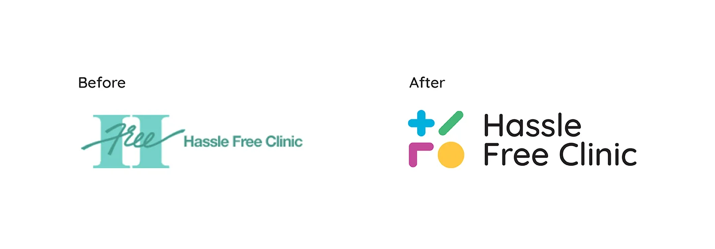
Hassle free clinic
Hassle Free Clinics' redesign creates a unique brand identity that captures the inspiring and inclusive personality that was hidden behind a generic, uninteresting medical logo.
BRAND IDENTITY WEB DESIGN
The problem
From reading through the Hassle Free Clinic history and how they talk about themselves, HFC has a very interesting personality that is not conveyed through their visual representation. The organization is self-sacrificing and hard working, rule breakers, and in order to provide service for their clients, have become rule-makers. This strong rebellious, and potentially bold personality is hidden behind an uninteresting medical mask.
Phase 1 research
The process began by looking into Hassle free clinics current brand identity. The results demonstrate how the existing brand identity does not represent the clinic's unique personality.
Brand challenges:
- The first challenge is their disconnected brand identity. Currently, their logo and visual identity do not match the history and the personality of the clinic.
- Their identity does not reflect the majority gay and trans community they serve.
- Their logo has little to no connection to the business, and it is not present enough in the marketing to have the user value the relationship.
- They have a very weak social media presence, they are not on all the major platforms, and their presence is text updates on the clinic. They do not involve the educational aspect of the clinic into their social media presents
- They have no advertising presence outside of government lists of sexual health clinics.
Design direction
The goal is to make Hassle Free Clinic more recognizable to the clients and reflect the impact which the clinic has brought to them.
Summary of challenges:
- Create a dynamic logotype that represents the feeling and inclusiveness of the Hassle Free Clinics history and services.
- Create a scalable logomark that adjusts to all user's interactions with the brand.
- Create a dynamic approach in branding to the clinic's advertisements that makes the Hassle Free Clinic recognizable and identifiable to the people.
- Incorporate the who, what, why, when, where and how of Hassle Free Clinic into the advertising to familiarize the people with their personality and educate them on the purpose of a sexual health clinic.
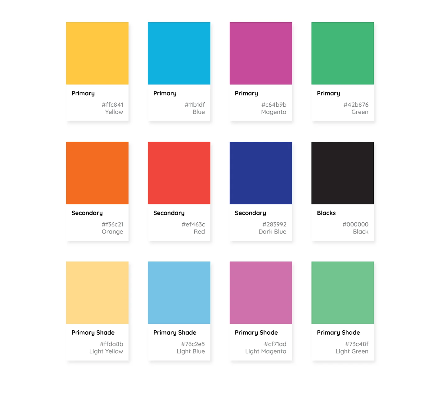
Colours
Hassle Free Clinic clients/customers are men, women, members of the trans and LGBTQ+ communities. I used their target audience as inspiration for the colours of the new brand identity. The primary seven colours are the same seen on the pride flag and were selected as they represent the clinic's bold history and personality.
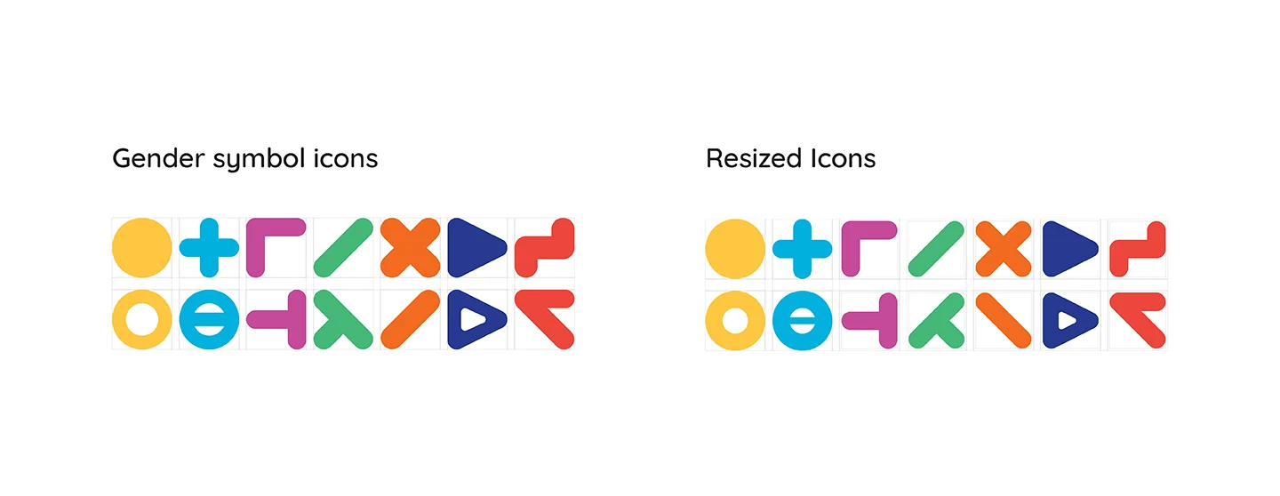
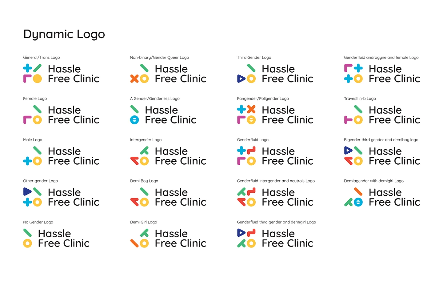
Gender symbols
I felt that a dynamic logotype would represent the inclusiveness of the clinic. To achieve this, I broke down all of the gender symbols and created icons that represented each symbol's different characteristics. Using the seven colours, I made a system for the symbols so the same colour would not appear twice unless an icon occurred twice.
The gender symbol system required multiple iterations as some appeared larger than others and needed to be resized. I experimented with the sizing and weight of the symbols so that they appeared balanced.
Brand identity
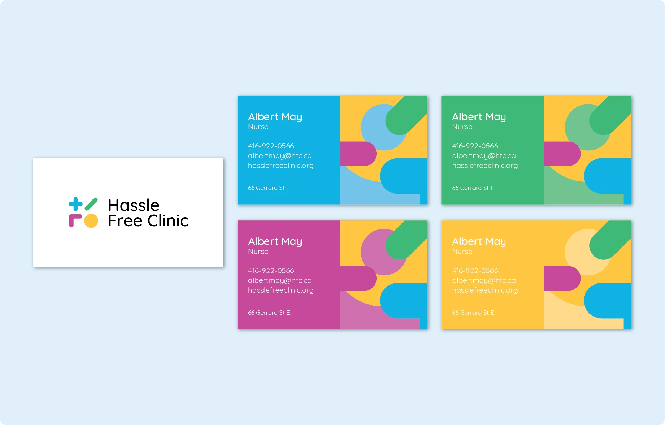
Hassle Free Clinic’s philosophy is to work from an anti-oppression framework that recognizes and respects the diversity of Toronto’s communities. The new logo represents this philosophy by breaking down the characteristics of the gender symbols and using them as the four main symbols of the logomark. Combining the individual symbols to represent the male, female and transgender symbols respectively in a two by two grid. The logomark is accompanied by a logotype set in Quicksand for its rounded terminals and shared characteristics with the logomark.
Logo variations
I knew that the logomark and logotype would not be appropriate in smaller environments. First, I took the symbols and laid them in a line without the wordmark to create a condensed version of the logo. I then also felt it was necessary to develop a wordmark of HFC using the four main symbols' colours. This allows the user to identify the clinic with the organization of the four colours and icons.
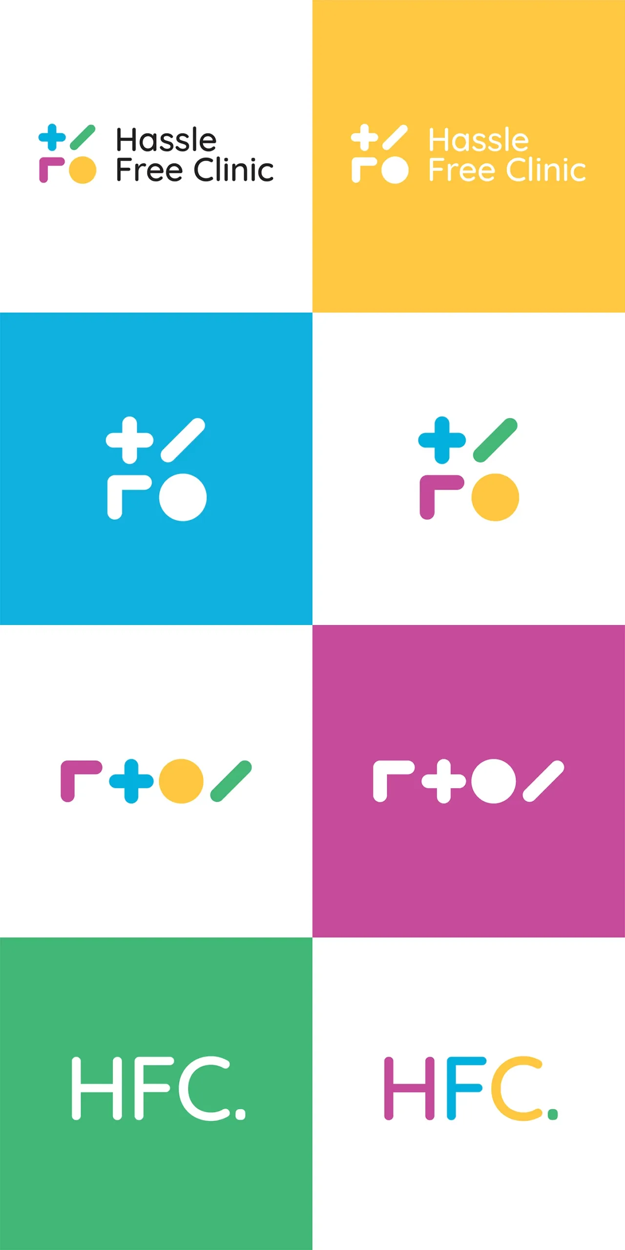
Clinic logo variation
Most challenging was creating a variation for the men/trans and women/trans clinics. Using the dynamic system of symbols, I created unique marks for each of the clinics. The struggle came with the layout of the supporting logotype to identify the two clinics. I continued to use the two-line grid and different font sizes to help read the two elements appropriately.

Dynamic logo
To make the new brand identity dynamic, the individual icons are placed into the two by two grid to represent each unique gender. To keep consistency, the circle icon is always placed in the bottom right space. The top right space is filled next to accommodate the gender symbols with only two icons. The bottom left is the third space to be filled, followed by the top left.

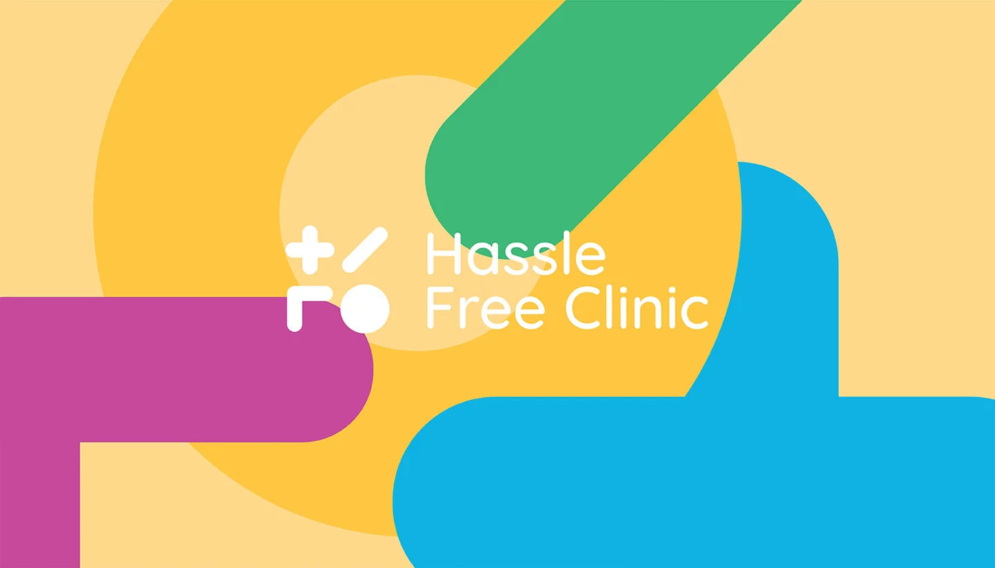
Hassle Free Clinic style manual
The style manual for the Hassle Free Clinic outlines the rules and application of the new brand identity. The full style manual can be accessed by clicking the link or image below.
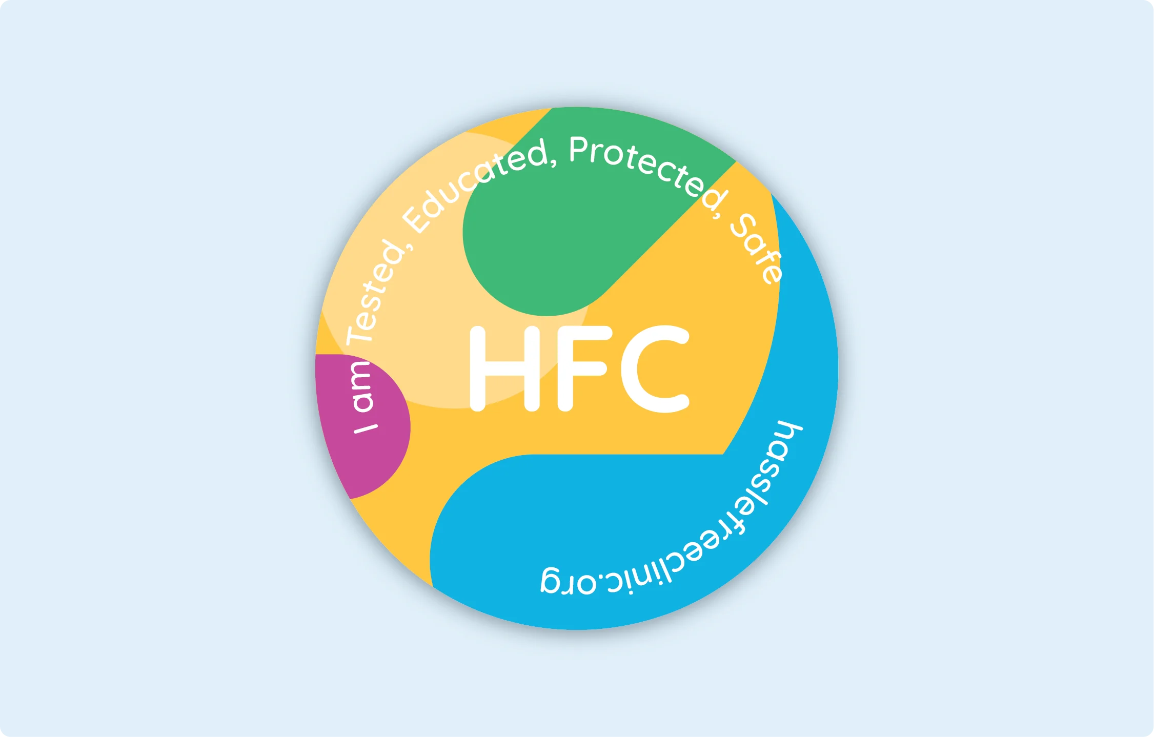
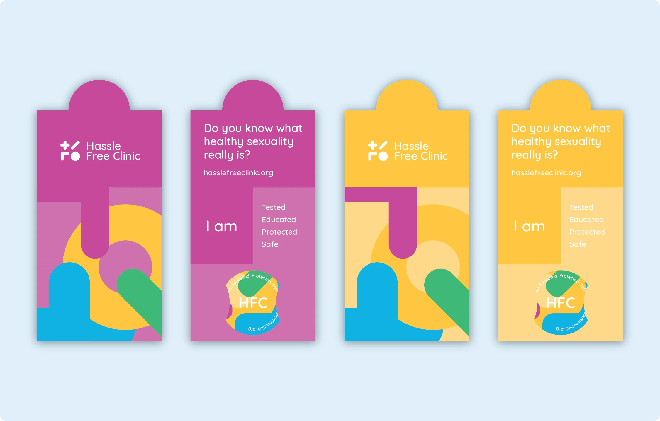
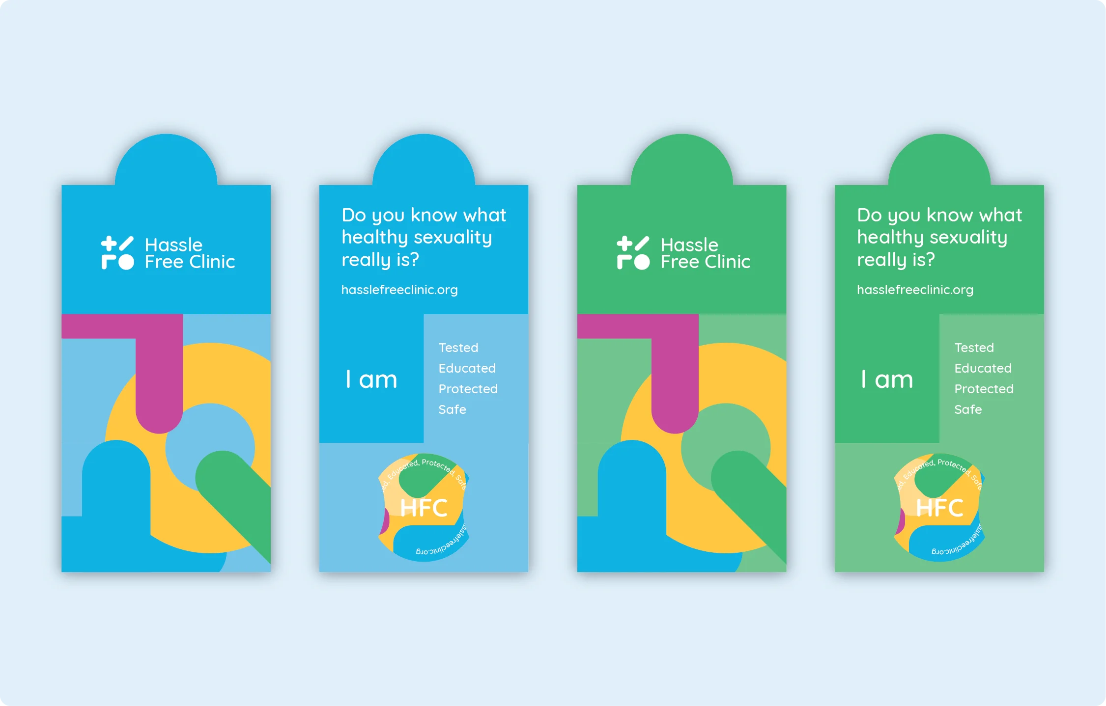
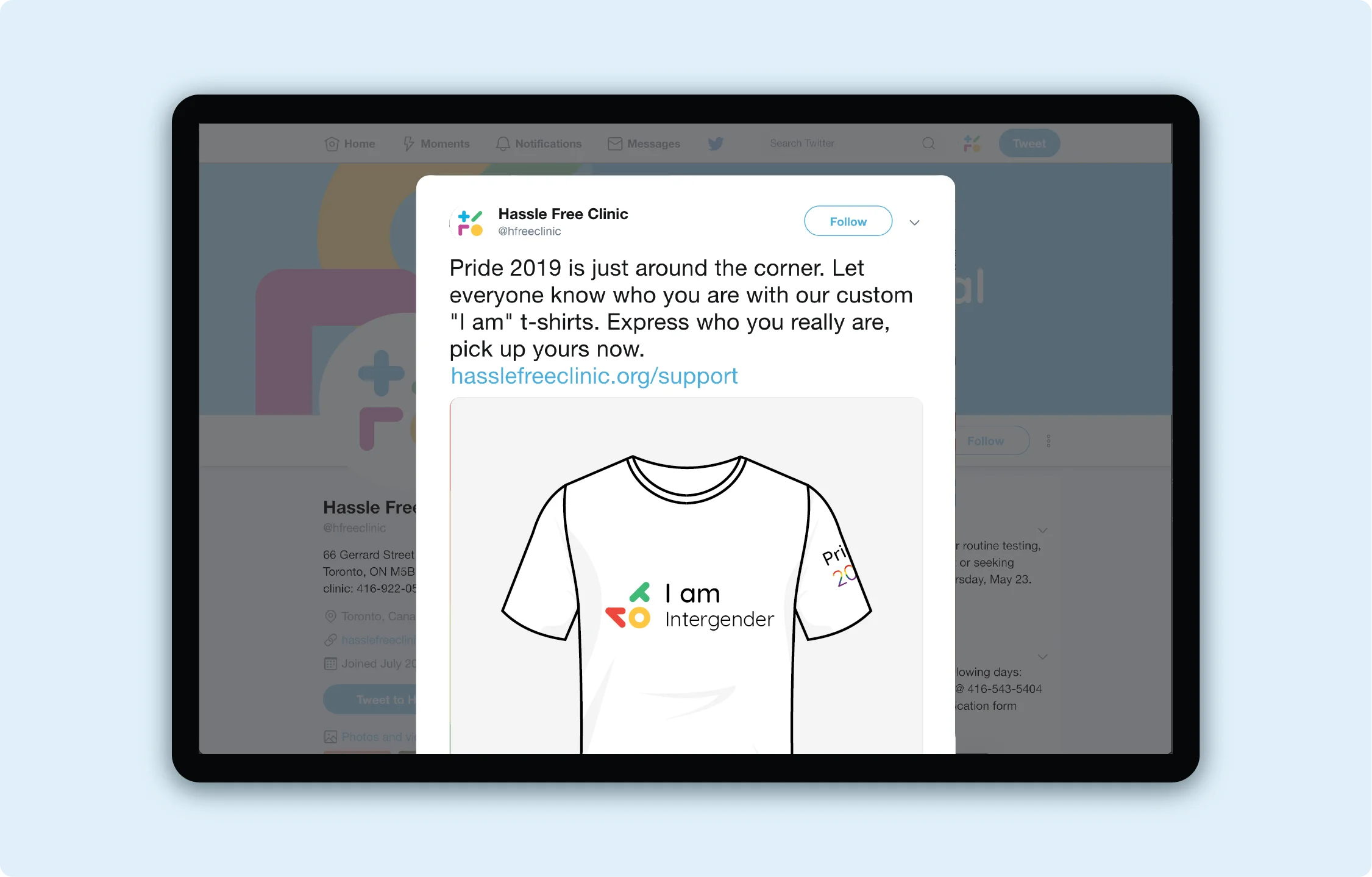
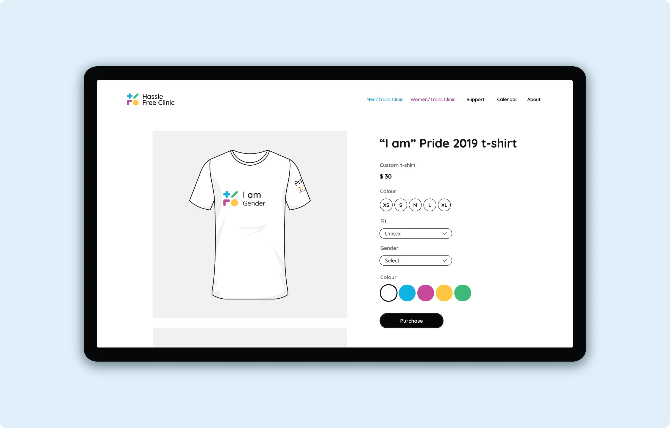
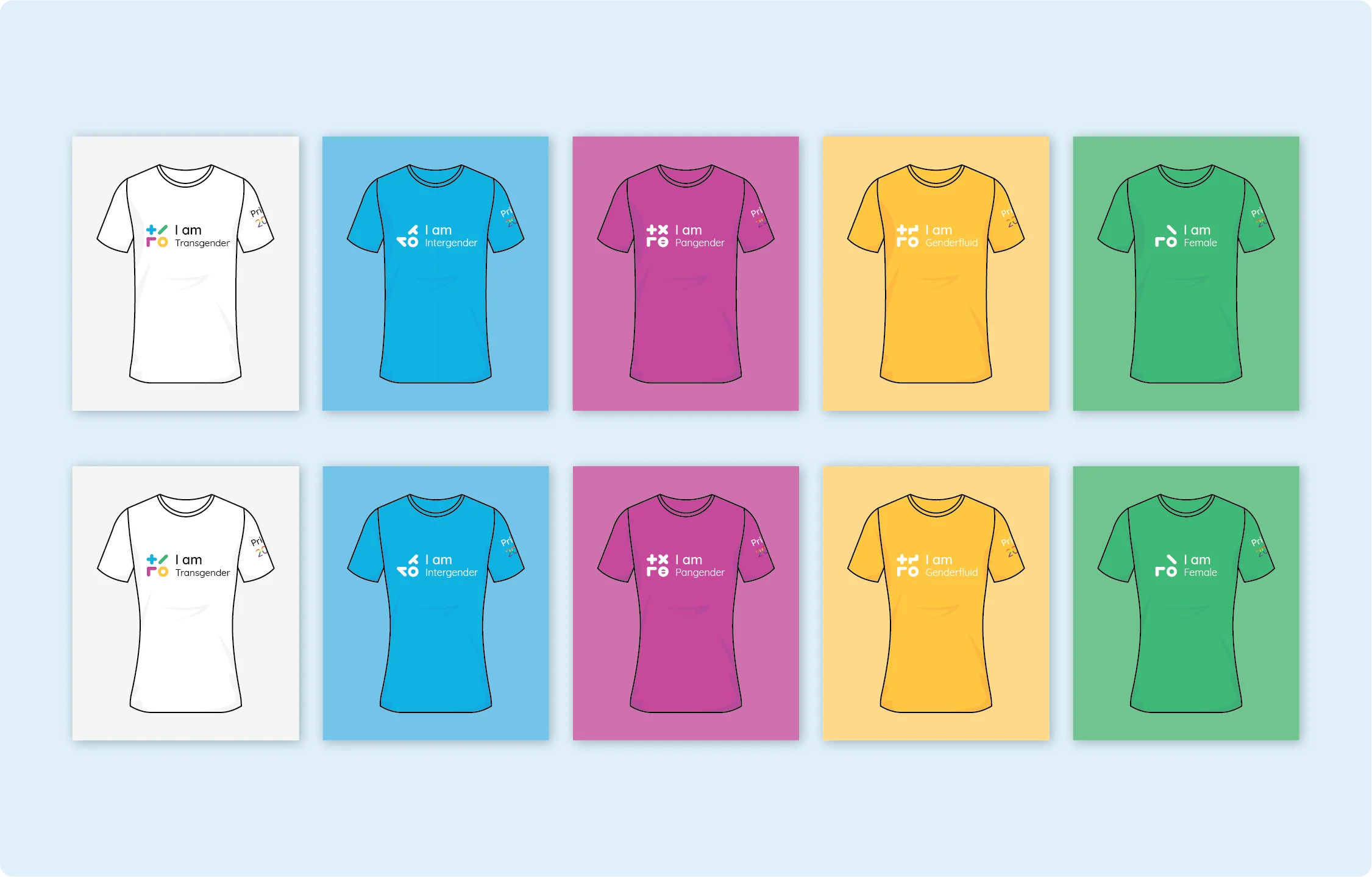
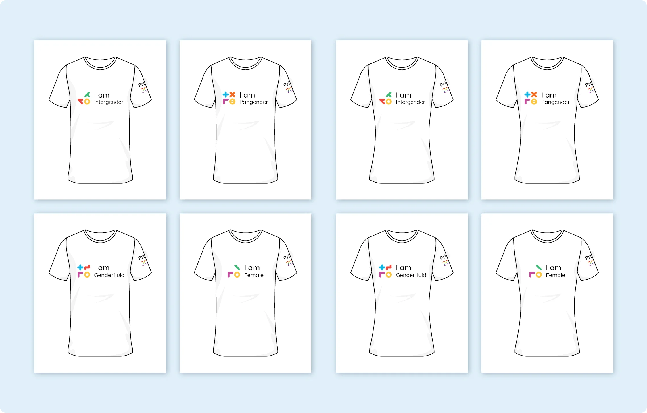
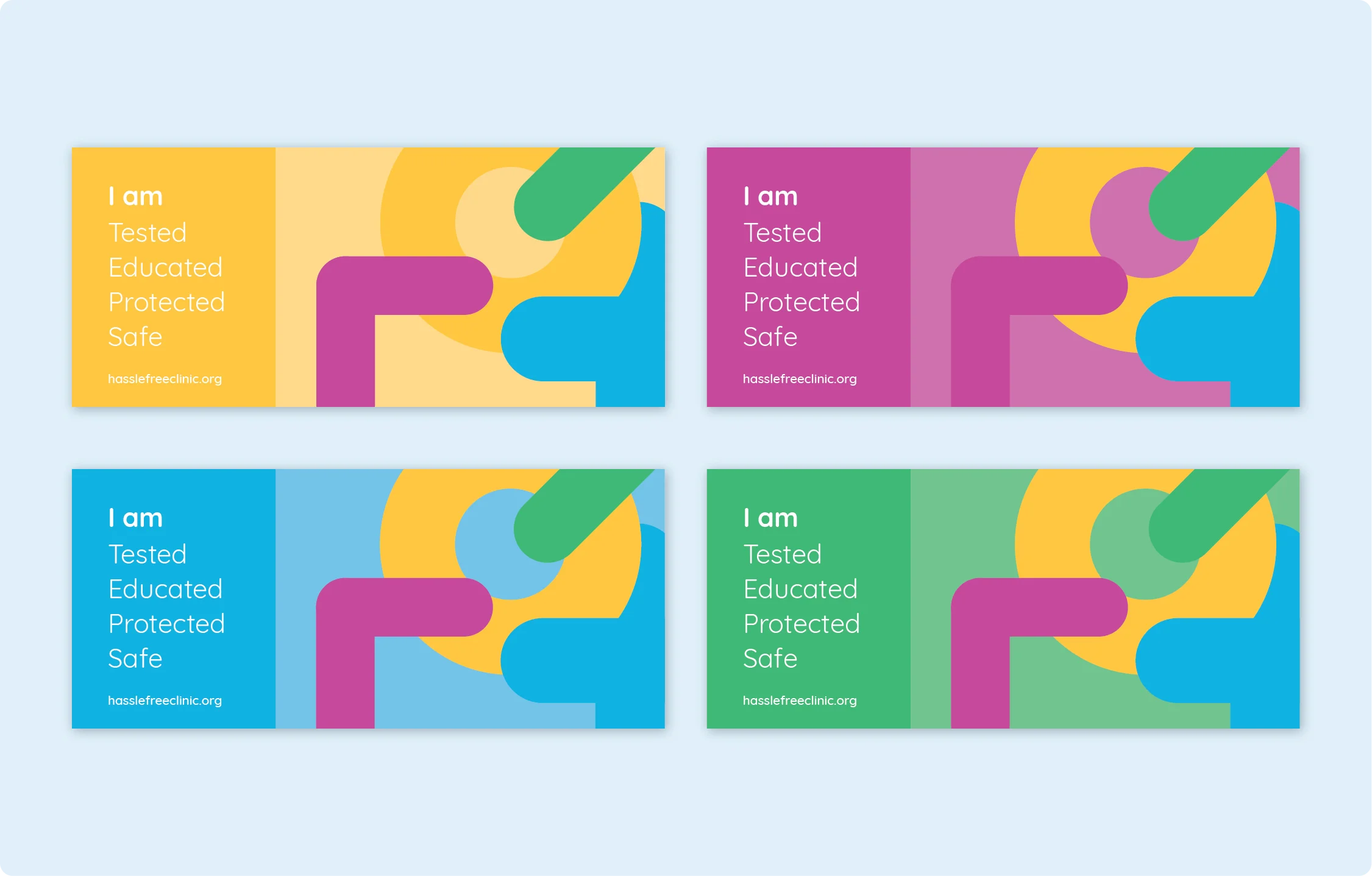
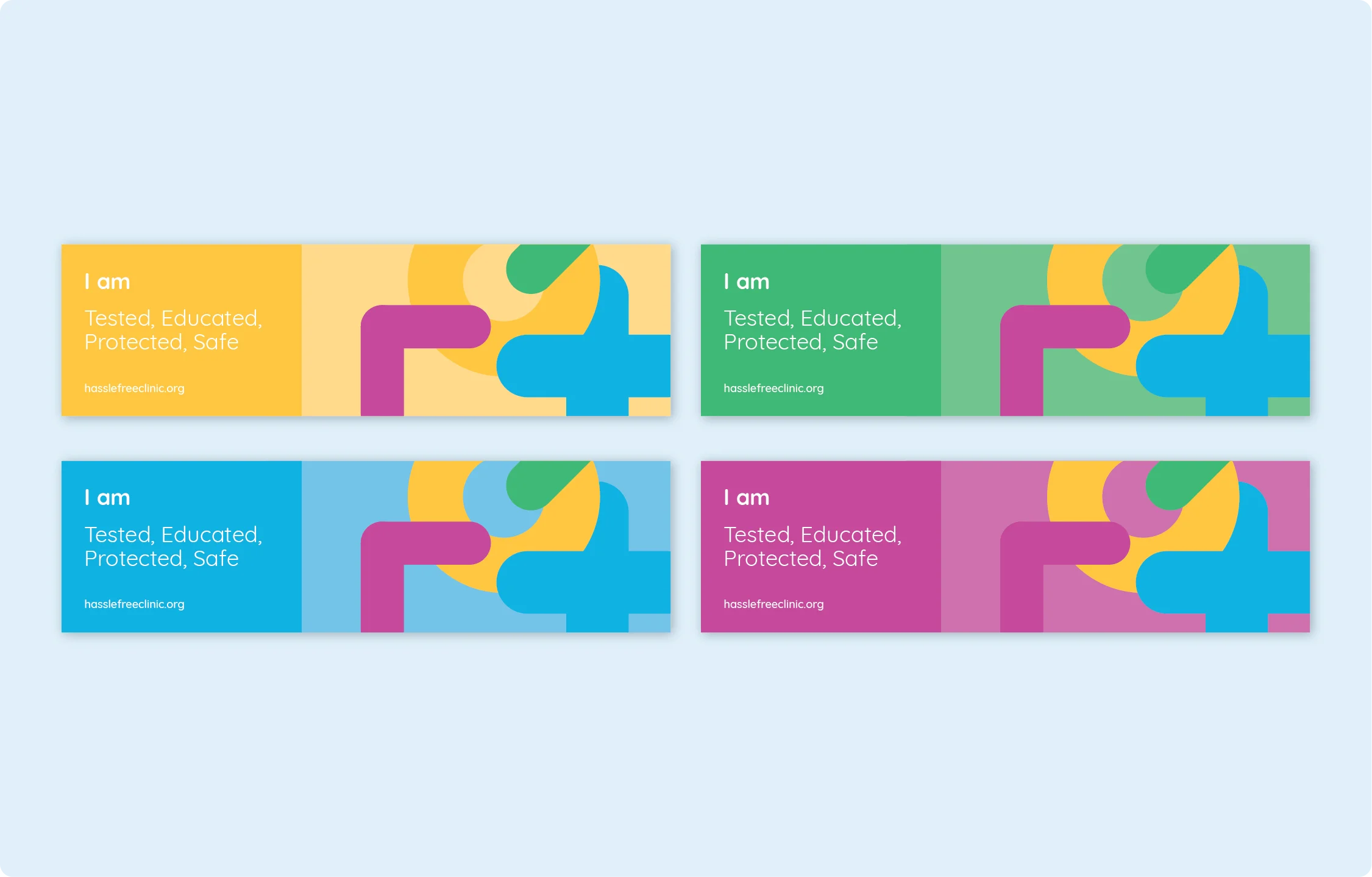
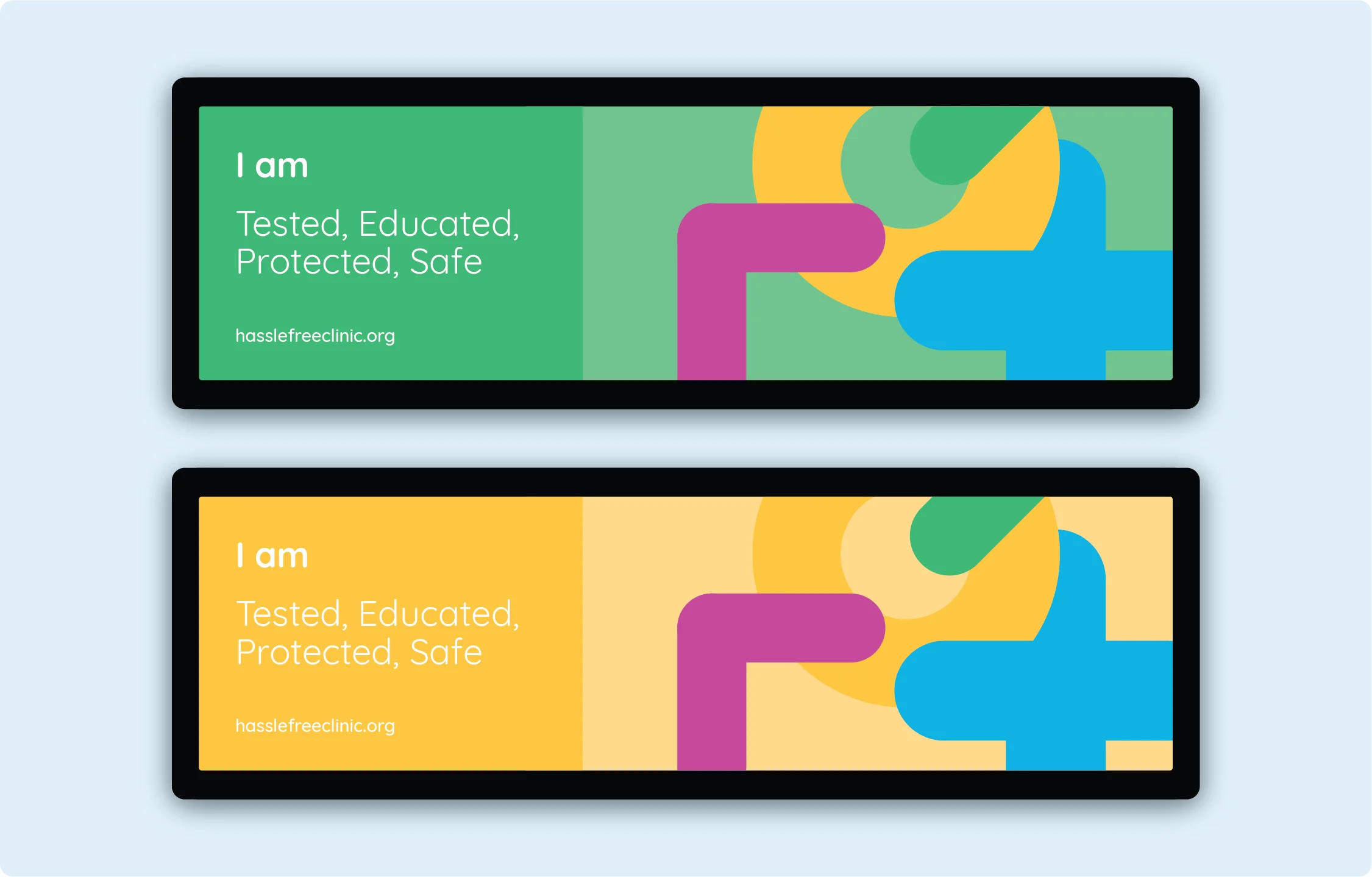
I am
The custom “I am” T-shirts were designed for the pride festival to improve Hassle Free Clinics community presence. The T-shirts use the dynamic logo and alternative layout to convey the individual’s gender symbol and title. The I am message displays the new brand identities desire to educate and inspire their community.
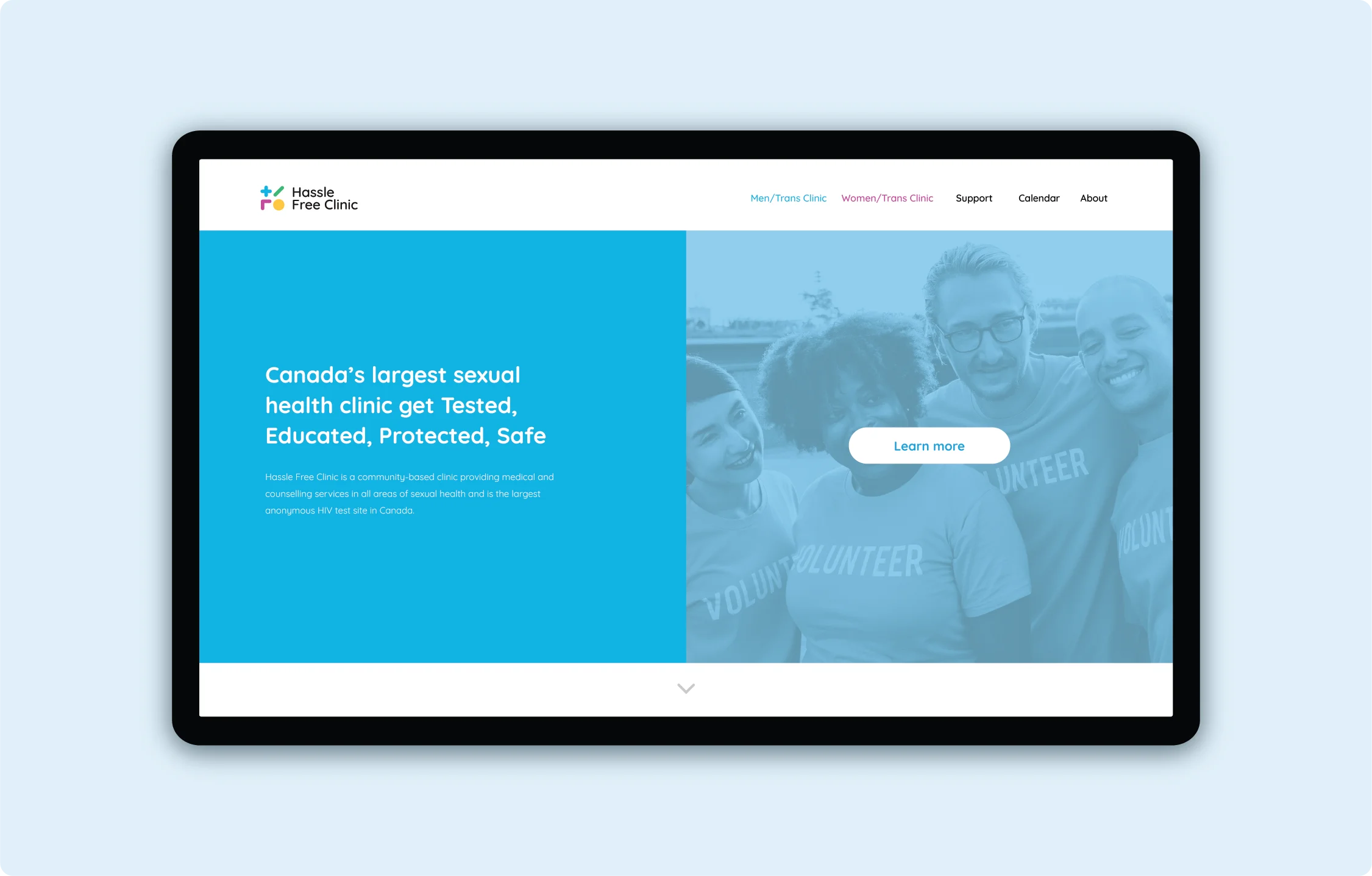
Website
The Hassle Free Clinic website has been updated to meet the new brand identity. The website is simplified and organized so that the user experience is improved and essential elements are easy to access and direct the user to their desired location. The new system allows the use of colour to help identify and distinguish important parts of the website and establish a hierarchy to elements on the page.
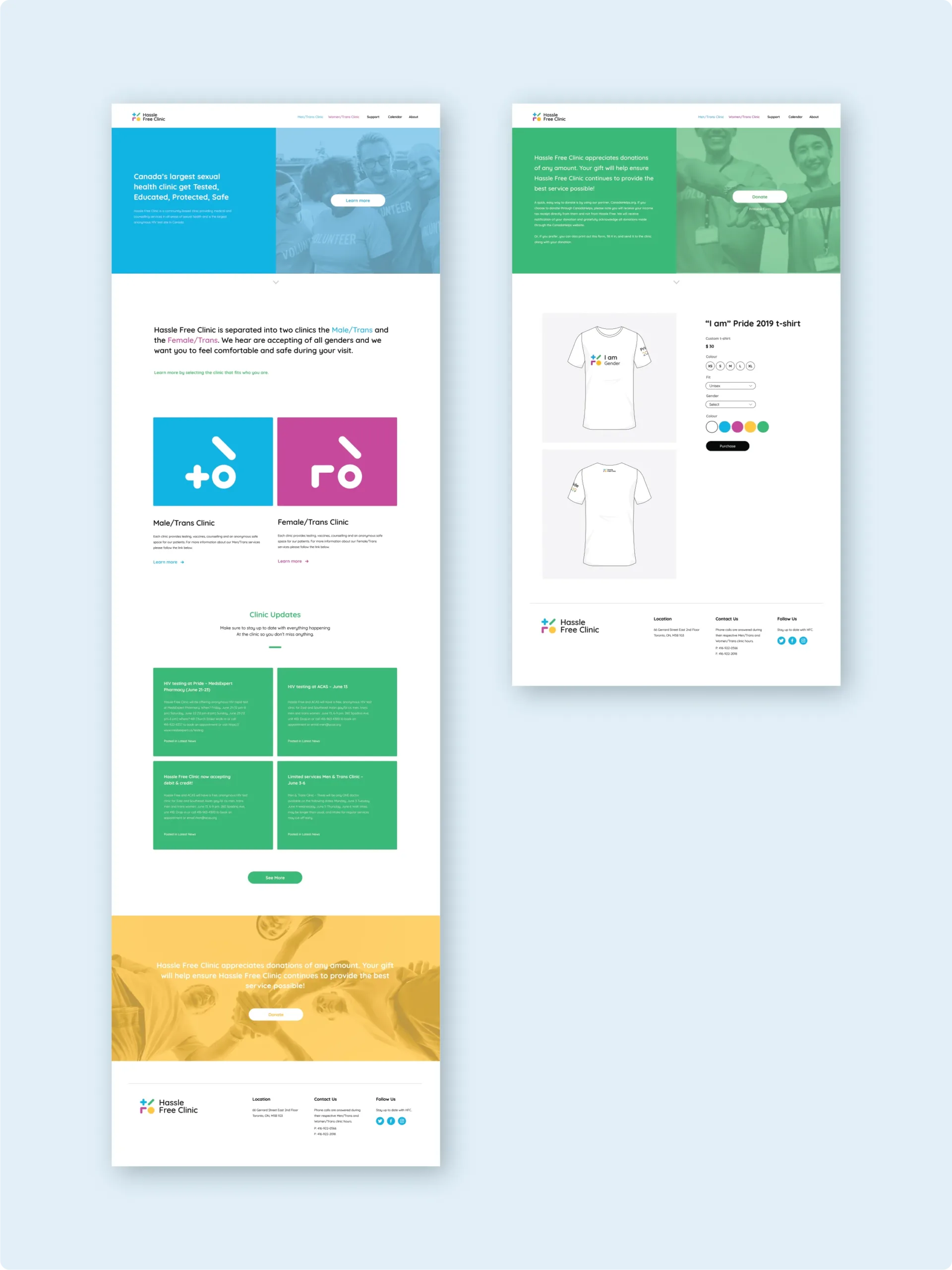
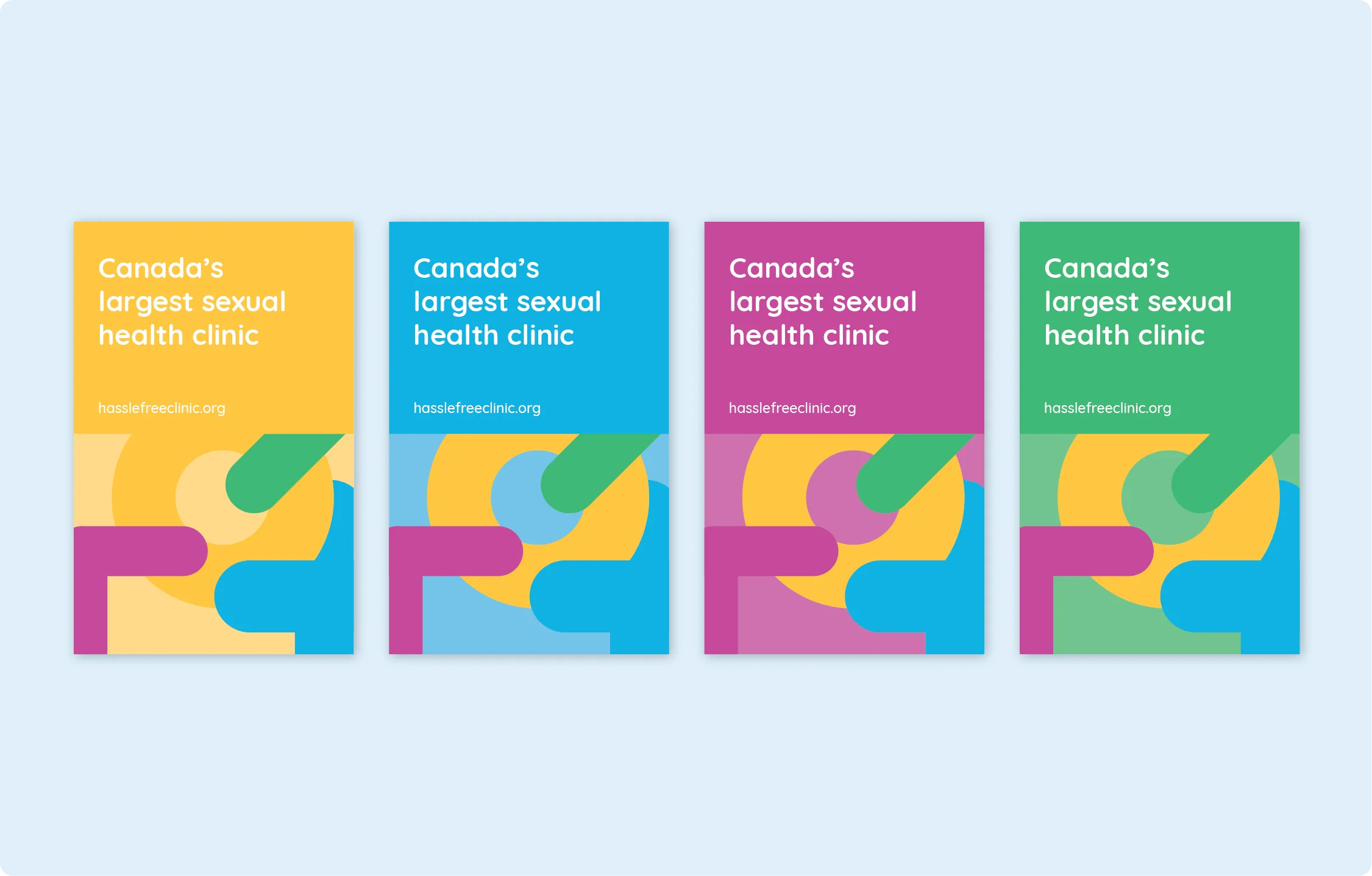
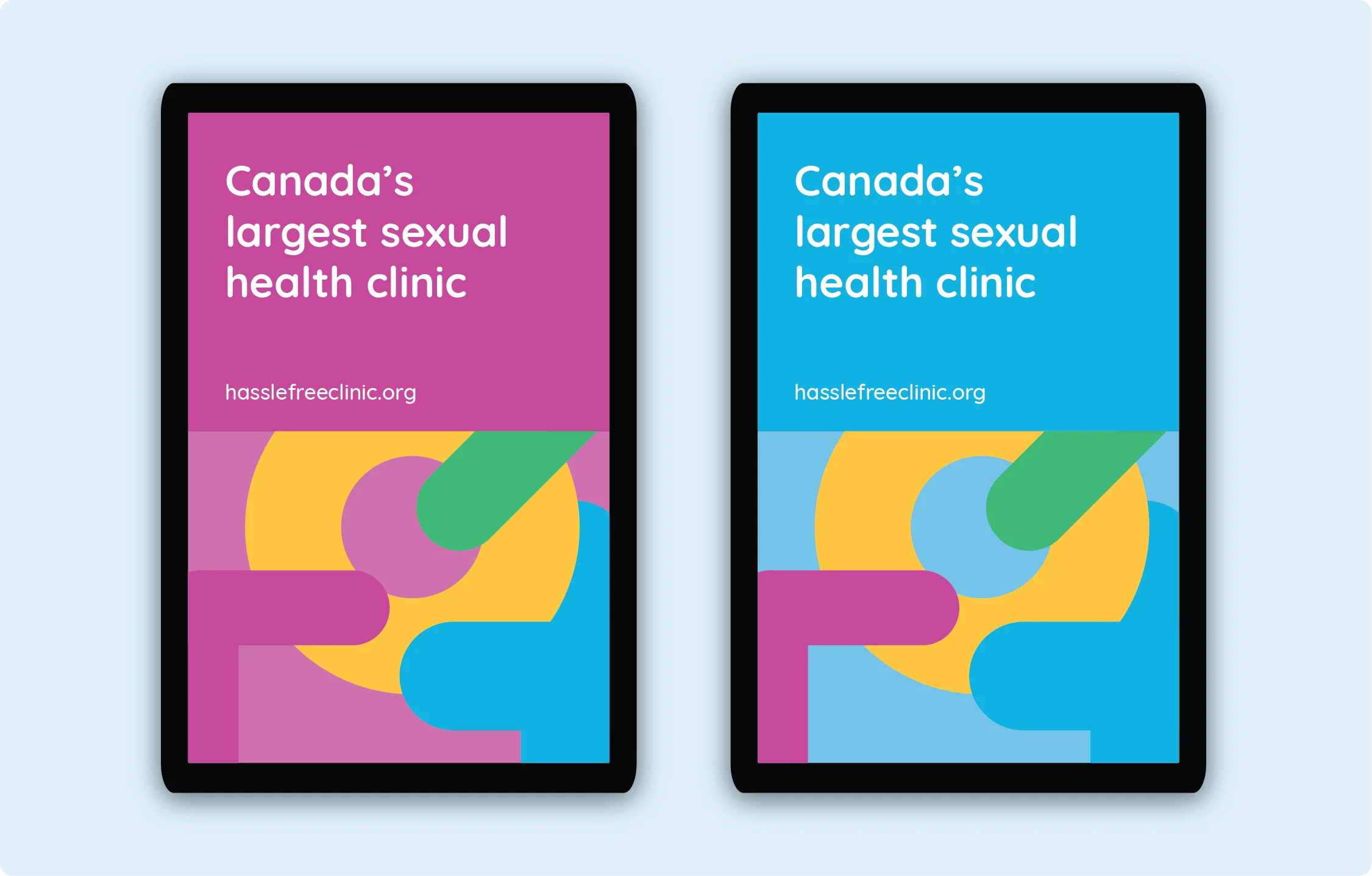
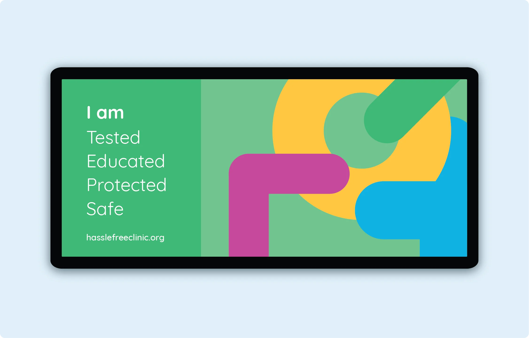
Advertisements and product
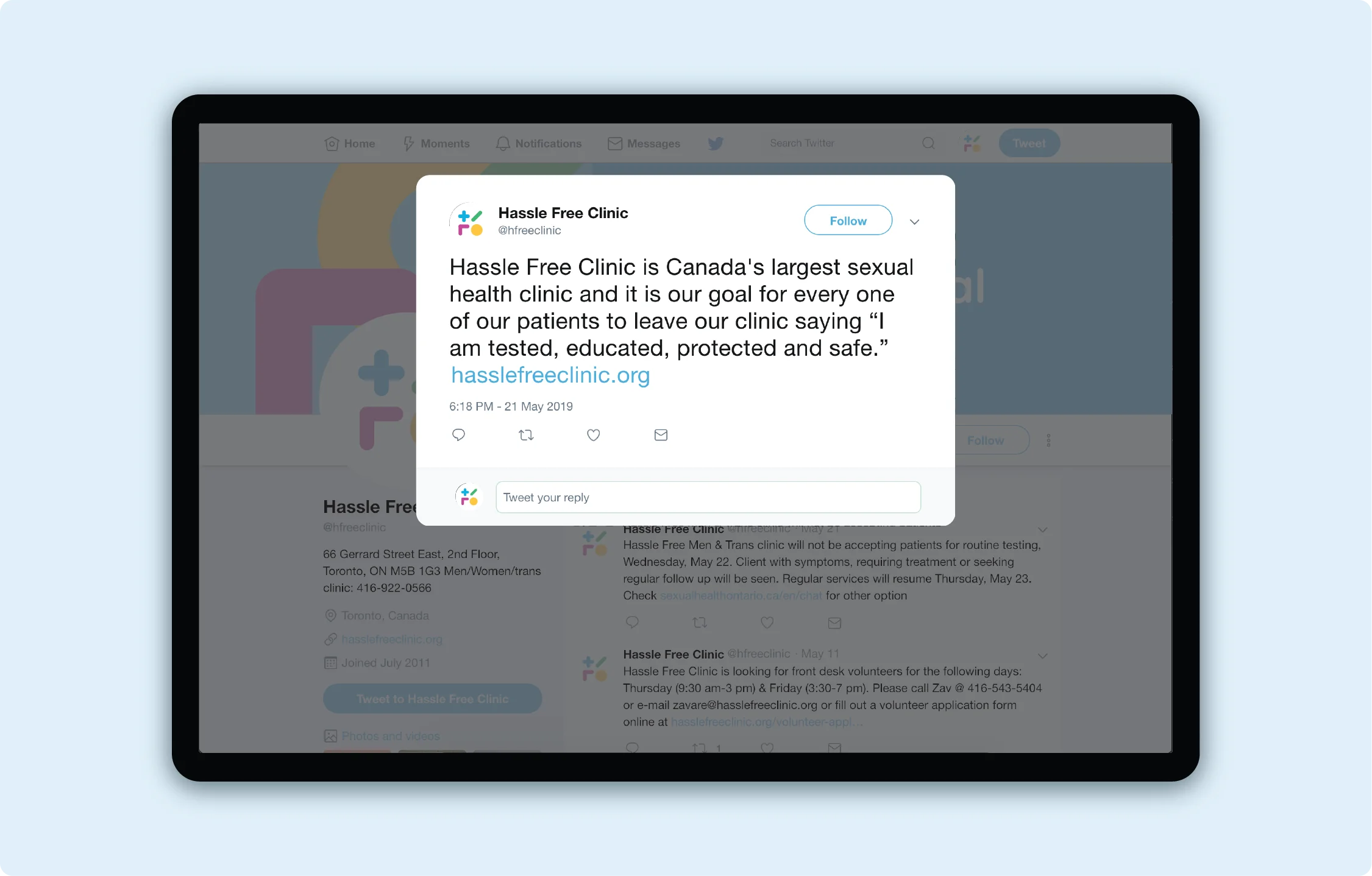
Posters and banner advertisements follow a simplistic set of elements. This range of posters will contain the three components: the key message, website, split colour background and the pattern of the four main symbols. The “I am” message is used again with the words tested, educated, protected and safe. Along with “Canada’s largest sexual health clinic,” this poses direct but subtle messages, so users identify the mature content but are not put off by any uncomfortable imagery.
Condoms are commonly given out at sexual health clinics, so using the established system, a creative packaging was created to improve brand recognition and educate the users on sexual health and bring their attention to the services of Hassle Free Clinic.
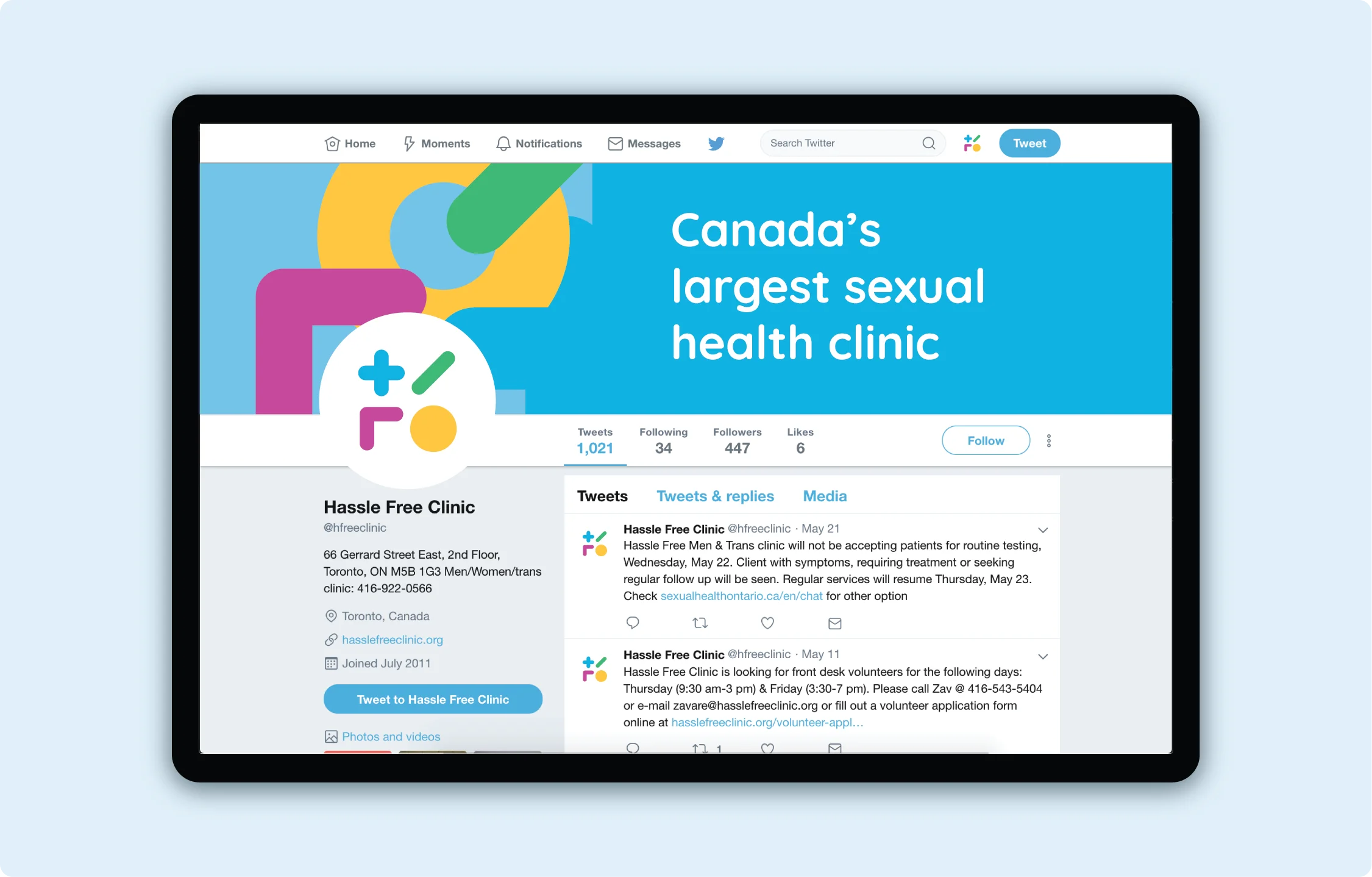
To improve Hassle Free Clinic's social media presence, their profile has been updated to meet the new brand identity. Introducing the system and adding more personality into their posts through images and post reflective of their culture and inclusive services aim to improve their profile and reach online.