Manchester city
This is a passion project that is very close to my heart. The redesign of the Man City badge excited me both as a fan of the club and as a designer. Explore my creative process in capturing the history and people that represent Manchester City.
BRAND IDENTITY
Context
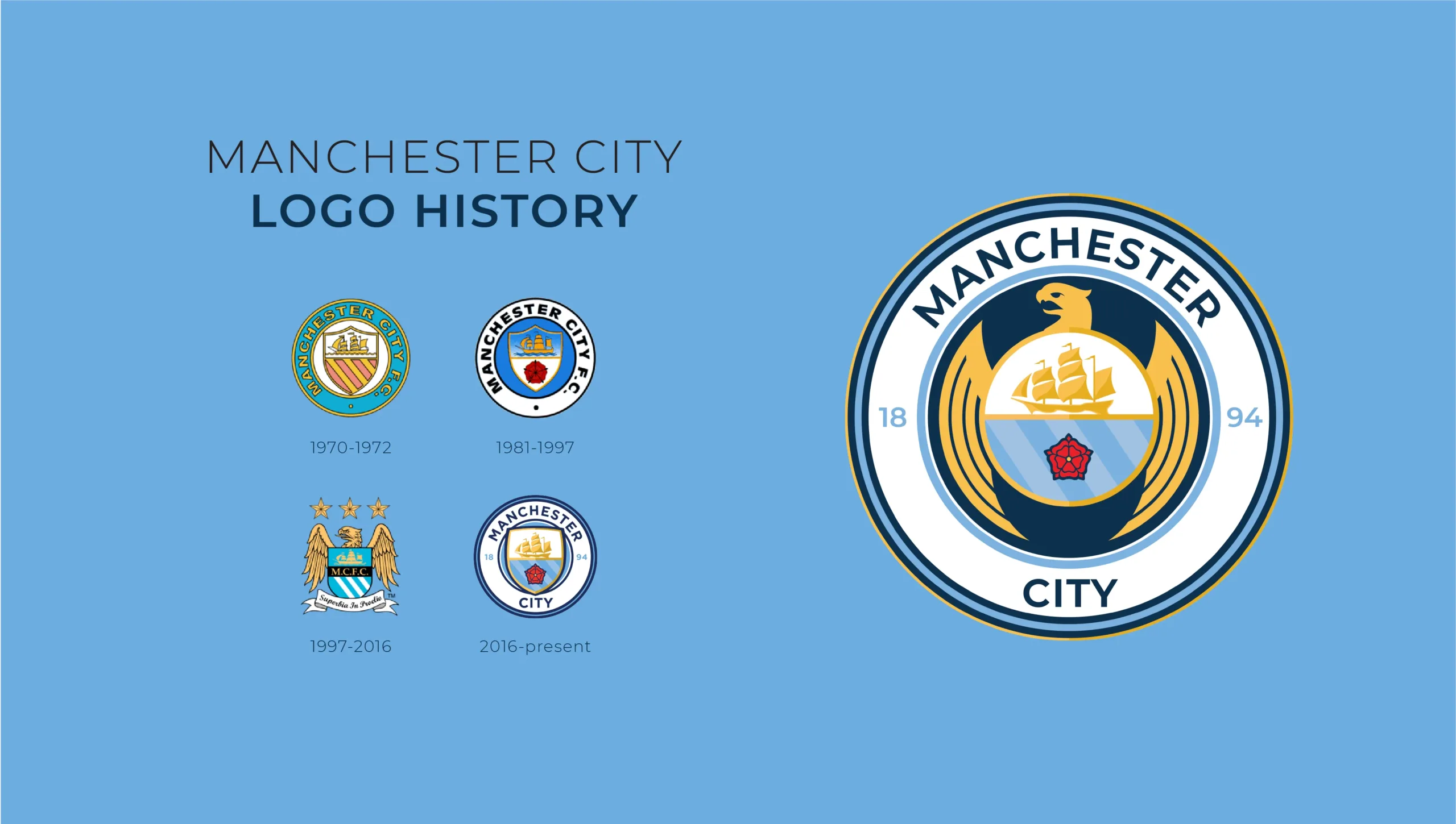
This is a personal project that is very important to me. Manchester City is an English football club that I have supported for many years. In 2016 it was announced that Manchester City would be releasing a new logo that would reflect the club's history and include fan contribution through surveys. Upon releasing the new logo, I felt that there were some changes that I would make, so I designed my logo based on the information they provided. In the second phase of the project, Manchester City was rumoured to be changing their main from Nike to Puma, so I designed new kits and promotional material to announce the brand collaboration.
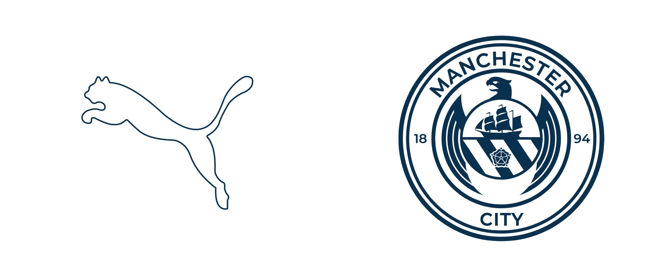
Crest elements
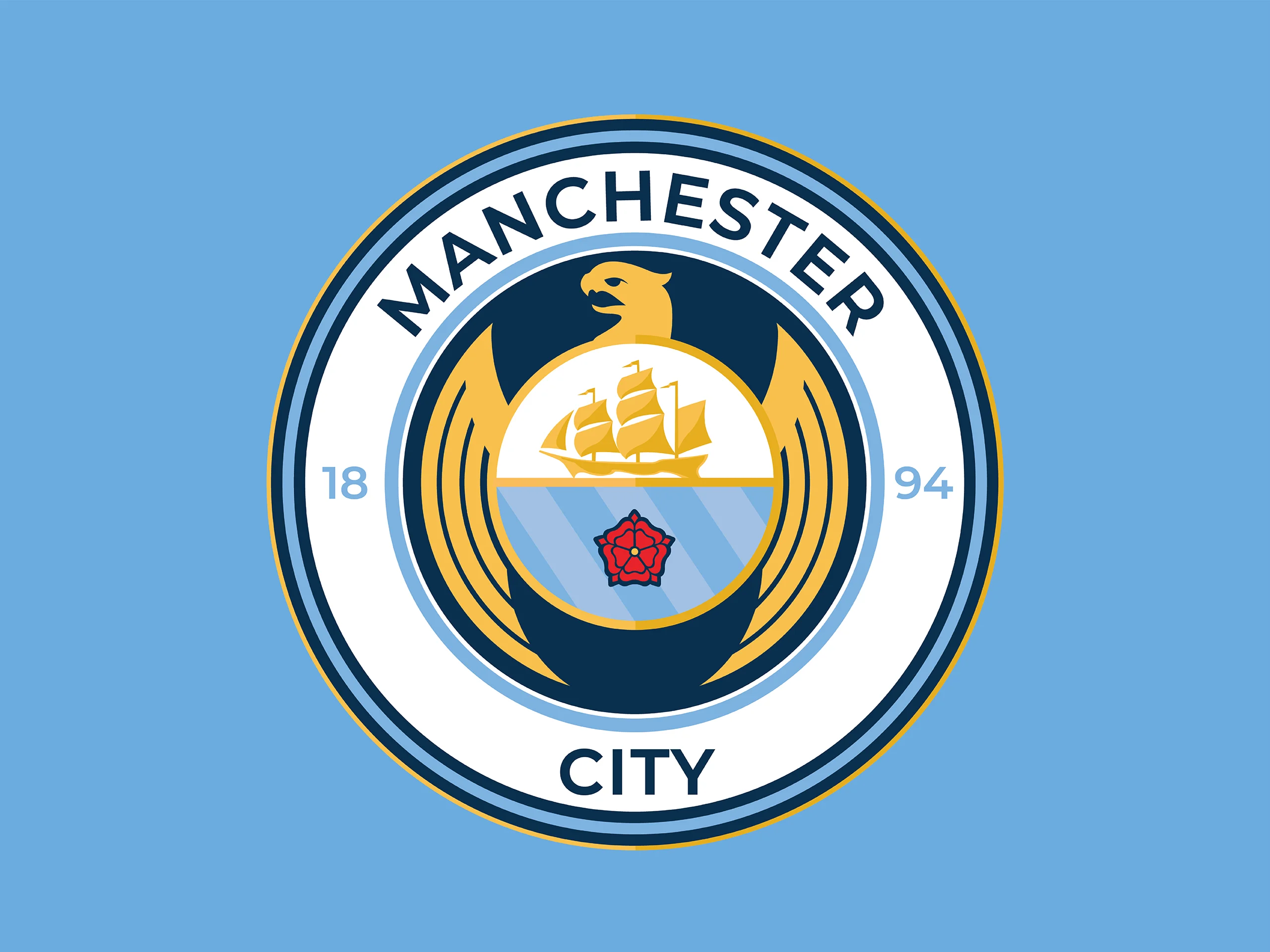
One of the most prominent aspects of the new Manchester City logo was its return to the circle form. This, along with other elements of the new logo, were determined by community involvement as Manchester City values its fans' opinion. The majority voted on returning to the circle form and other elements like the rose, the three lines for the three rivers, and the boat.
Considering the people's feedback and my feelings toward the badge, I started creating my version of the new logo. I supported the new logo but felt the eagle was a powerful visual element to the last iteration of the logo and was necessary for my iteration. I stylized the eagle into a more minimal style to fit the new aesthetic and then changed the internal badge shape to a circle as it conflicted with the wings. Keeping the circle elements similar, I placed the colours similar in the border but made the darker blue to emphasize the logo's main characteristics.
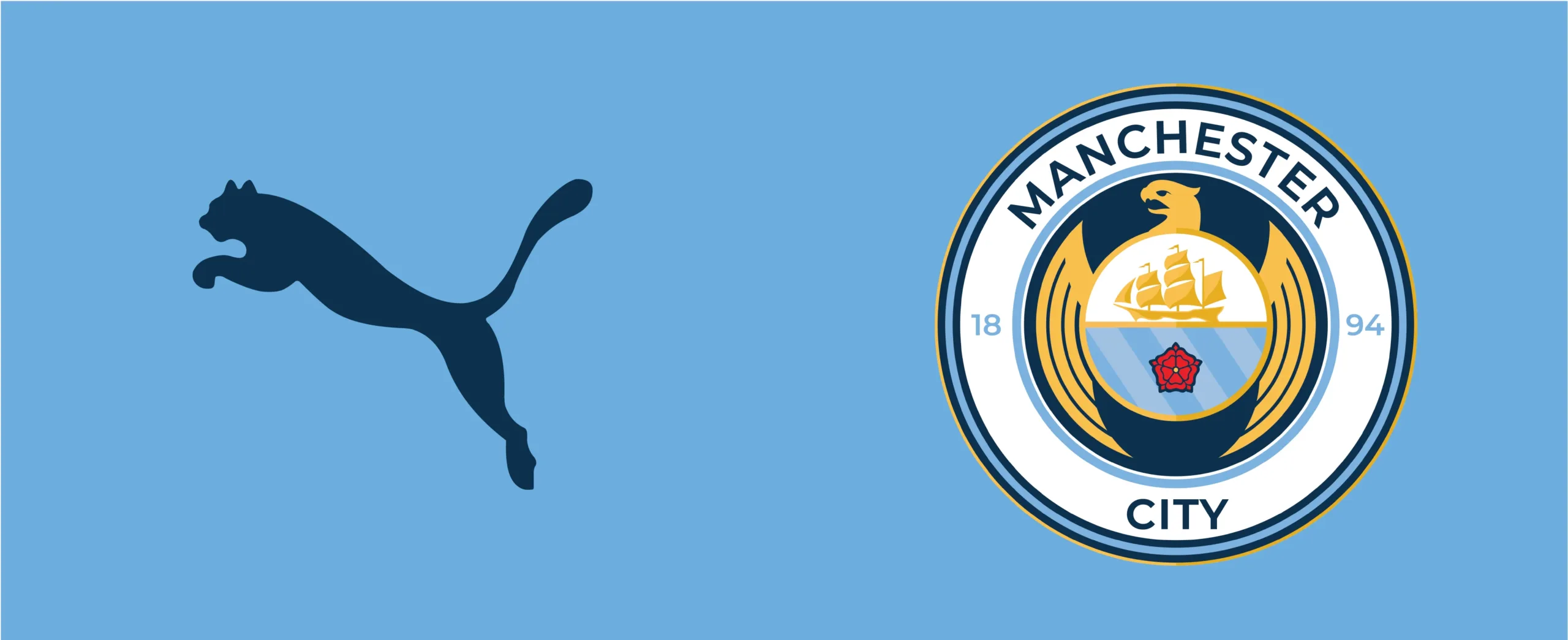
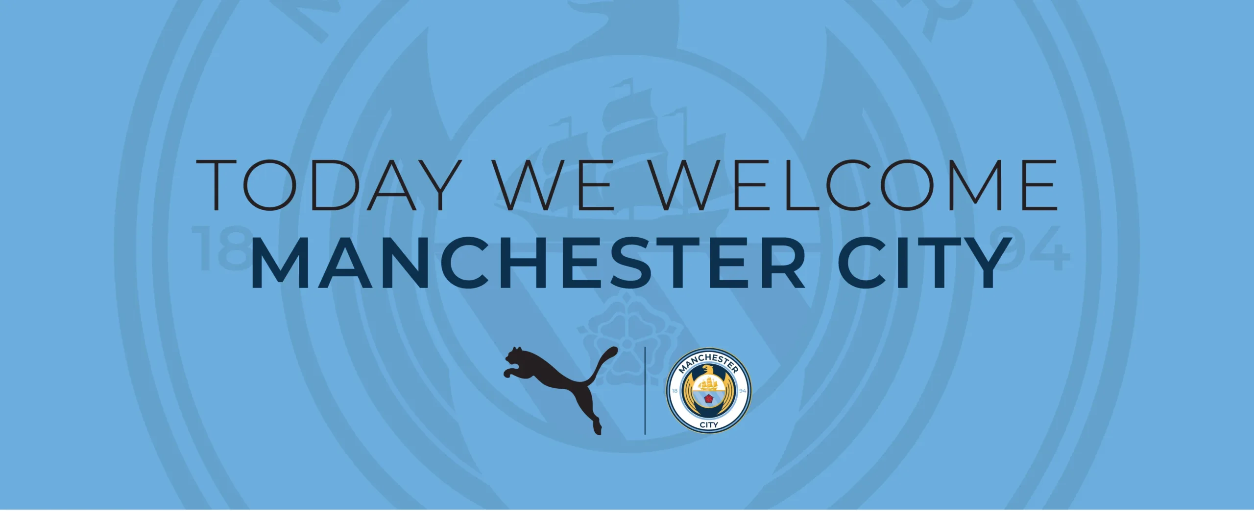
Puma kit deal
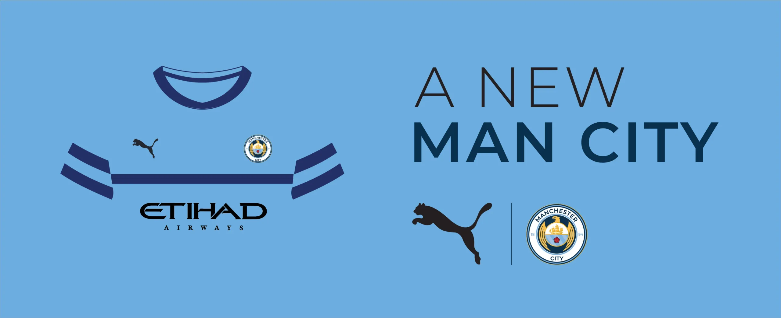
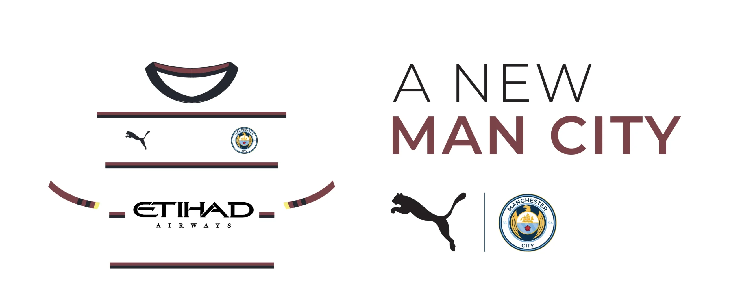
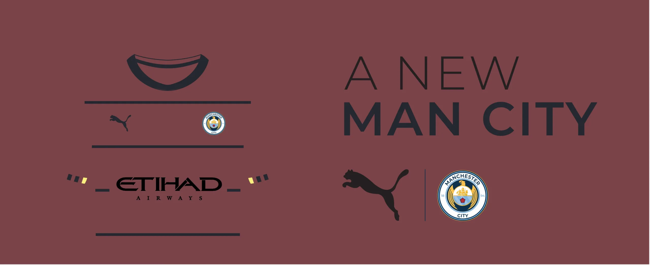
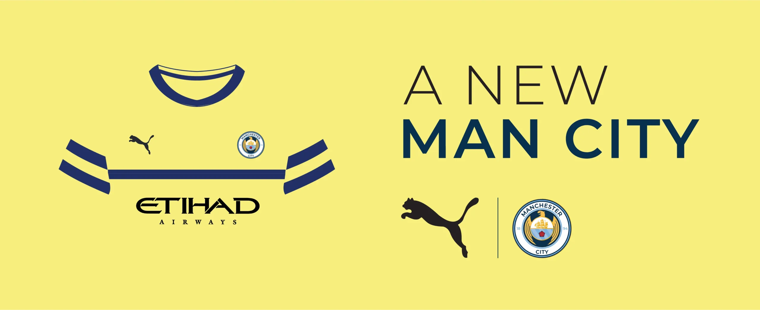
I returned to this project this year as I saw an opportunity to take this further. Manchester City has been rumoured to be changing their main sponsor from Nike to Puma. I Created promotional material to introduce the two brands' announcement with my presented logo.
Another significant element of the Puma deal will be the creation of Manchester City Kits. I felt that Puma should take inspiration from their kit history and present three kits that are clean and respectful to their strong history. I believe this would show the fans their commitment to represent them in the kit rather than create a new revolutionary design that may not represent Manchester City's history.
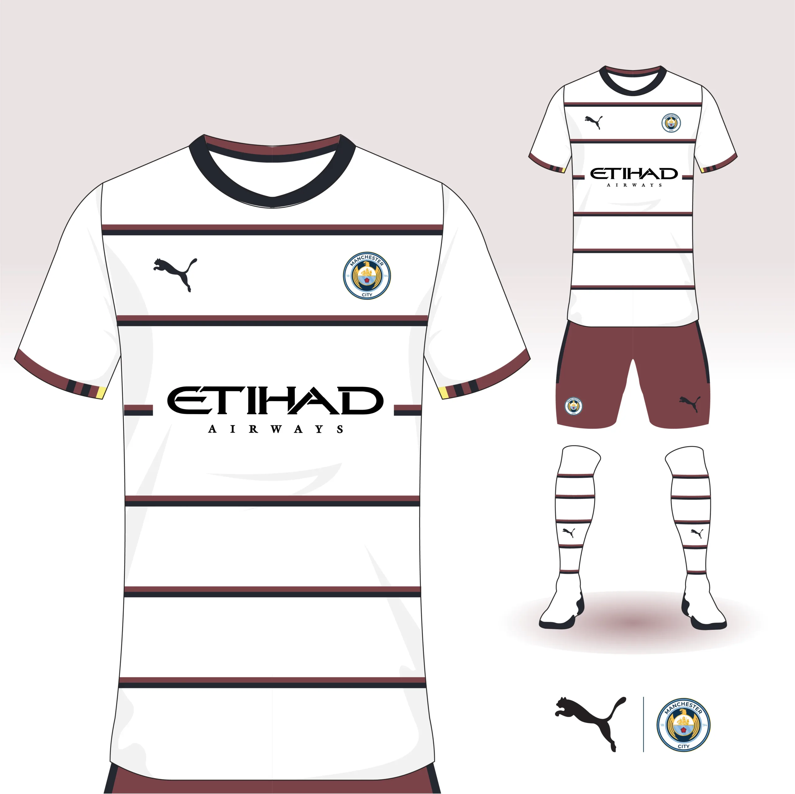
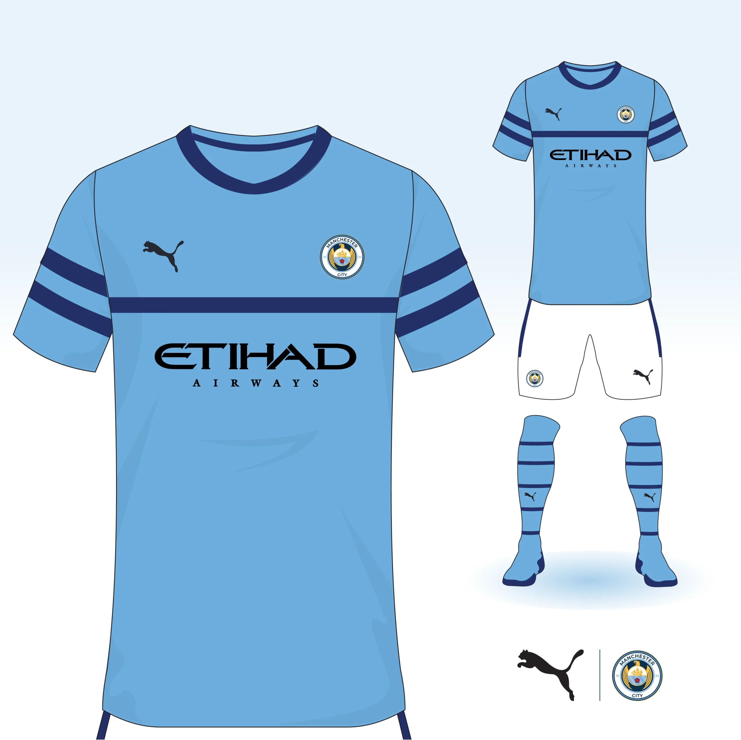
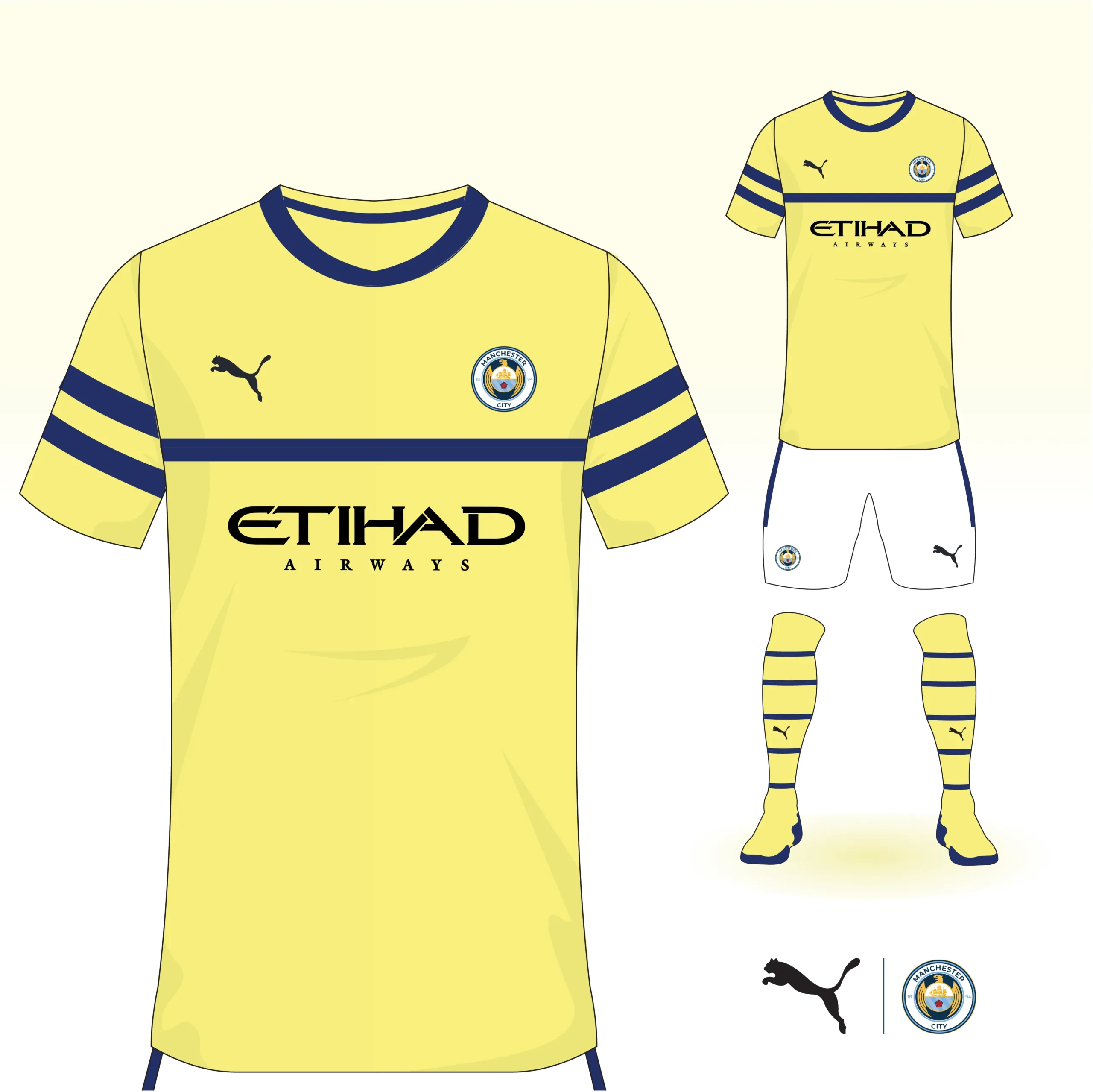
I drew inspiration from previous kits and used elements like the stripes from the first time they won the Premier League. The colours I inspired from past kits. Sky blue is the brand's colour and the mandatory colour for the first kit. The maroon colour a variation of the reds used in their away kits, and the yellow a more bold choice that represented a prominent colour of third kits in their history. After designing the kits, I created promotional material that would introduce their fans to the new season's kit.
Conclusion
Completing this project was very fulfilling. I am very passionate about Manchester City and desire to create a design worthy of my devotion. As a supporter of the club, I feel very involved in these changes. Not only do they touch on my passion for football but also how the team is portrayed. Creating this crest taught me about the value of a brand and how to implement the history and culture of the brand and the fans. This is my interpretation of the Manchester City logo and kits. What do you think? I imagine I will return to this project later as more things develop with the brand and I very much look forward to it.