Quest reader
Quest Reader is an app that brings a new experience to reading—rewarding its readers by going on grand quests and earning items with their own custom character.
PRODUCT DESIGN
Challenge
The focus of this project is reshaping existing digital material into a new outcome. This process was designed to question what to keep, adjust, modify, transform, and add to a proposed concept. The main goal is to leverage existing material into your own adaptation. It is also a way to add extra value to existing design materials.
Selected problem
There are apps in the children's reading space, but none that combines both a holistic user experience with engaging content for kids. Existing products either focus on a catered experience for select books, have monetization models that parents have issues with, or even have a user experience that is confusing for parents, let alone kids.
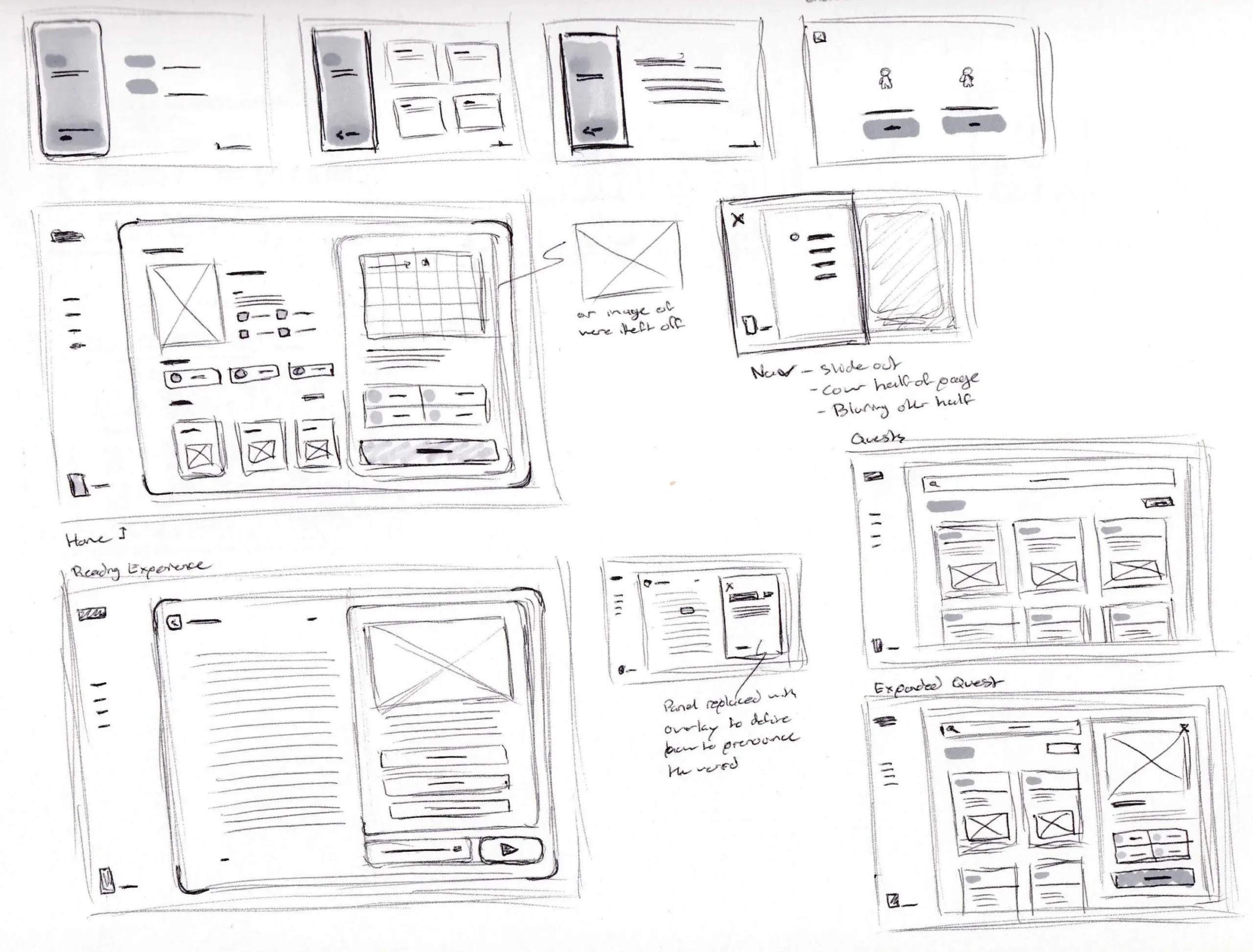
Existing assets
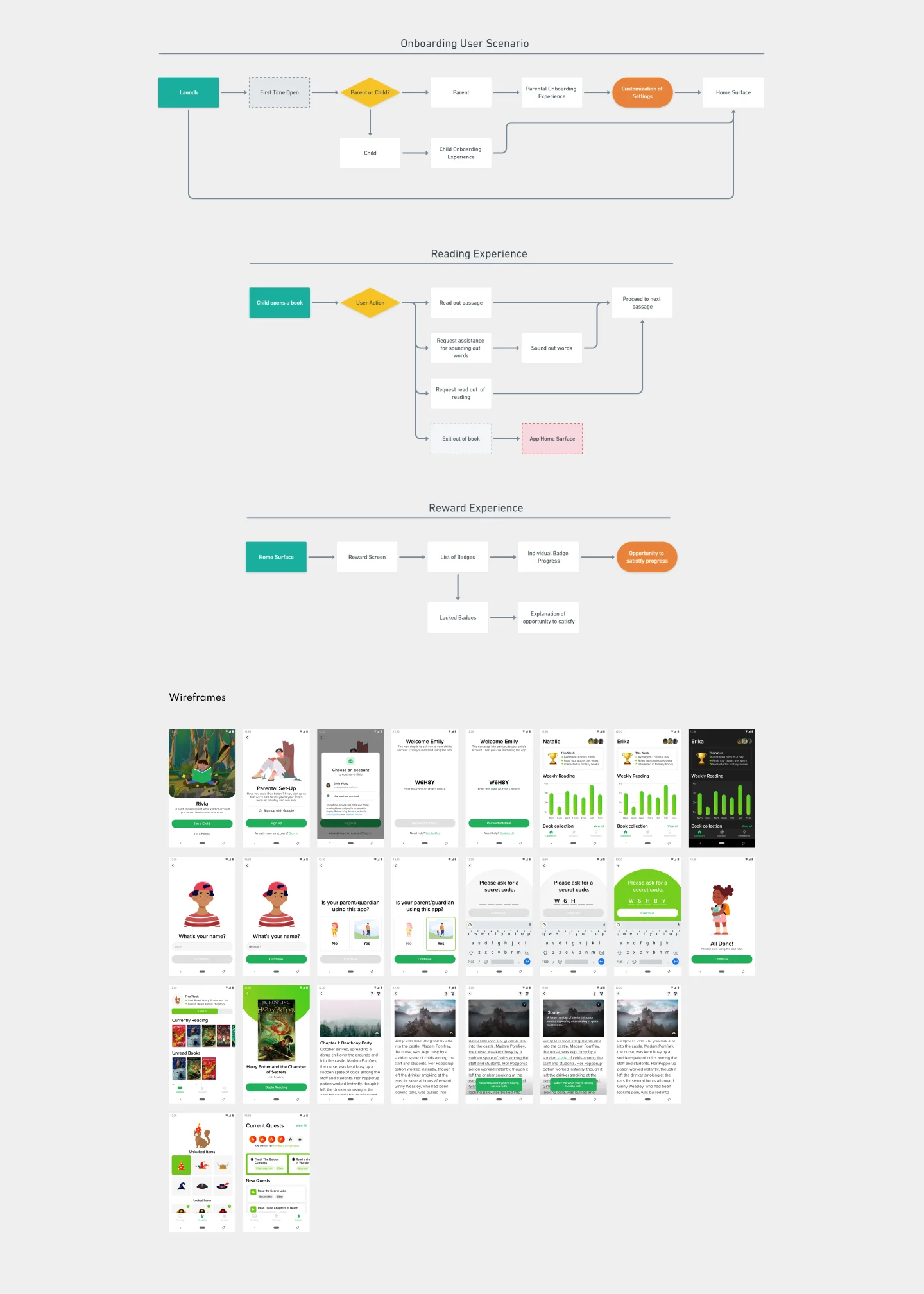
Provided with the proposed problem and research were user flows and wireframes. These provided context to the designers' preliminary attempt to solve the problem. The assets identified three main user experiences as the onboarding, reading and reward experiences.
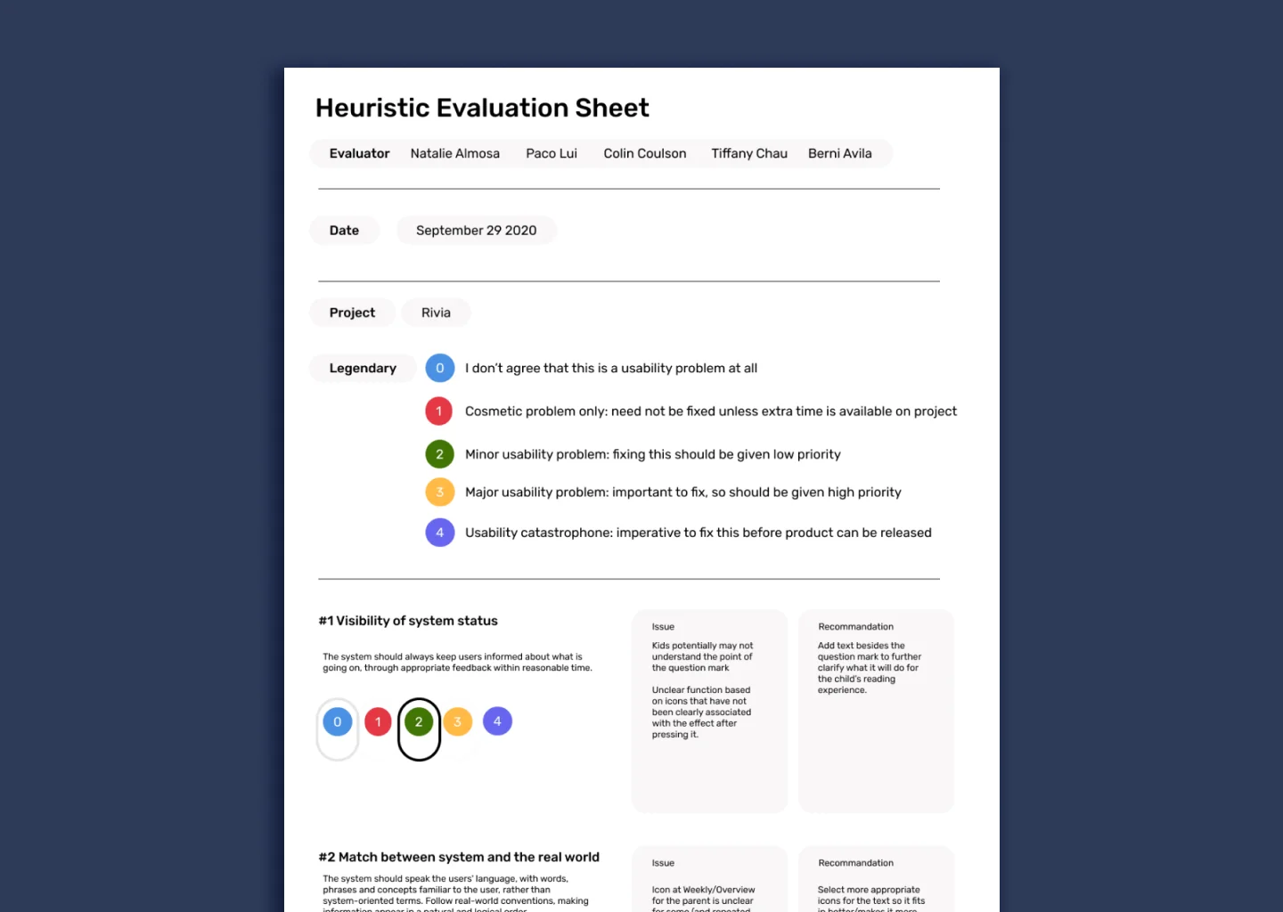
Heuristic evaluation
Based on the existing material provided, myself and a group of other designers tackling the same problem conducted a heuristic evaluation. To briefly summarize the heuristic evaluation, the presented user scenarios create a minimal/efficient experience directed to the app's intended audience. The use of imagery as the predominant form of communication rather than a heavy reliance on text will keep the younger audience engaged and not feel overwhelmed and intimidated.
Pain points
Due to the shorter user experiences, our group's main pain points were contained within some of the elements in the proposed screens and information that needed further development to communicate the right message to its users effectively.
- The homepage hierarchy of elements was confusing and could be managed more effectively.
- The home page also proposes unread books, but there is no option for users to explore or find new books.
- The absence of a library or store feature for the user to search for books.
- The presented reading method seems to be a long scroll instead of a swipe to page gesture, which could be problematic in navigating long readings.
- There is also no indicator of the user's location within the book and conflicts with the main quest feature as if users don't know how much they have read or how much they need to read, the user would not feel they are not achieving anything.
- There emerged a confusion with the reward system and quest system that we believed should have a dedicated form of orientation (Tutorial) to the user, so they understand how the system functions and how they are involved in the experience.
Proposed changes
Based on our findings, I began to ideate on the main user experiences. I believed that the quest and reward system required further exploration. My proposition was to add a narrative experience to the existing reward system. My goal was to synergize the reading and quest experiences so that they did not feel disconnected.
In the onboarding experience, users would select a character that would complete quests and tasks based on their reading. There would be a quest panel within the reading experience, and based on word or page count, their character would interact with an illustrated environment. The intended result was for the user to feel more invested in their character as they progress through the quests. Combining both reading and quests into a holistic user experience that engages the user.
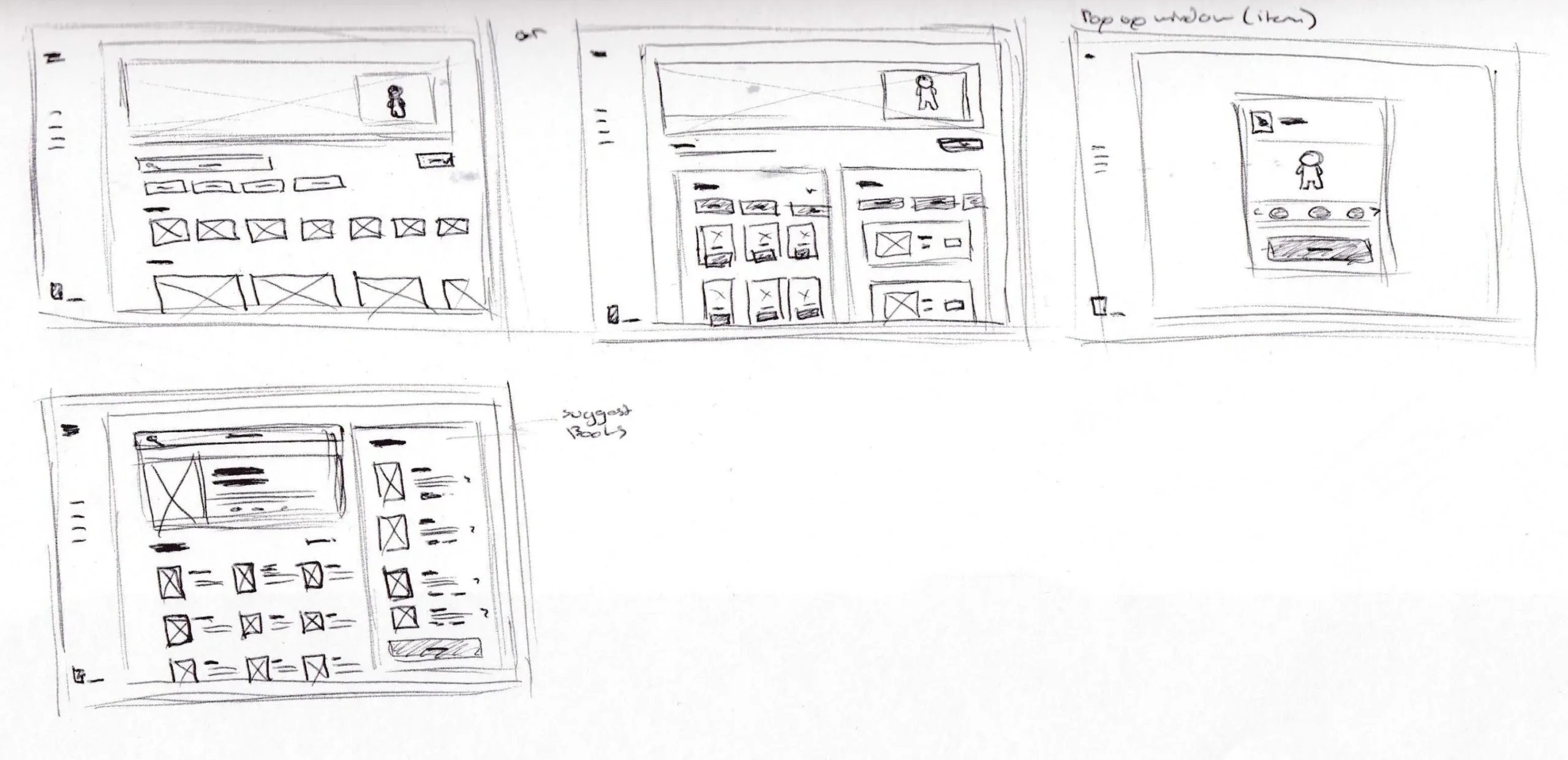
User scenarios
I continued with the three existing user scenarios. Expanding on the rewards experience, I implemented my proposed changes to accommodate my new quest and items experience. The overarching changes sought to capture the narrative experience of reading and integrate it throughout the app's user flows.
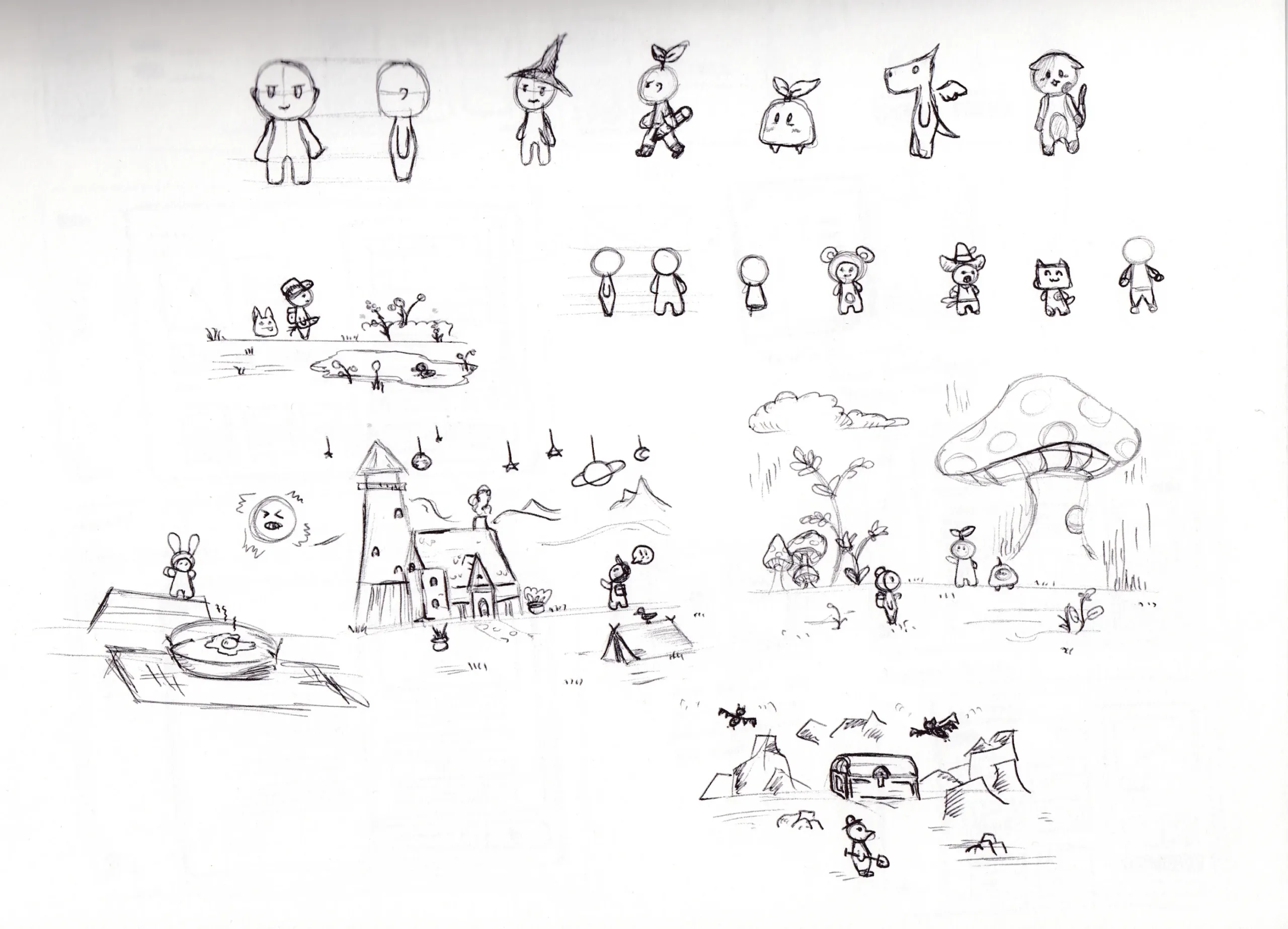
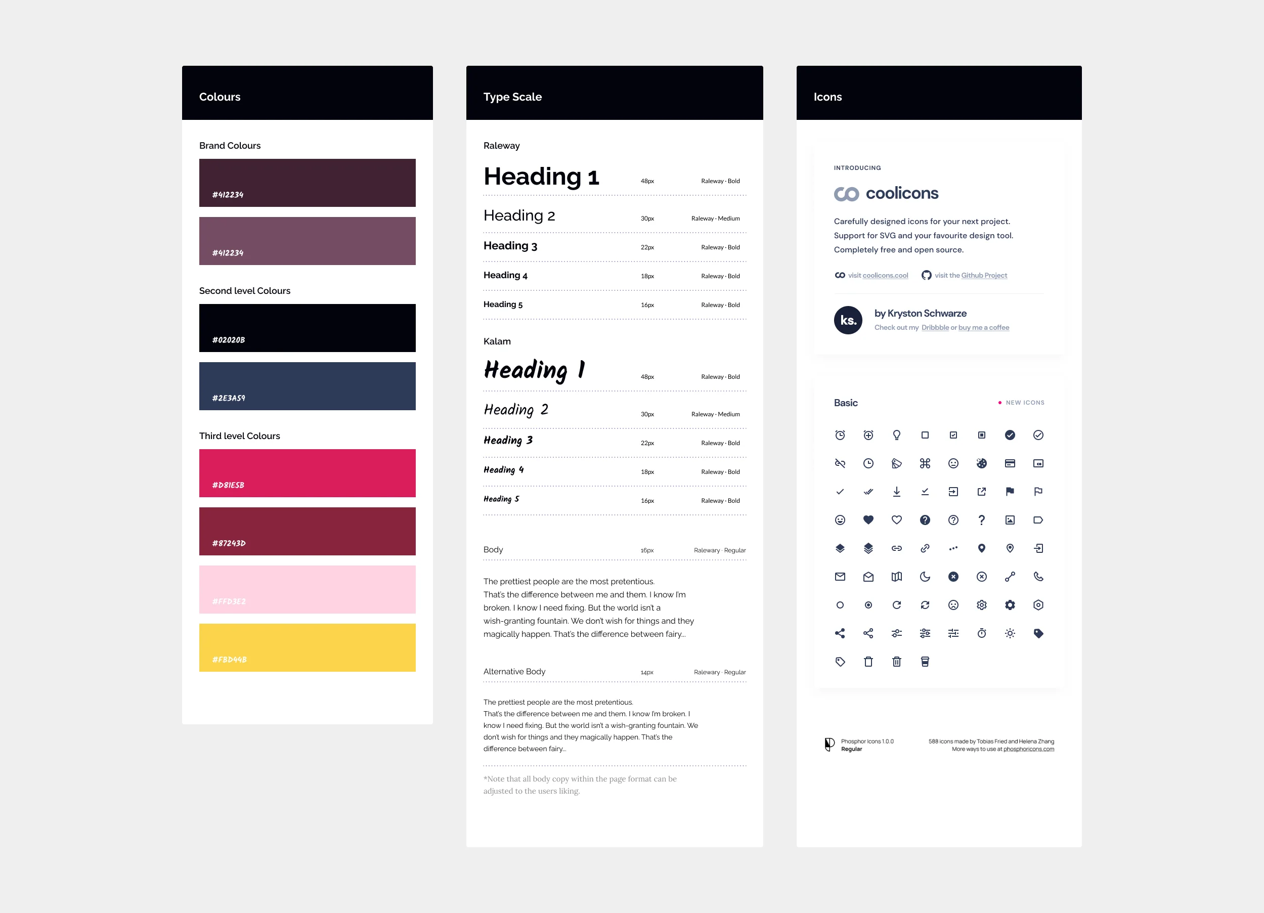
Style guide
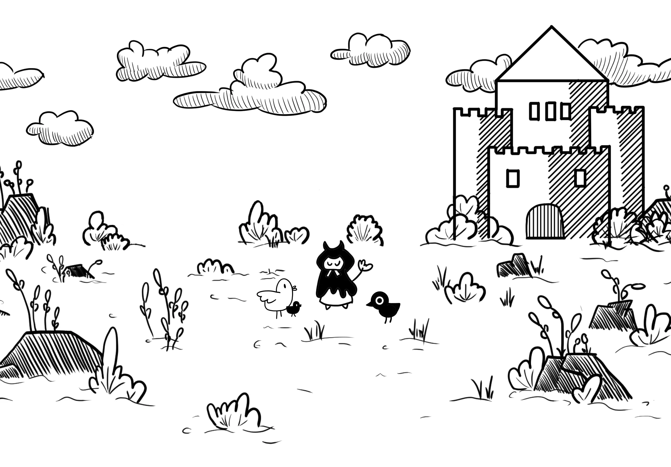
A style guide was created so that components of the design system would be consistent throughout the product. The handwritten font used connects with the line art illustrations, giving the brand a playful but accessible experience. All the brand's style elements were chosen for their legibility and familiarity for the younger audience while maintaining the playful aesthetic of the quest illustrations.
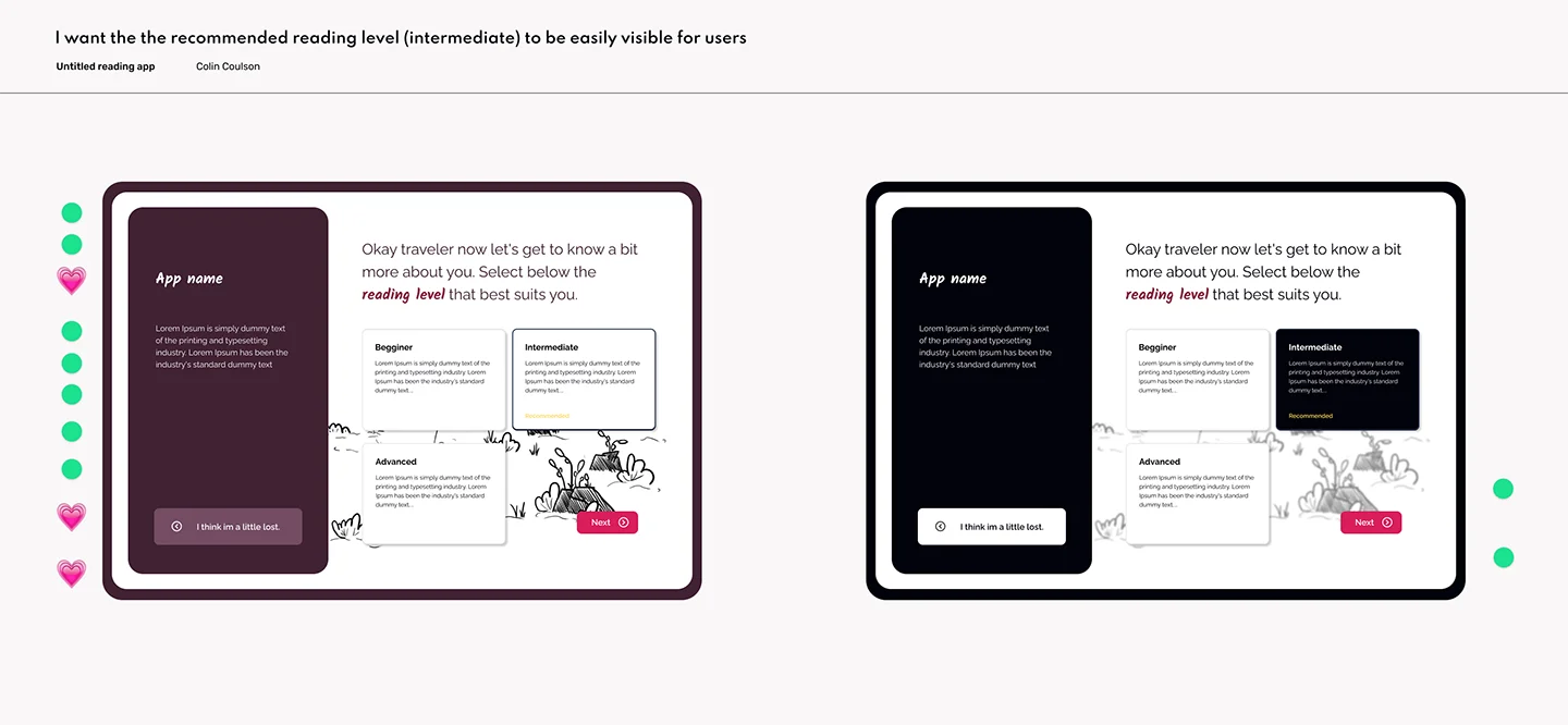
Preference testing
Select screens were chosen from the prototyping phase to conduct preference testing. This opportunity was used for the primary screen to assess the hierarchy, layout, colour and components. The results largely supported my personal preferences and reaffirmed my direction.
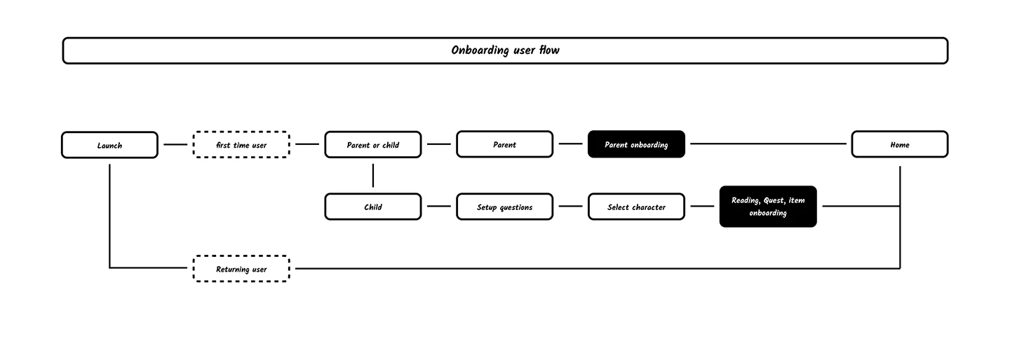
Onboarding user flow
The onboarding experience is broken up into two distinct sections. The first section collects basic information about the users reading level and frequency. This would allow the app to adjust the reading goals for quests, so they are progressing and being rewarded for their reading level. The second section walks through the features of the reading experience and has the user complete a quest. This is done, so users are not overwhelmed by the quest system when they begin reading.
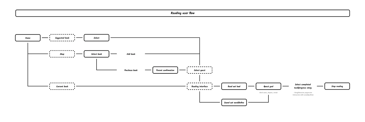
Reading experience user flow
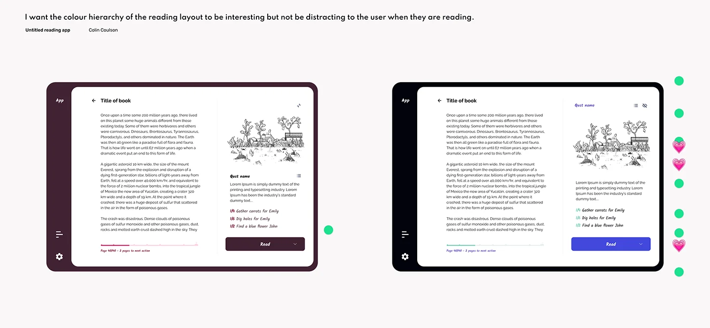
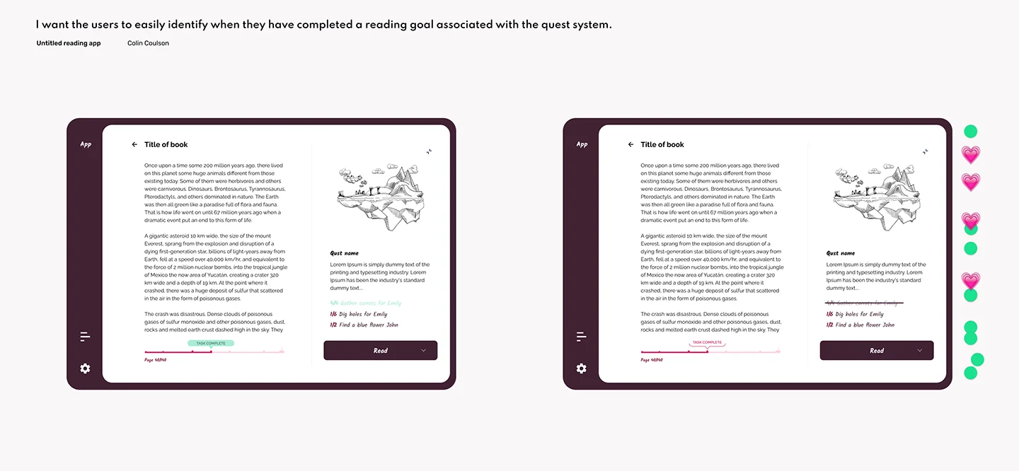
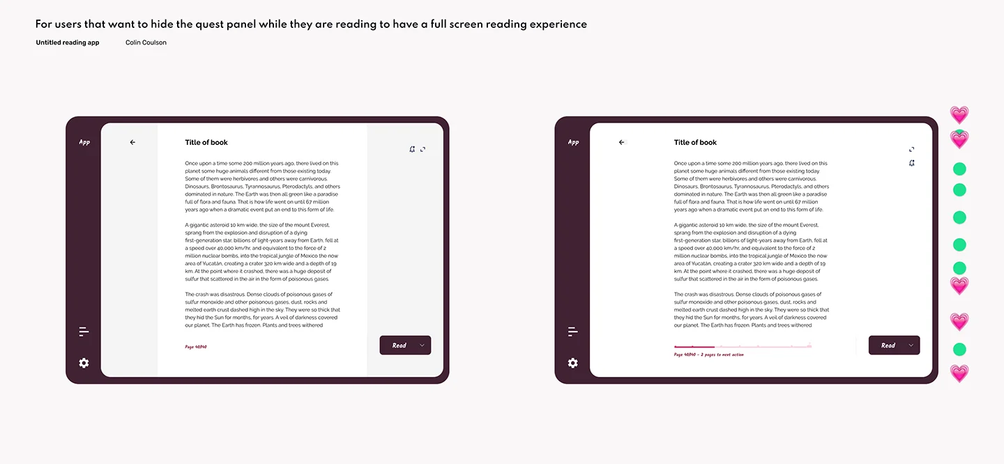
The reading experience is laid out with the reading and quest panel. The reading panel contains the text from the book and a progress bar. This indicates how much they need to read to complete their next task and what stage they are into the quest.
At the top of the quest panel, when the reading Goal is met, the image will animate as the user's character will interact with the environment around them. Under the illustration is a description of what just occurred and a checklist of their active tasks. Once all the tasks in a section are completed, it is crossed out, and they progress to the next item on the list. A read-aloud feature was also included to accommodate users who prefer to listen to a book. At the end of a chapter, the user is offered a bonus quest, where the user can answer a question based on what they just read to receive gold—adding this feature aimed to promote active reading and entice the user to complete the chapter before stopping.
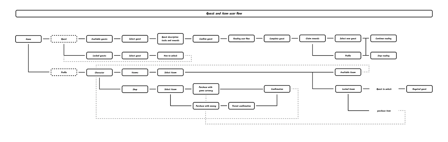
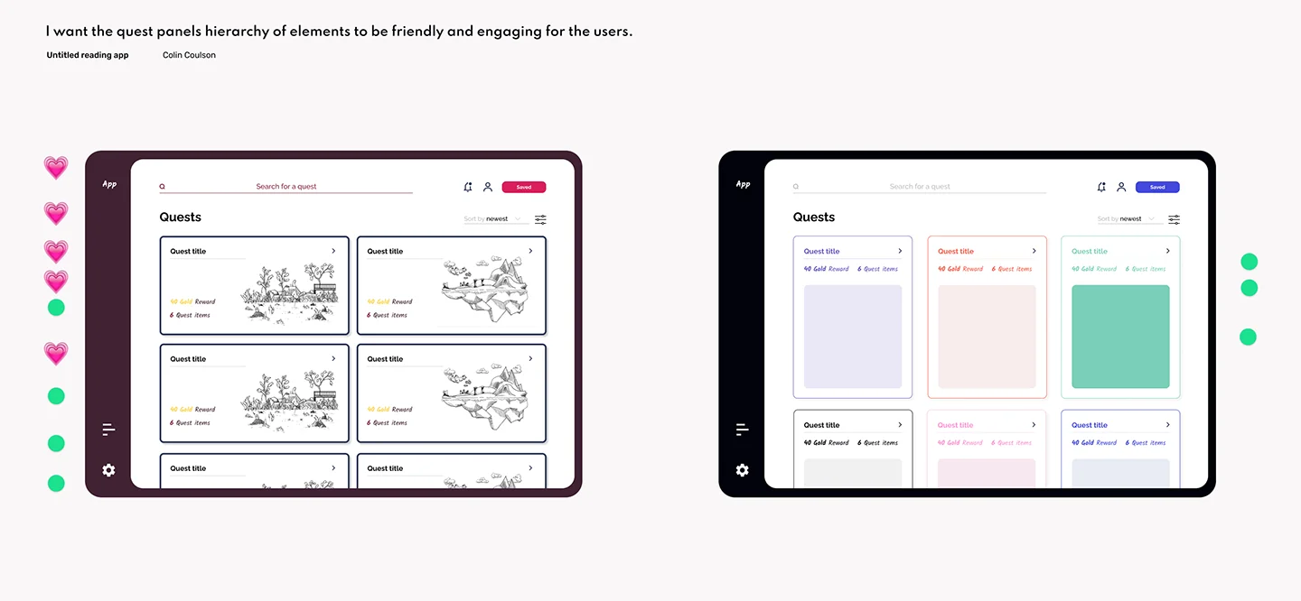
Quest user flow
Selecting a quest for the reading experience was kept very simple. This feature allows the user to choose unique adventures that intrigue them and motivates them to read. The user can select the perfect quest and find items and earn gold that can be spent to customize their character.
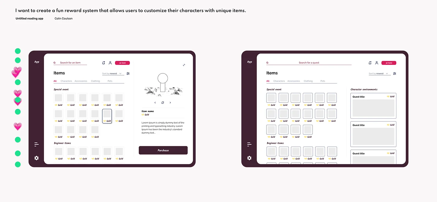
Item user flow
Users are credited with gold from reading, which can then be used to customize their character. This is a simple way of rewarding the user and allowing them to personalize their character. Once they purchase the items and outfit their character, the changes they make will appear in the quest panel.
Store user flow
The quest reader store utilizes the amazon Kindle, google books, and quest readers collection of books. A granting system for parents was added to the user flow. Permissions grant the parents the ability to limit the number of purchases their child can make. This allows parents to have a sound mind that their child isn’t overspending on their credit card. Requests make it so parents can remotely give access to more books making the experience accommodate both users.
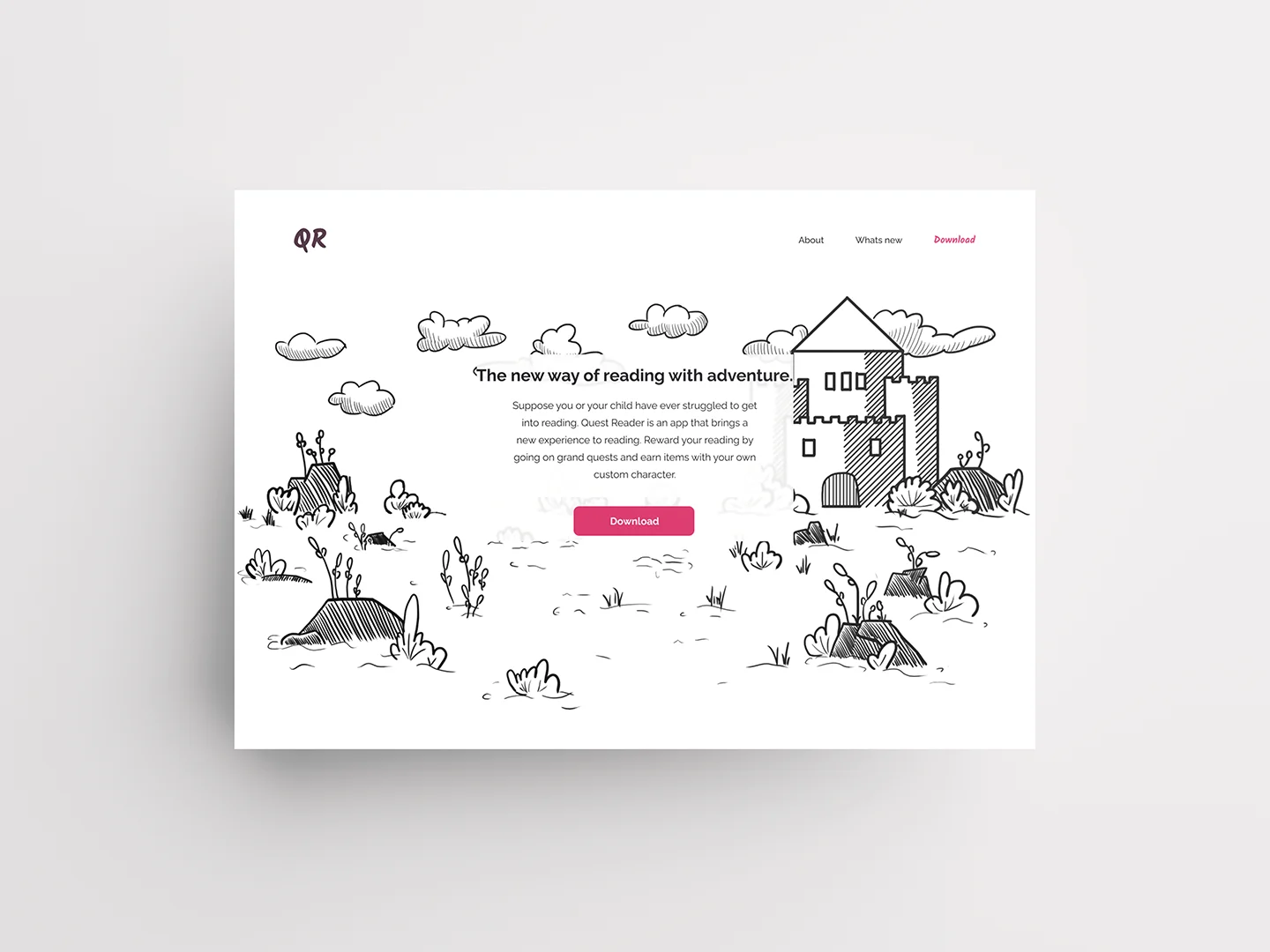
Marketing website
To accompany the Quest reader app, a website was created to showcase the significant features and attract different users. The content chosen represents the interests of both the child and the parent. The goal is to market the fun and unique experience that Quest Reader provides.