Paper and planes
Paper and planes is an experience that celebrates and educates the reader on both forms of aviation, whether you are crafting the perfect paper airplane or learning about the magical machines that fly us through the skies. Paper and planes is for everyone.
BOOK DESIGN
Concept development
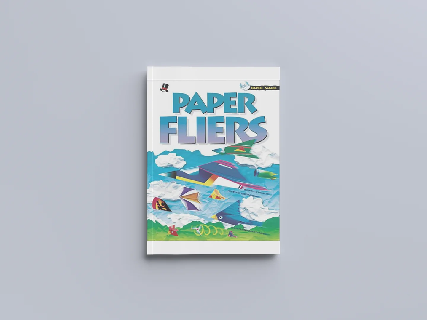
When tasked with developing a book, I looked to my bookshelves for inspiration. There I found Paper Fliers, a craft book from my childhood that brought back fond memories. The concept that I proposed was using the content for the Paper Fliers book and expanding it further. I feel that the book's idea is fun and creative but very weak in its application, missing features, and the grid structure needs to be corrected. I felt that I could adapt this book from my childhood into a unique project with my style.
Design proposal
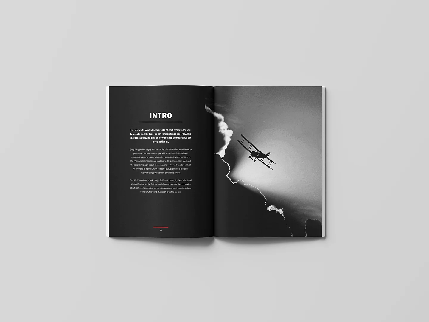
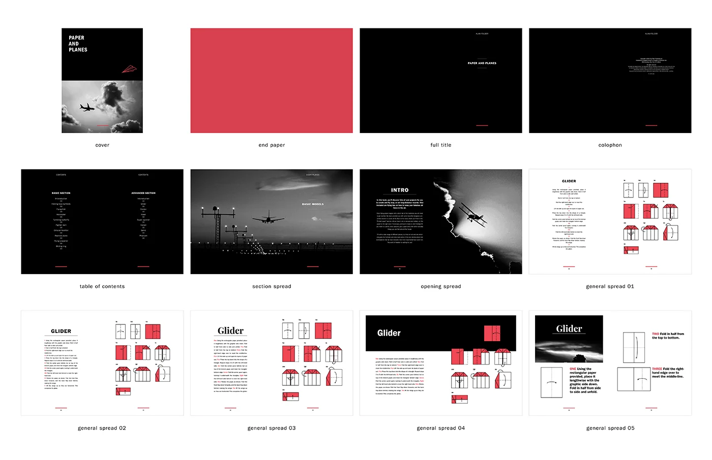
The design proposal contained sample versions of the cover, front matter and interior spreads. The initial process stayed loyal to the original content but played with different methods of laying out the contents. To distinguish between the front matter and the interior spreads, a black background marks the front matter, and the interior spreads are white. A more minimalist method of illustrating the instructions was also proposed.
Cover concepts
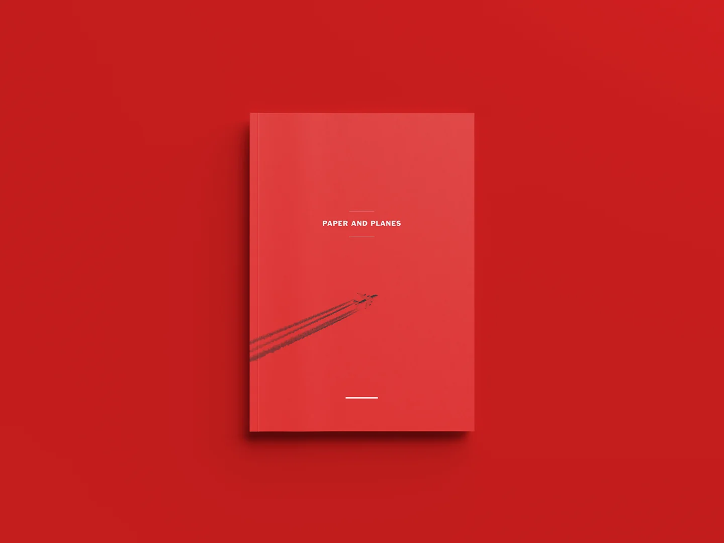
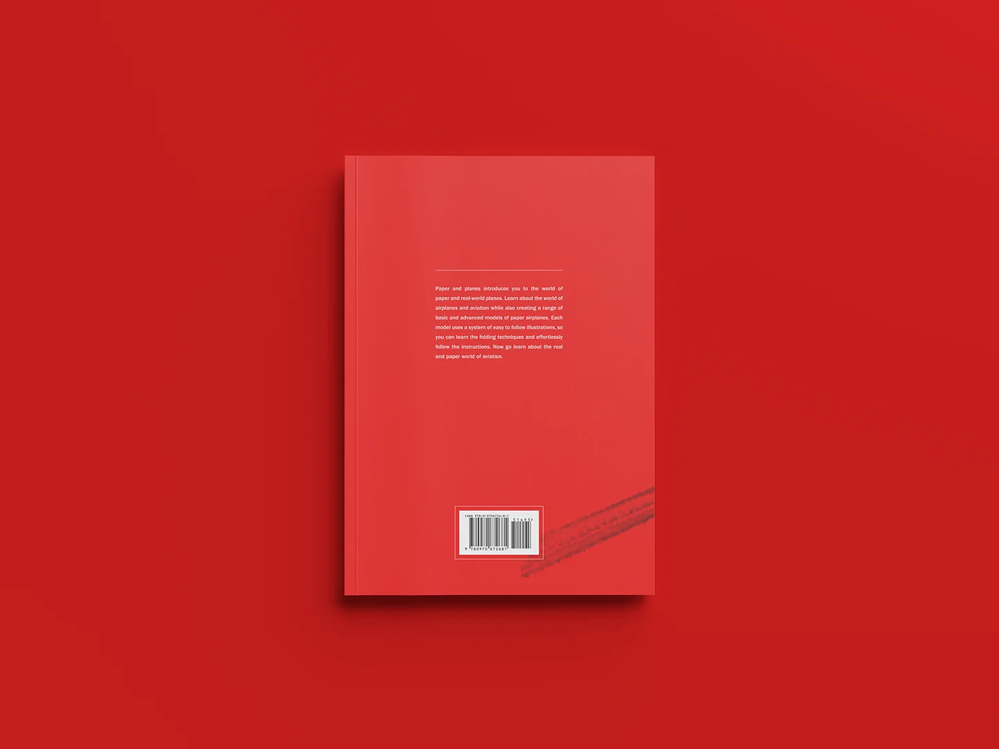
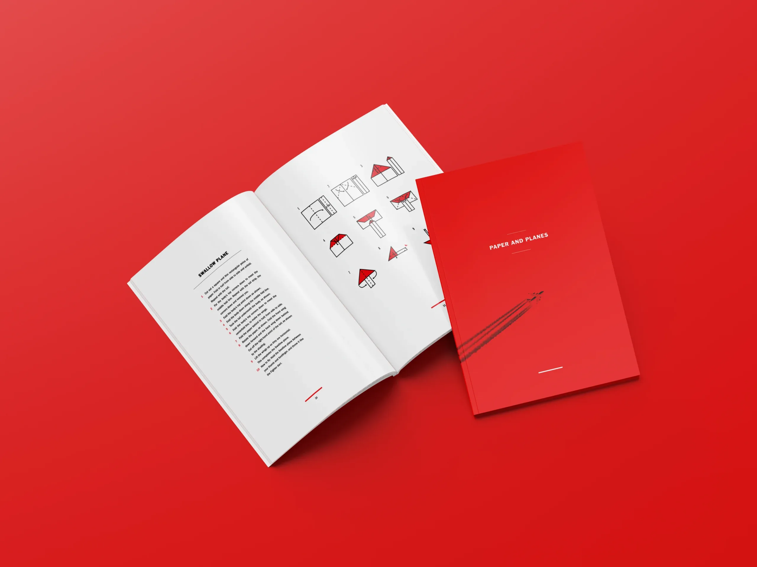
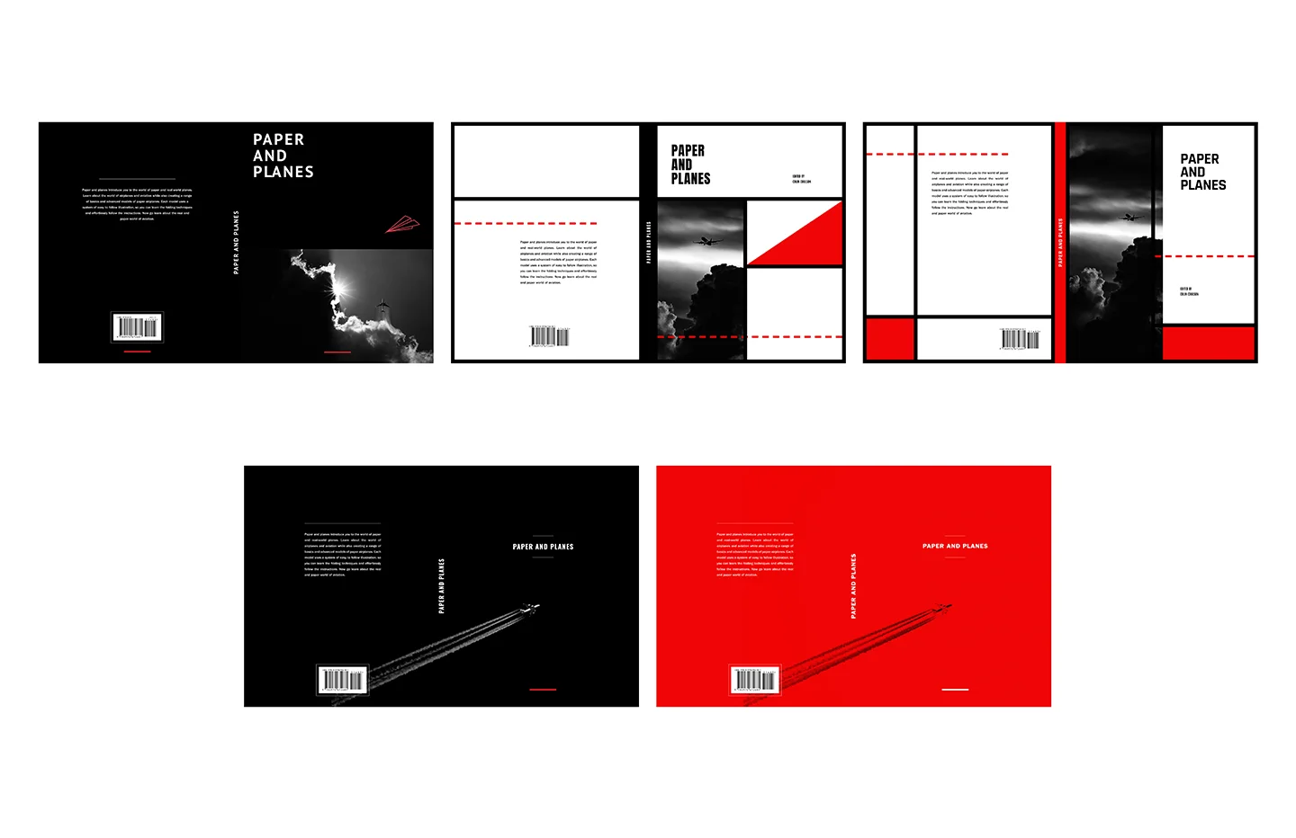
The goal of the cover was to both represent and use the elements from the interior spreads. So that the reader would easily recognize elements and have consistency throughout the spreads. The layout and minimal elements of the red cover were received the best and presented an interesting system/narrative for the book's entire layout.
Preliminary thumbnails
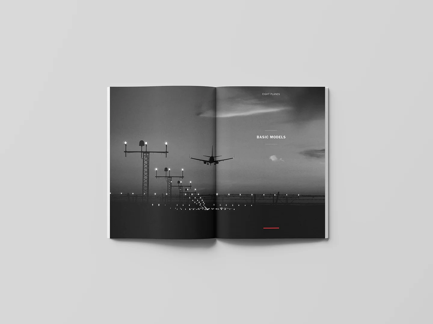
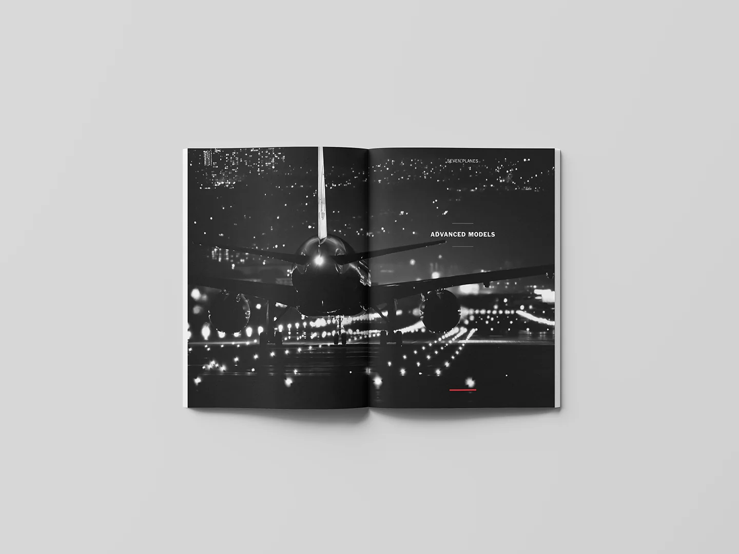
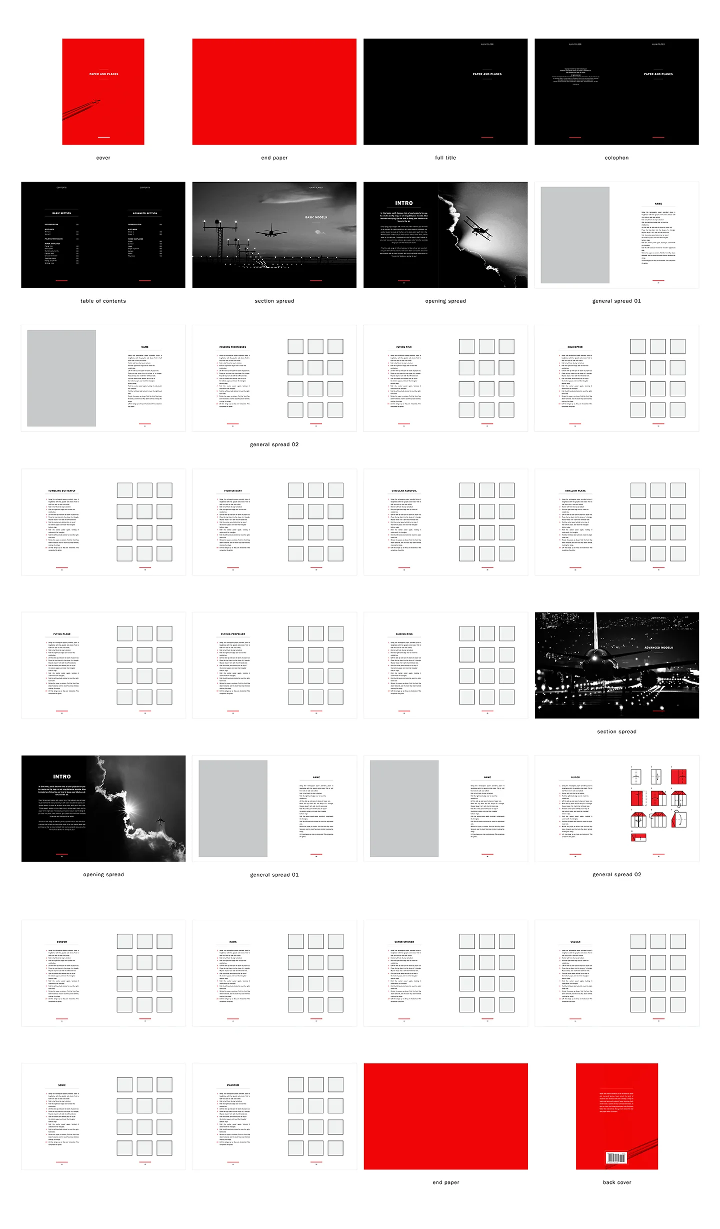
In the creation of the thumbnails, colour was used to lead the reader into the content. Breaking up each section beginning with red, then the front matter is black, and the general spreads are white, providing a visual separation of content. The section and opening spreads are also in black to divide the basic and advanced sections.
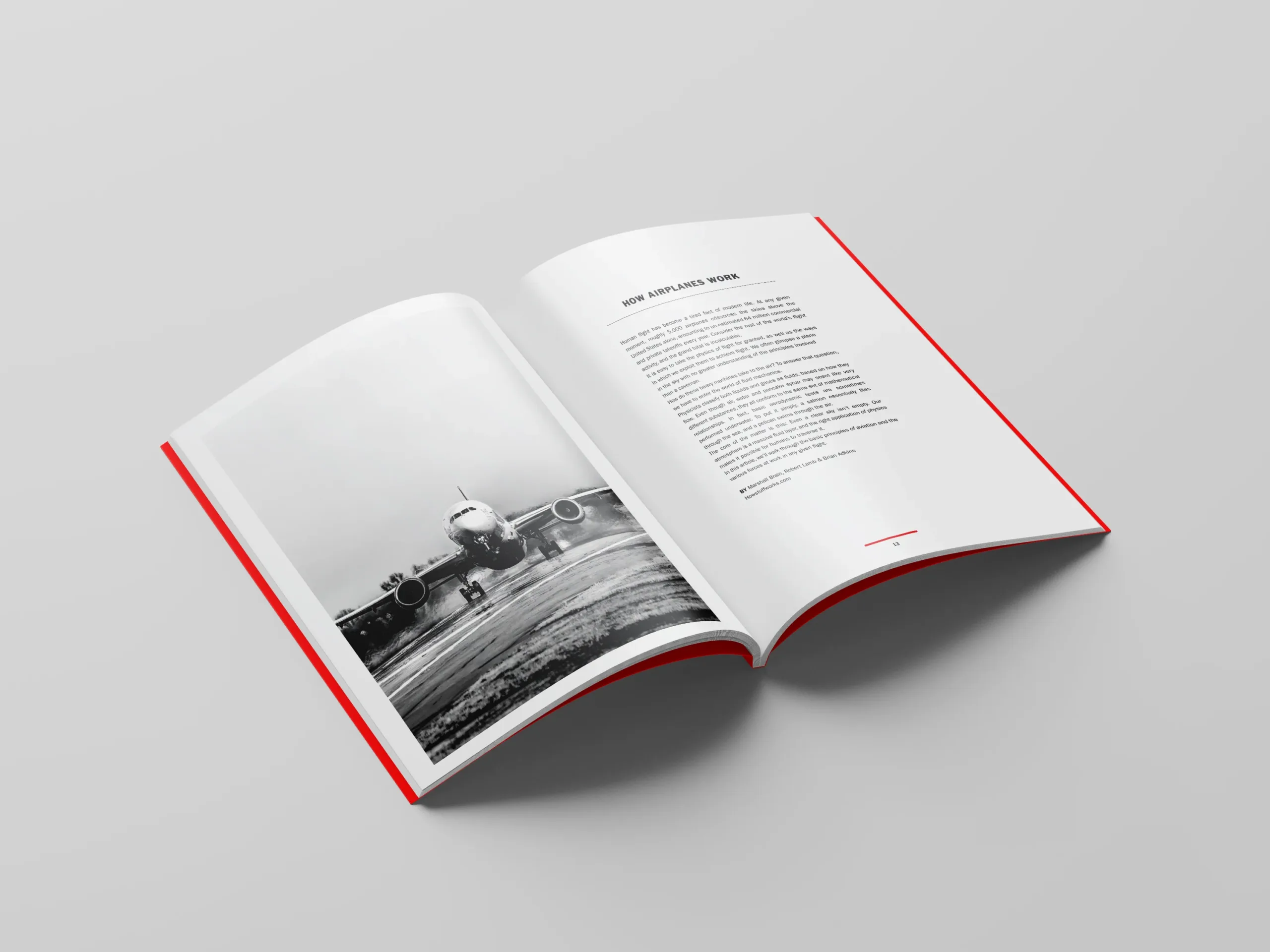
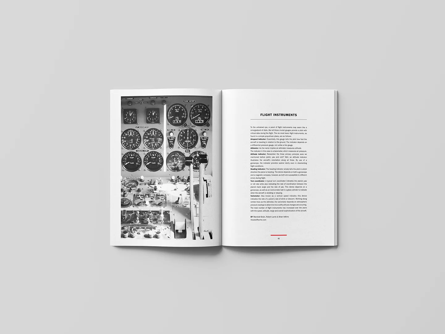
To make the content more engaging and educational to the readers, I decided to include short articles at the beginning of each section. These articles talk about different aspects of real-world planes and look to bridge the gap between the paper and real-world planes.
Illustrations
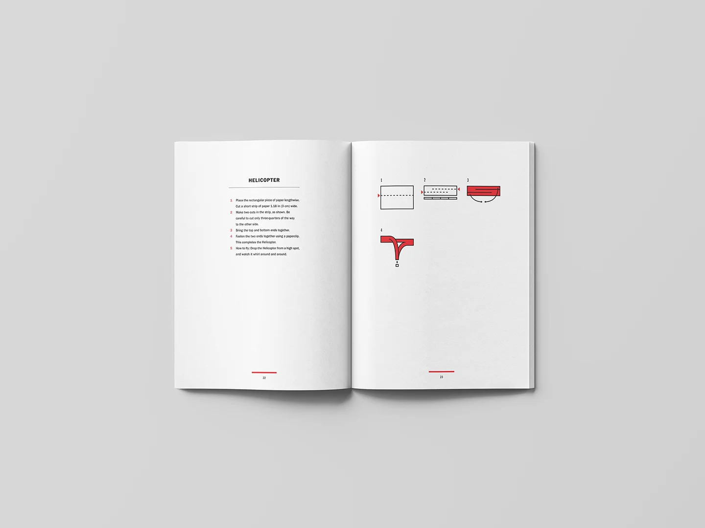
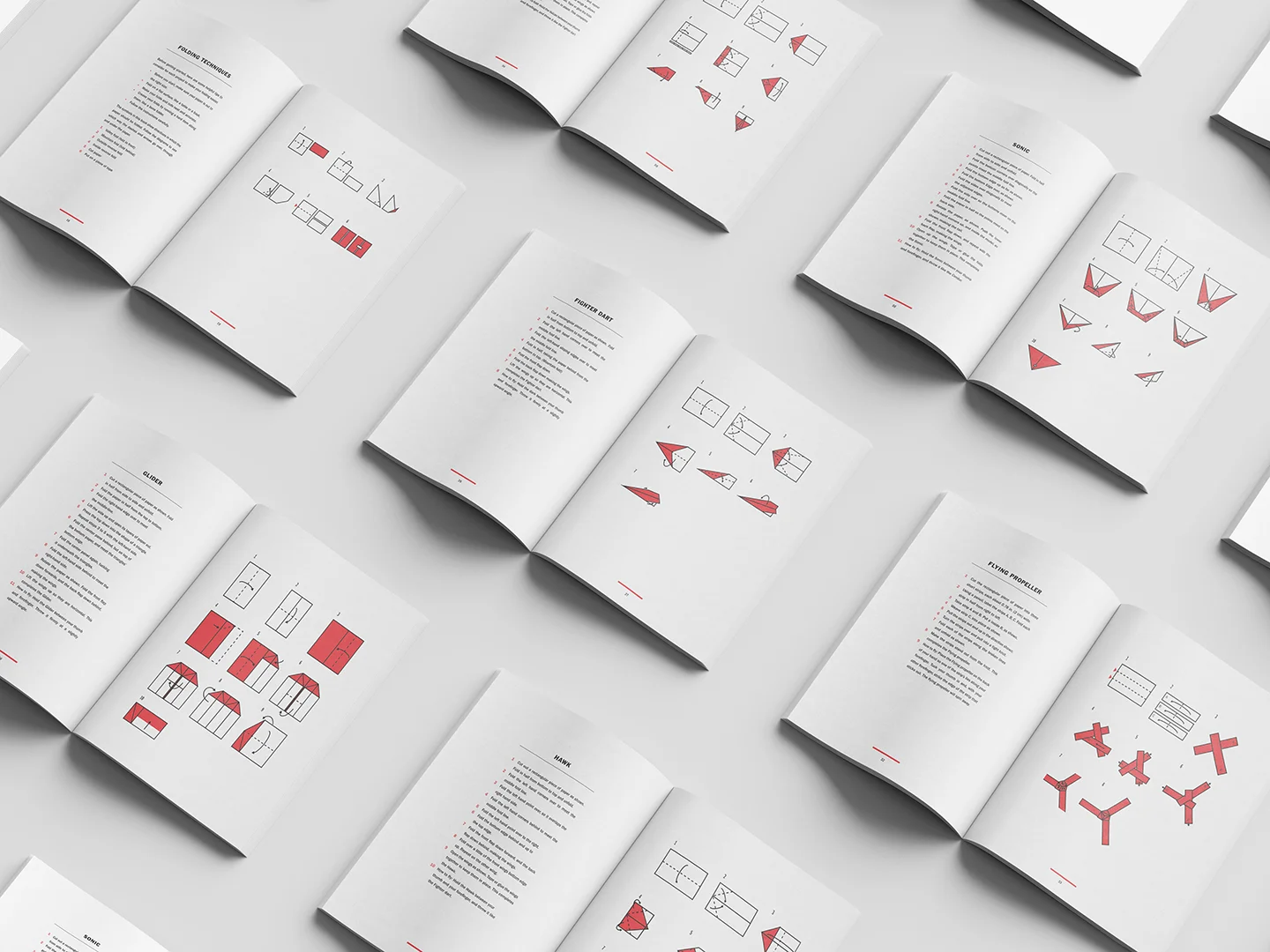
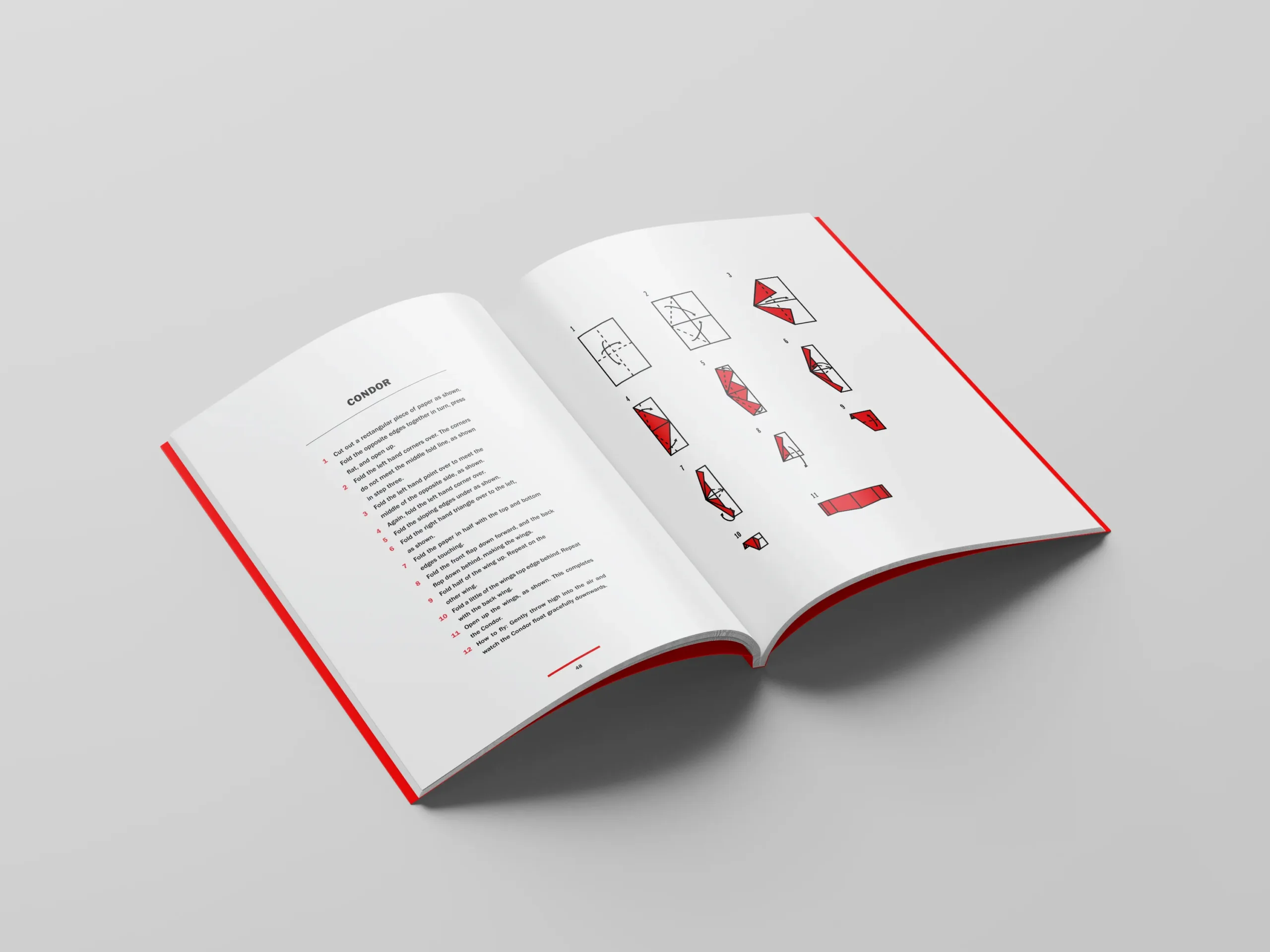
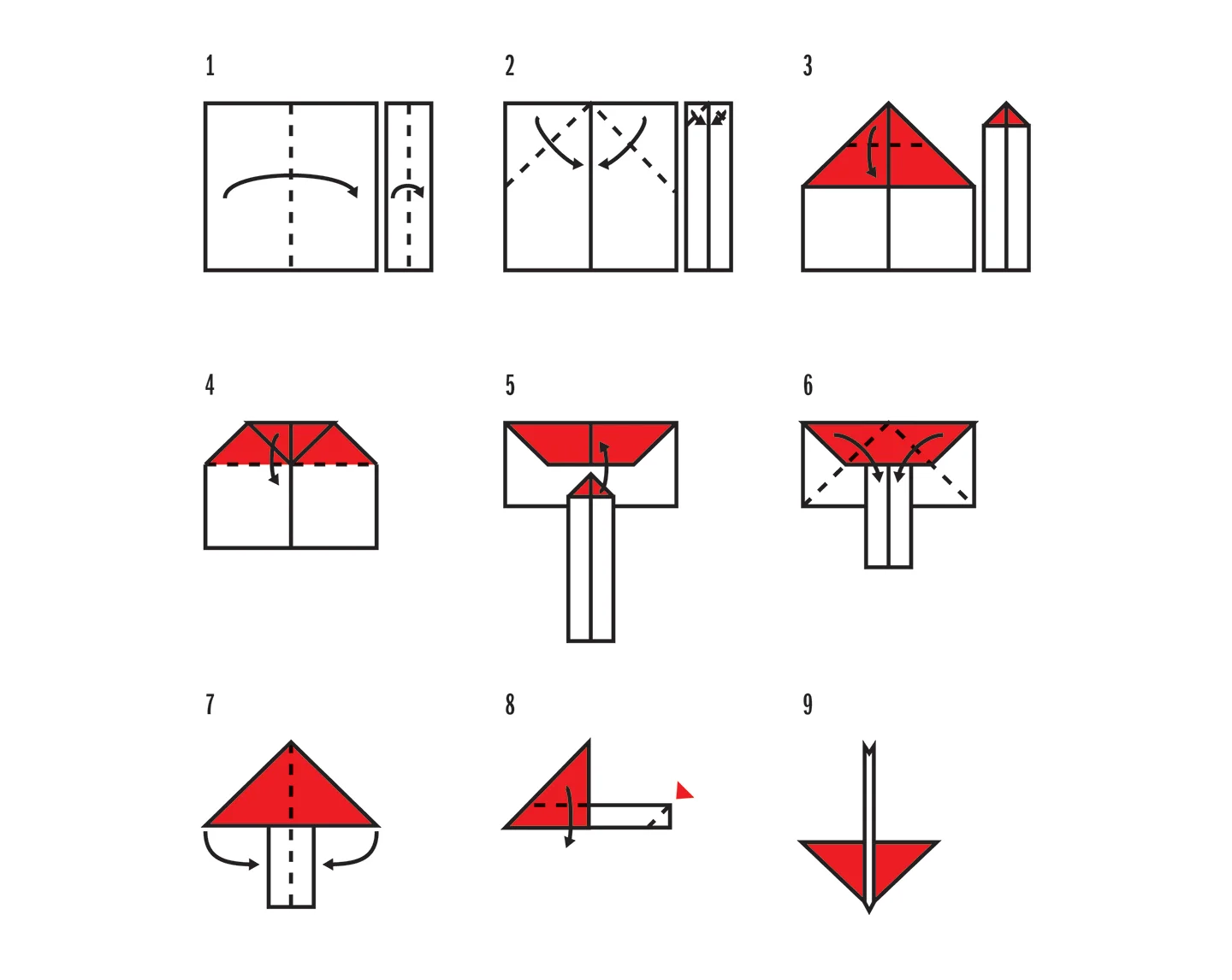
After the thumbnails, the illustrations for each of the fifteen planes. The original illustrations are disorganized and are displayed across both pages. I decided to lay out the illustrations on a single page in a three-column grid. The illustrations are made simplistic with dashed lines and arrows to communicate their purpose—the red contrasts with the white and black to represent the paper's back. The illustrations were created with purpose in mind, making the physical paper airplane the show's star.
Final thumbnails
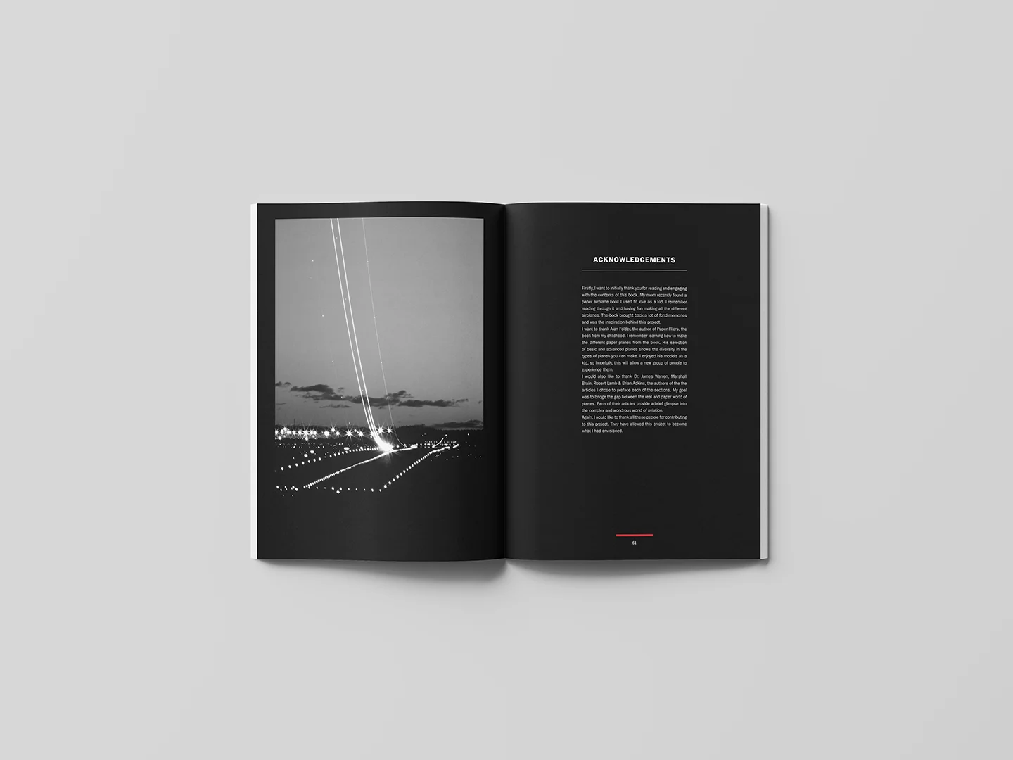
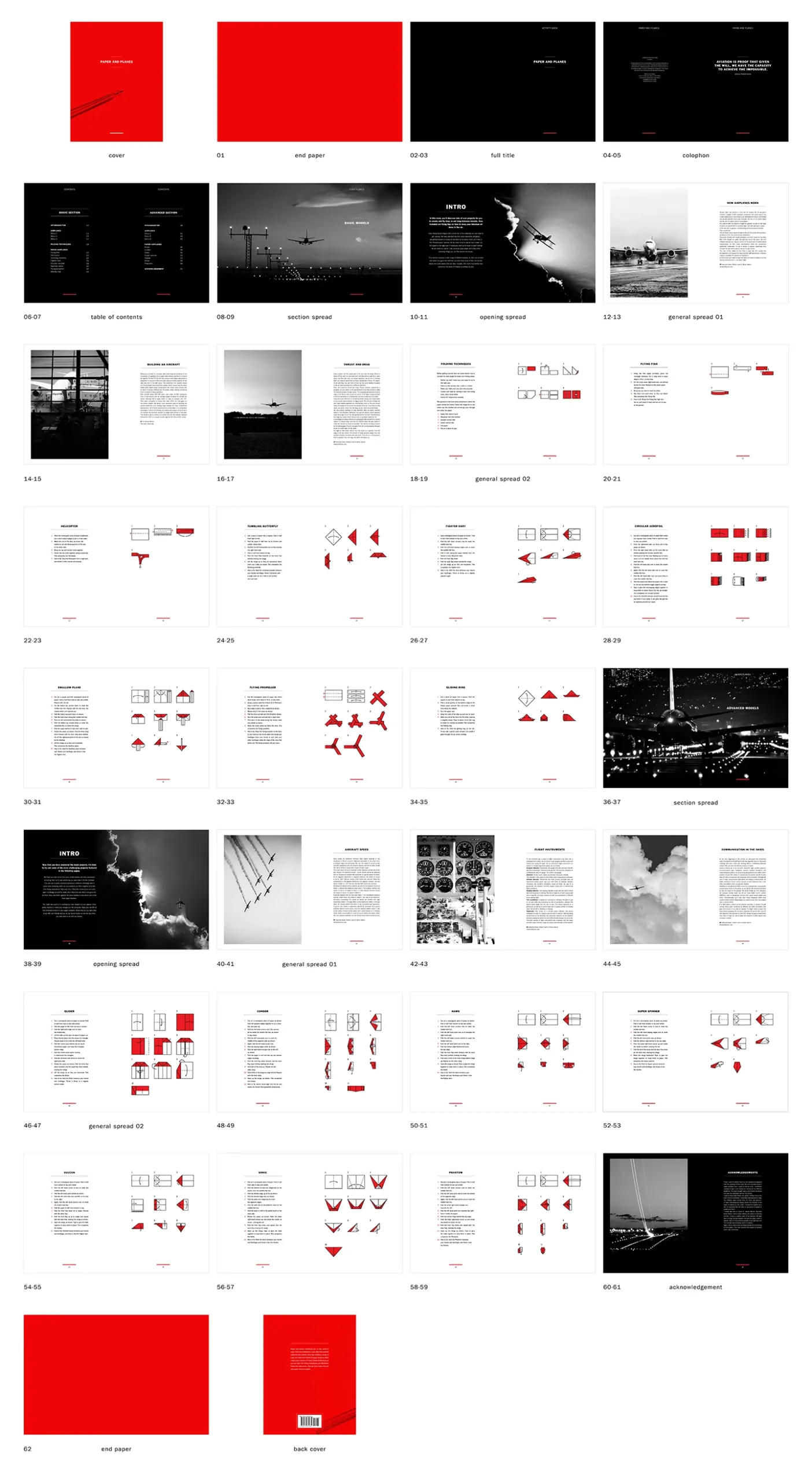
Reflecting on the thumbnails, the narrative use of colour was added to the end of the book. An acknowledgment spread in black (back matter) was added, so the book's end follows the pattern in reverse, going from white to black to red. This completed the visual narrative of the book and was well received by peers.
The biggest problem emerged from the alignment of the illustrations. It was challenging to balance the page in previous iterations as some instructions were concise, and others filled the page. This was solved by aligning the top of the instructions with the title on the left page of the spread. This allowed for visual consistency as the first illustration always appeared on the same part of the page.
Solution
Paper and plane's goal was to revitalize an outdated book from my childhood. In contrast to the original, the new book uses a limited colour palette and real plane images. This, combined with including the short article section, shows the intentions not to be a singular experience with paper airplanes but instead is an experience that celebrates and educates the reader on both forms of aviation. My goal was to bridge the gap between the real and paper world of planes. Provide a brief glimpse into the more complex aviation world.
