Kata hand wraps
Kata hand wraps is a project with a unique environmentally friendly second life that also captures the rich history of Thailand's national sport of Muay Thai.
PACKAGING BRAND IDENTITY
The problem
The problem addressed in this project is how hand wraps are packaged without environmental consideration. I personally train Muay Thai and have purchased many hand wraps from different brands and am always disappointed that the packaging is a plastic bag or plastic and heavy stock paper that do not have a second life. Both produce waste while also not expressing the deep history of the sport that could be explored by the user who may not be aware.
Goals
The goal is to research and develop a package that thoroughly explores the rich history of Thailand and develop a brand identity that expresses this exploration. Based on the research, the goal is to develop a package that has a second life that is more environmentally conscious, while also educating and exposing consumers on how to care for their hand wraps and the origins/culture of the sport of Muay Thai.
Research
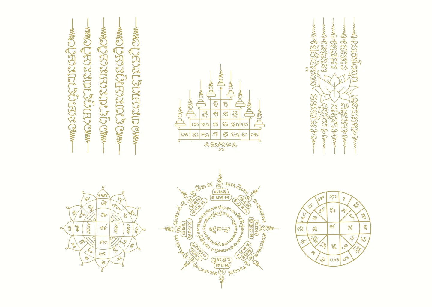
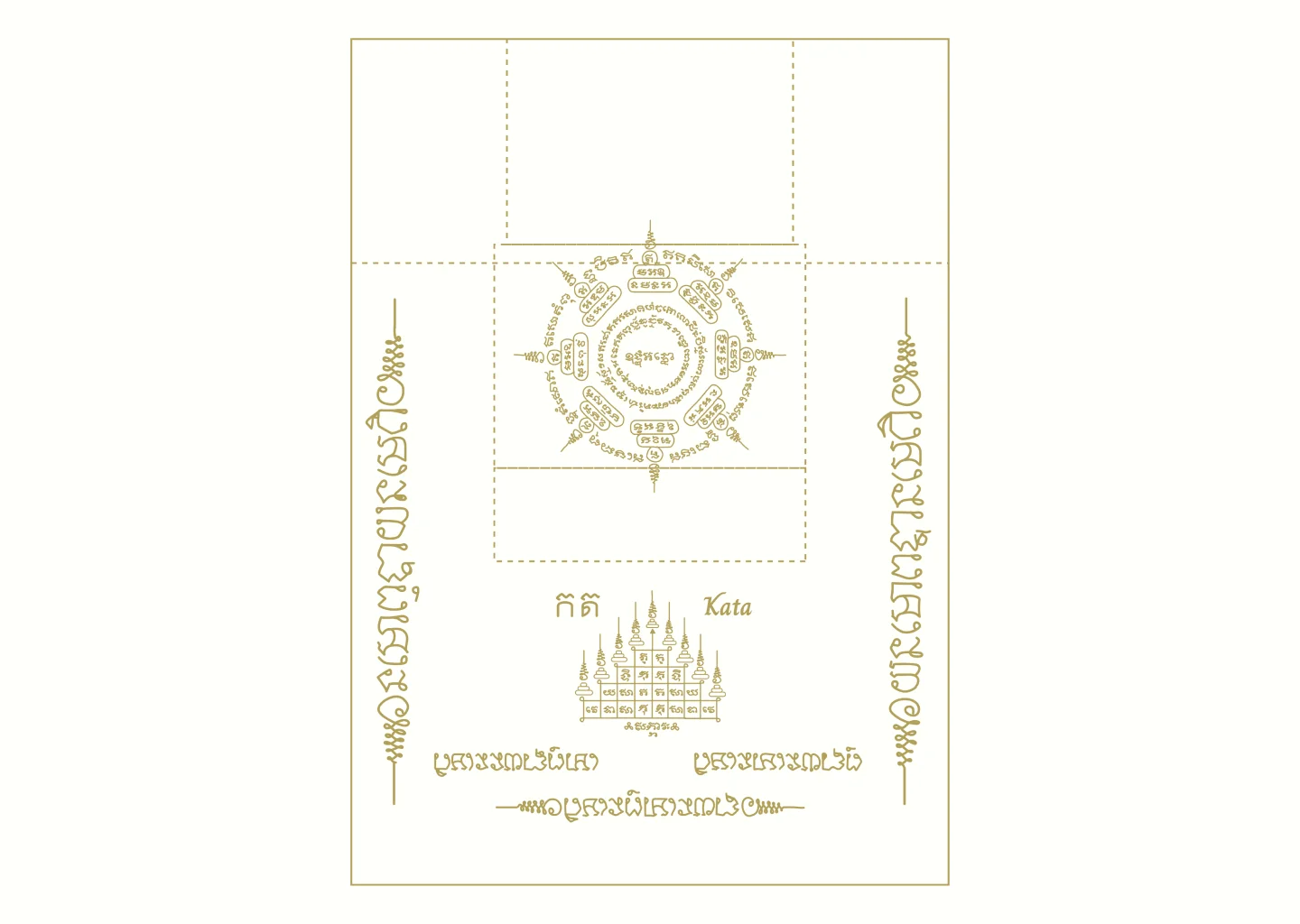
My research aimed to explore ways I could represent the sport of Muay Thai and the culture of Thailand where the sport originated. I wanted the package to also be a method of introducing and educating the western users to the long history of the sport. Through my research I discovered the tradition of Sak Yant tattoos which are sacred geometric designs, incorporating Buddhist psalms, and magical formulas that invoke various elements and powers of protection and various blessings. I chose to represent the Sak Yant practice as my primary element.
Initial process
After researching I started brainstorming different ways of containing the handwraps. I began with two approaches, mainly focusing on the two materials of fabric and recycled paper. My strongest idea came with modifying the laundry bag to allow me to perform the folding technique used by the military for t-shirts. This involved adding an open section of the on top of the bag to pull down. I made a sample bag so that I could make sure the fold would actually be able to contain the handwraps. This was successful and allowed me to further plan the layout of the bag and the materials I would be using.
Brand identity
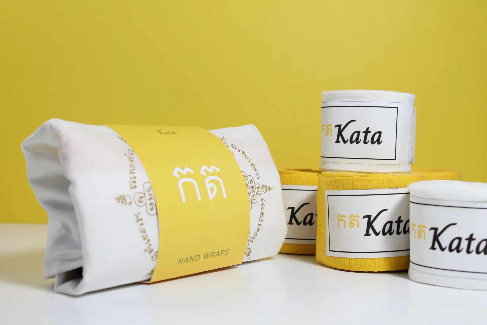
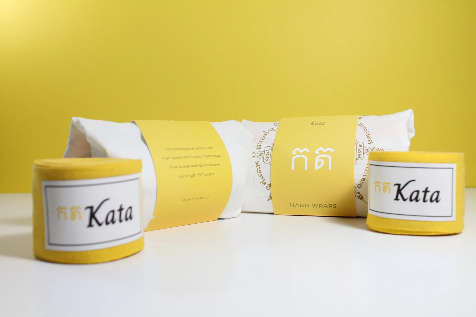
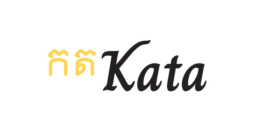
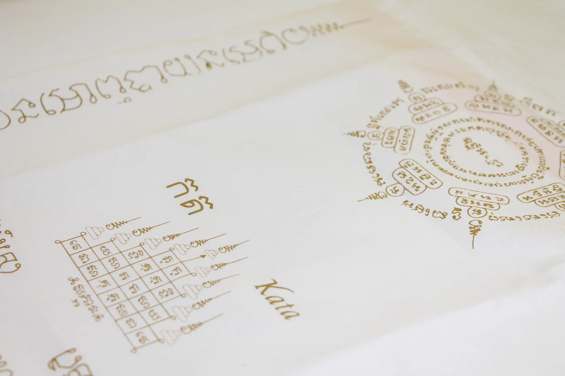
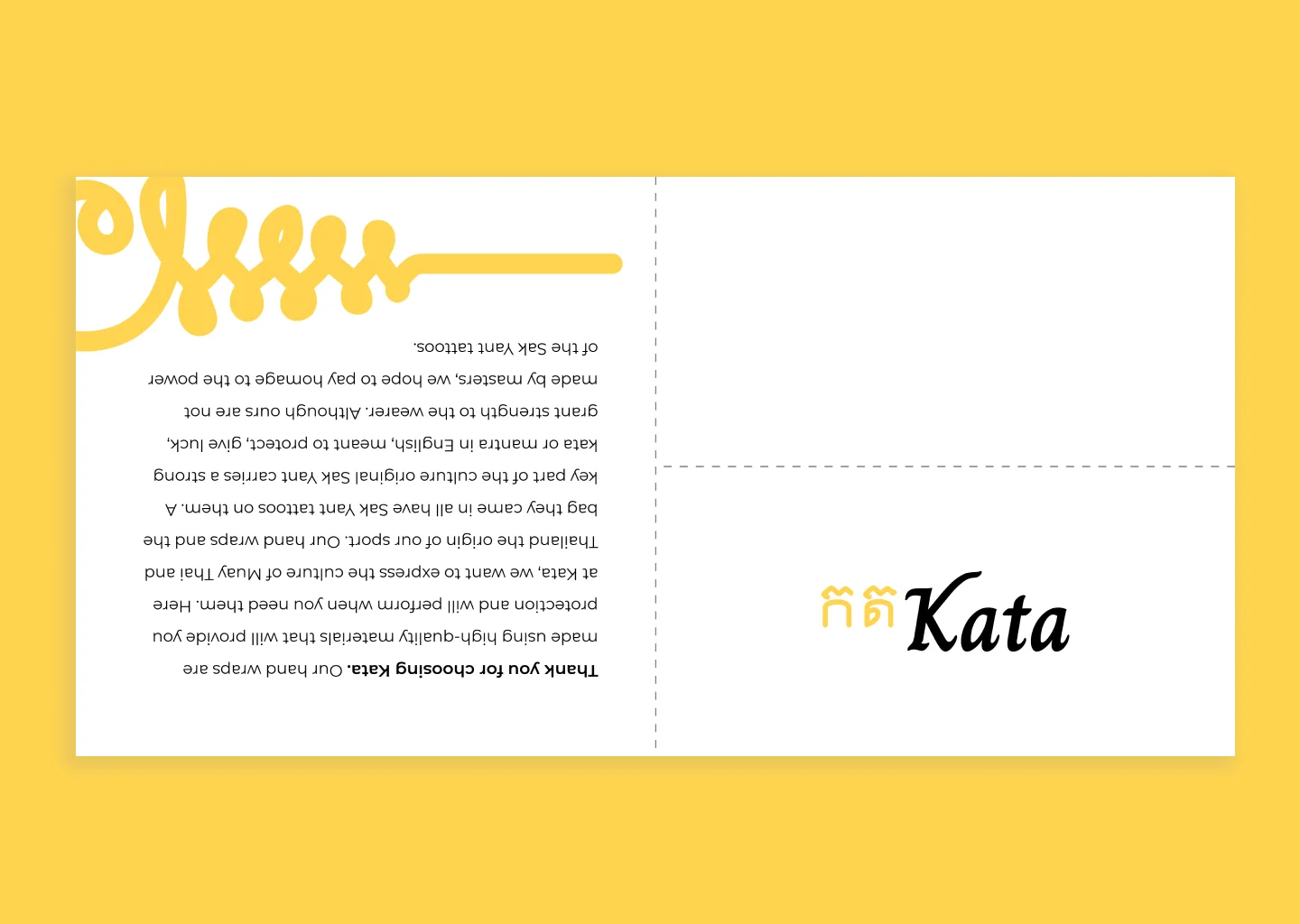
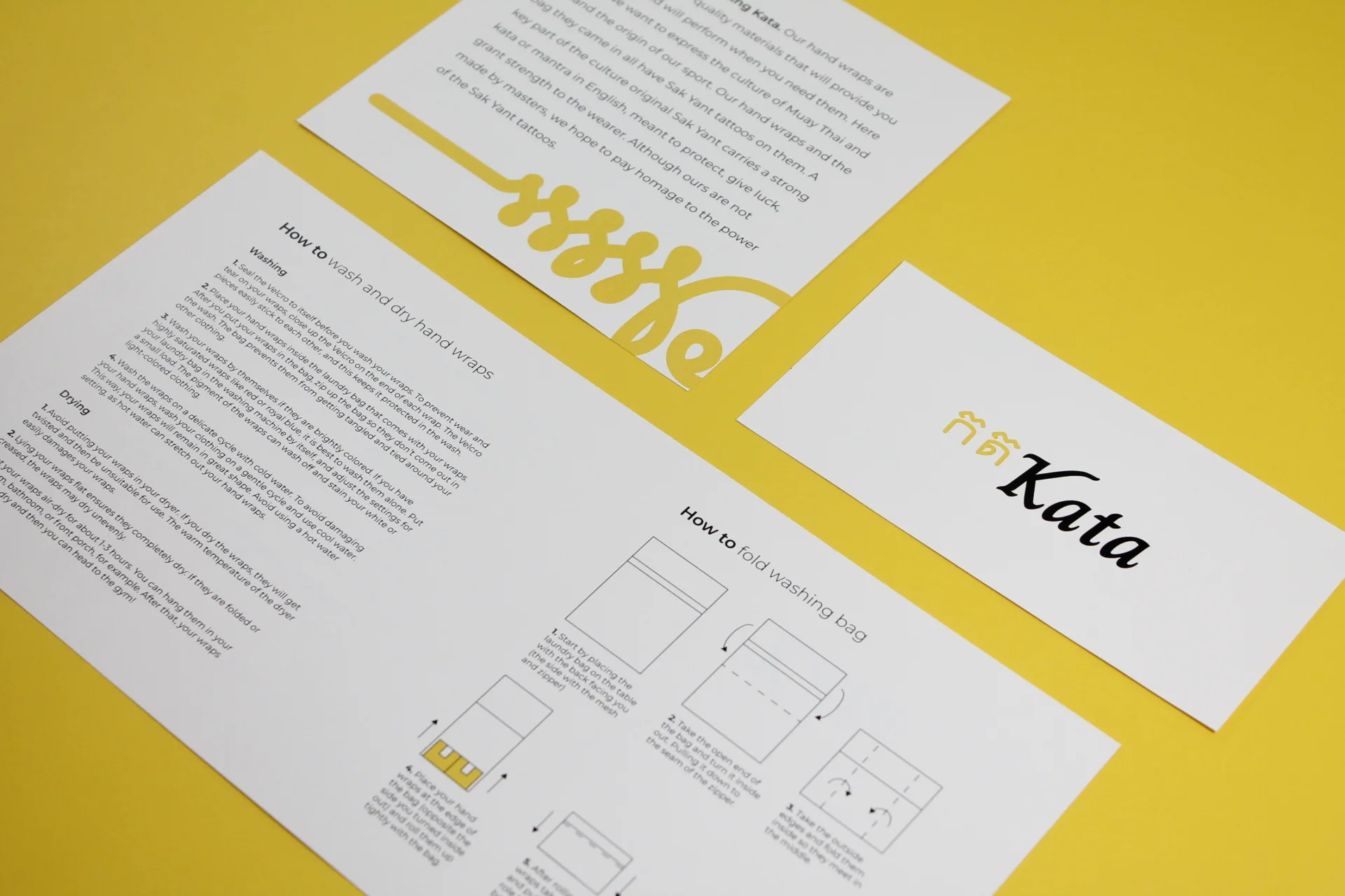
The name Kata comes from the Thai language meaning “mantra.” This name was chosen as it relates to the Sak Yant tattoos that are so important in Thai culture. As these tattoos are key to the brand, the name Kata was in line with the goal of the project. The two characters of the logomark were created in order to represent the ancient Khom script used in the Sak Yant tattoos. The first character means “Ka” and the second means “Ta” so simply the two Characters represent the word ”Kata” when placed together. The Colour yellow is used as it is the royal colour of Thailand. The Thais revere their King is very strong and he was born on Monday making the importance of the colour key to the culture.
The font used in the logotype is Charm. Designed by Cadson Demak is the first Thai communication design firm whose goal for this typeface was to create “a handwritten Thai and Latin family. The letterforms were created using a flat tip pen on paper.” These characteristics of the typeface reflect the intent of the brand and the goal to communicate the culture of Thailand and the Sak Yant tattoos.
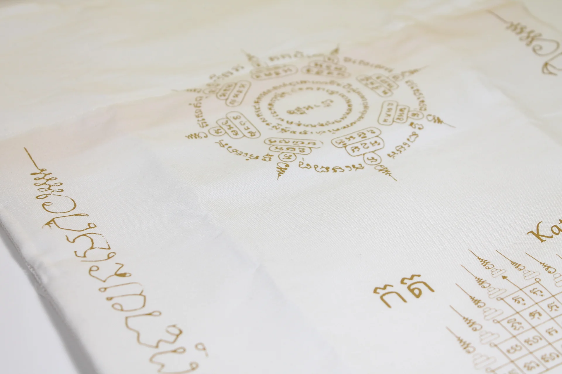
Sak yant tattoos
Sak Yant tattoos all have unique meanings and when tattooed they use a mantra that is said to give the tattoos magical powers. These tattoos are meant to grant many things like giving the wearer luck, fortune, and protection in battle. These tattoos are worn by many muay Thai fighters and expressing and educating the west about the cultural importance of these tattoos is a goal of the brand.
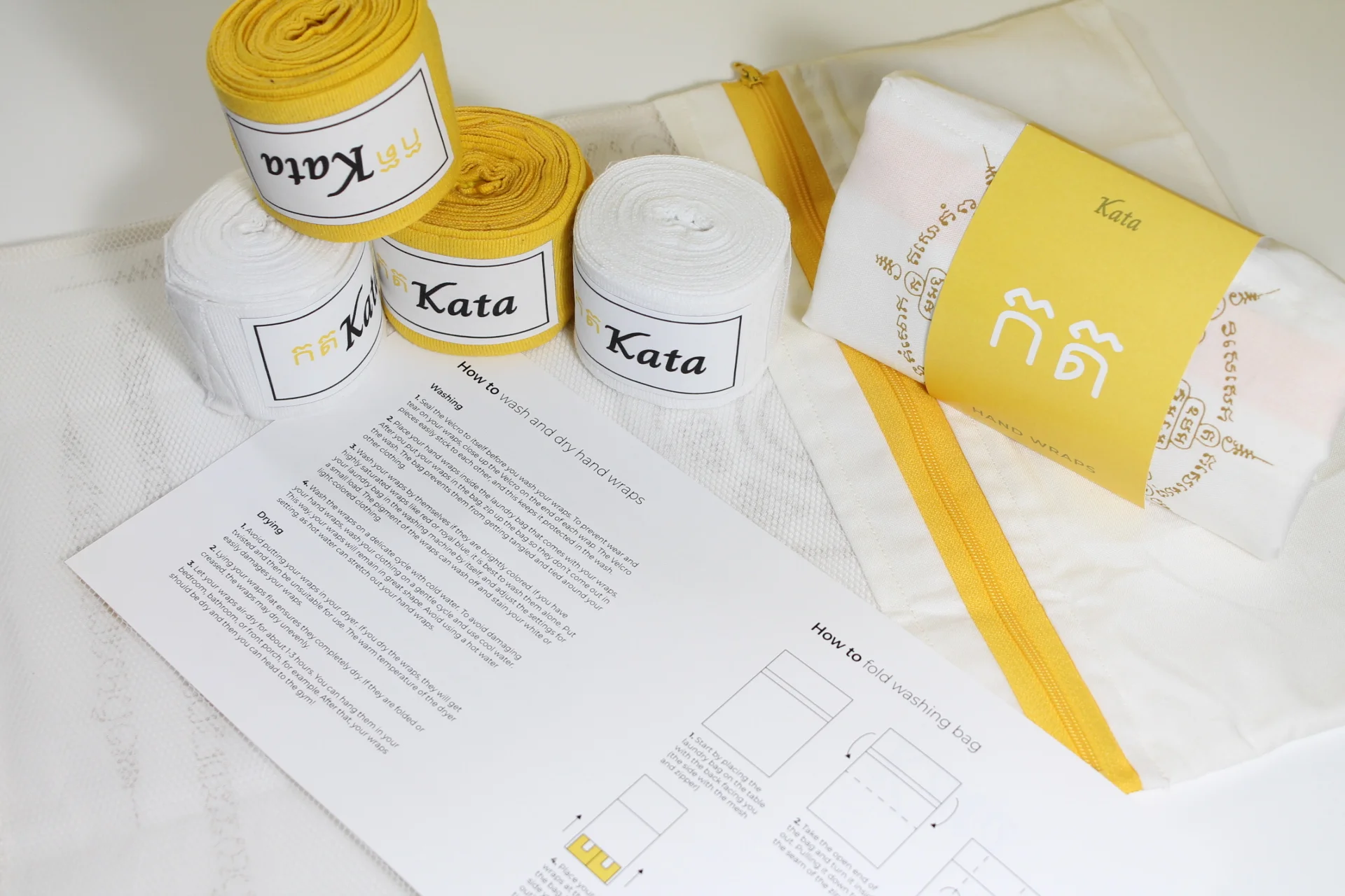
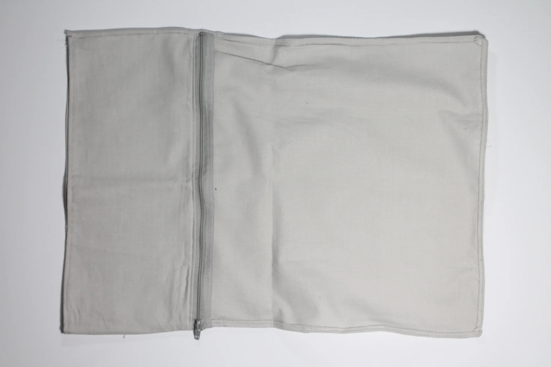
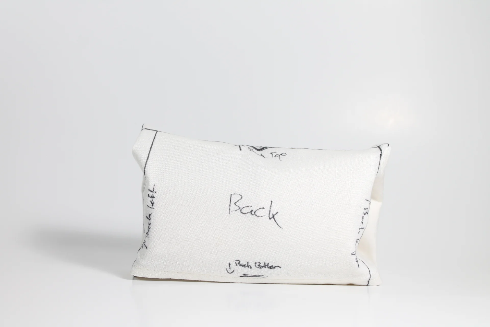
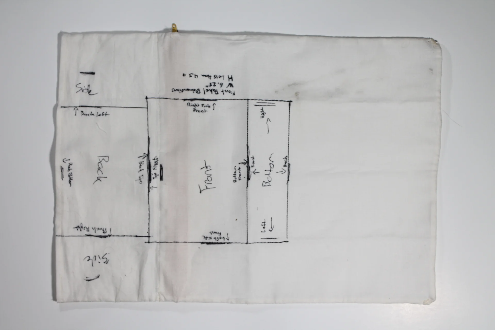
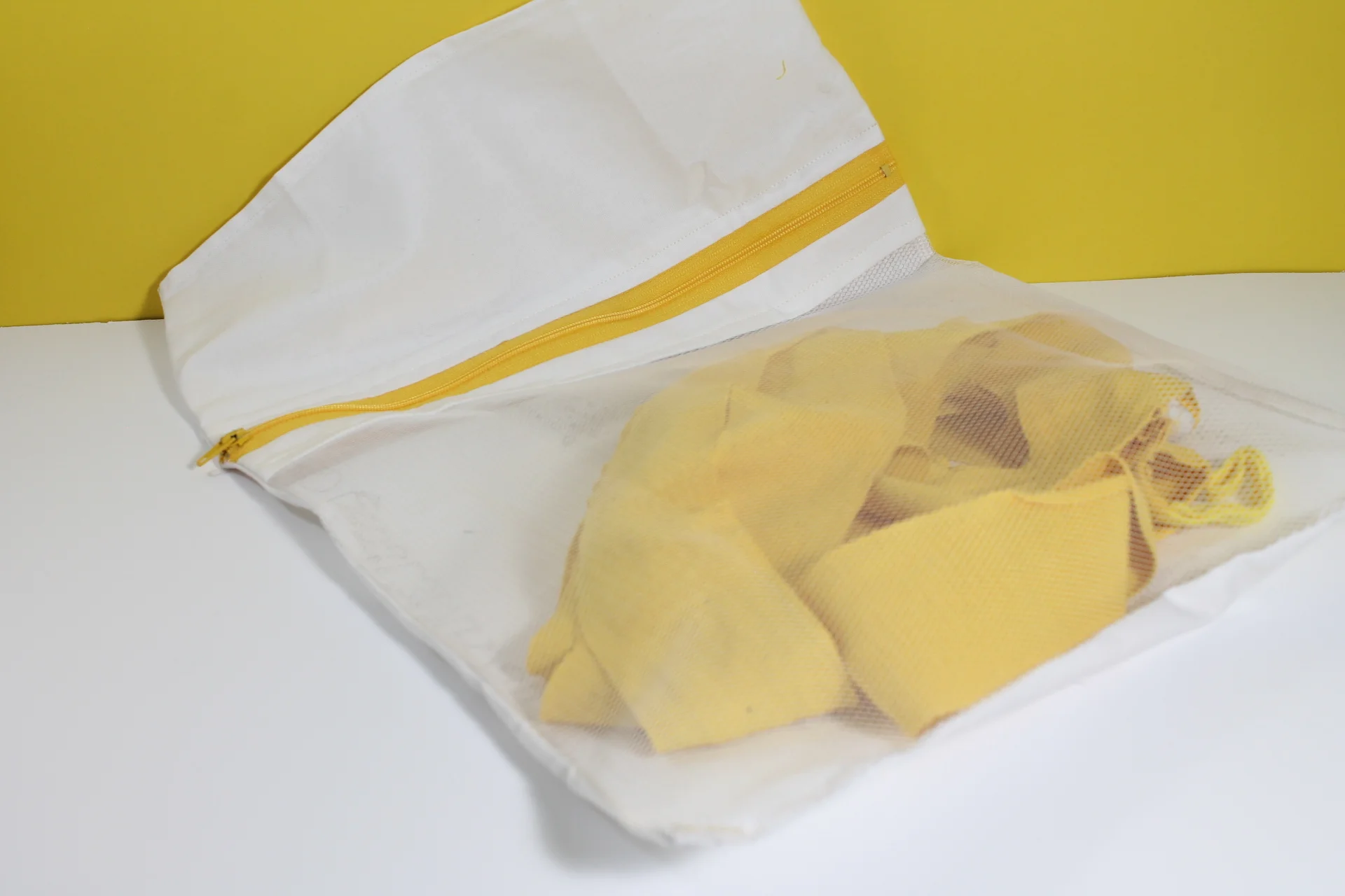
Laundry bag
The main container of the package is a folded laundry bag. A folding technique used on t-shirts by the military was applied to the laundry bag to contain the hand wraps. The top section of the bag was added to perform the folding technique and enclose the wraps. It was settled through prototyping with different materials that a thicker cotton and mesh material was needed to form the laundry bag. A yellow zipper was used to connect with the brand identity and allow the user to place their wraps inside easily.
Screen printing
The layout for screen printing worked around the folding technique to create a layout that hand elements land on the right panels when folded. The front panel's main element is the eight-point Yant that needed to land on the center when folded. Then when the user unwraps the bag, the full layout is displayed. The inclusion of the three tattoos allowed for a simple organization of the different elements and styled them based on traditional cloth Sak Yant or back tattoos.
Infographic
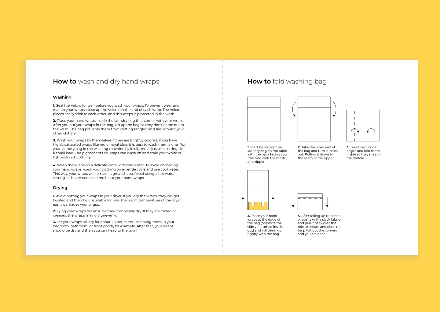
path for the reader. Starting with the logo and then opening it to the second panel thanking the customer and giving a brief explanation of the brand and the Sak Yant tattoos. The final spread is used to educate the user on caring for their hand wraps with washing and drying instructions. The other panel gives instructions on how to refold the bag so the user can recreate the package.
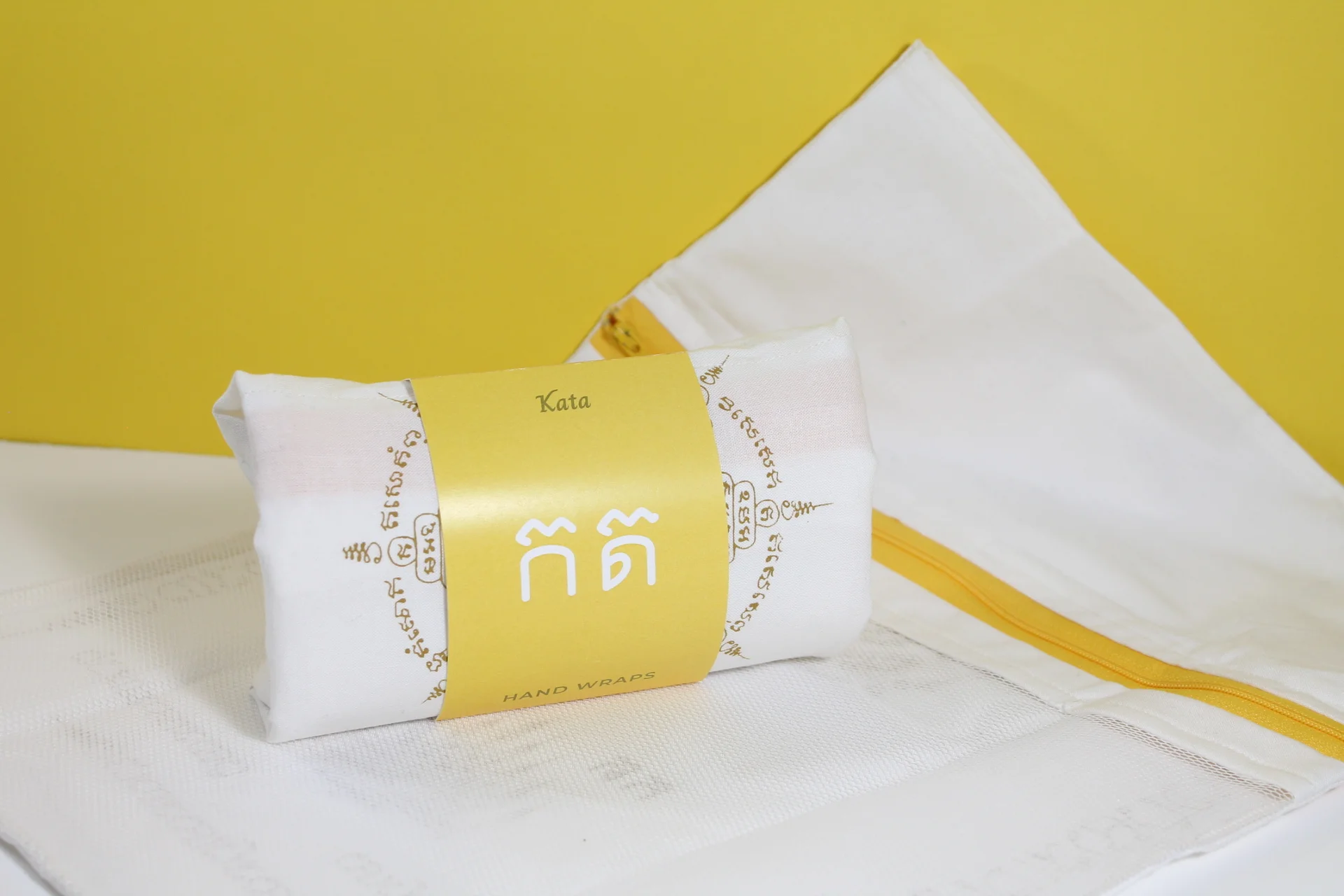
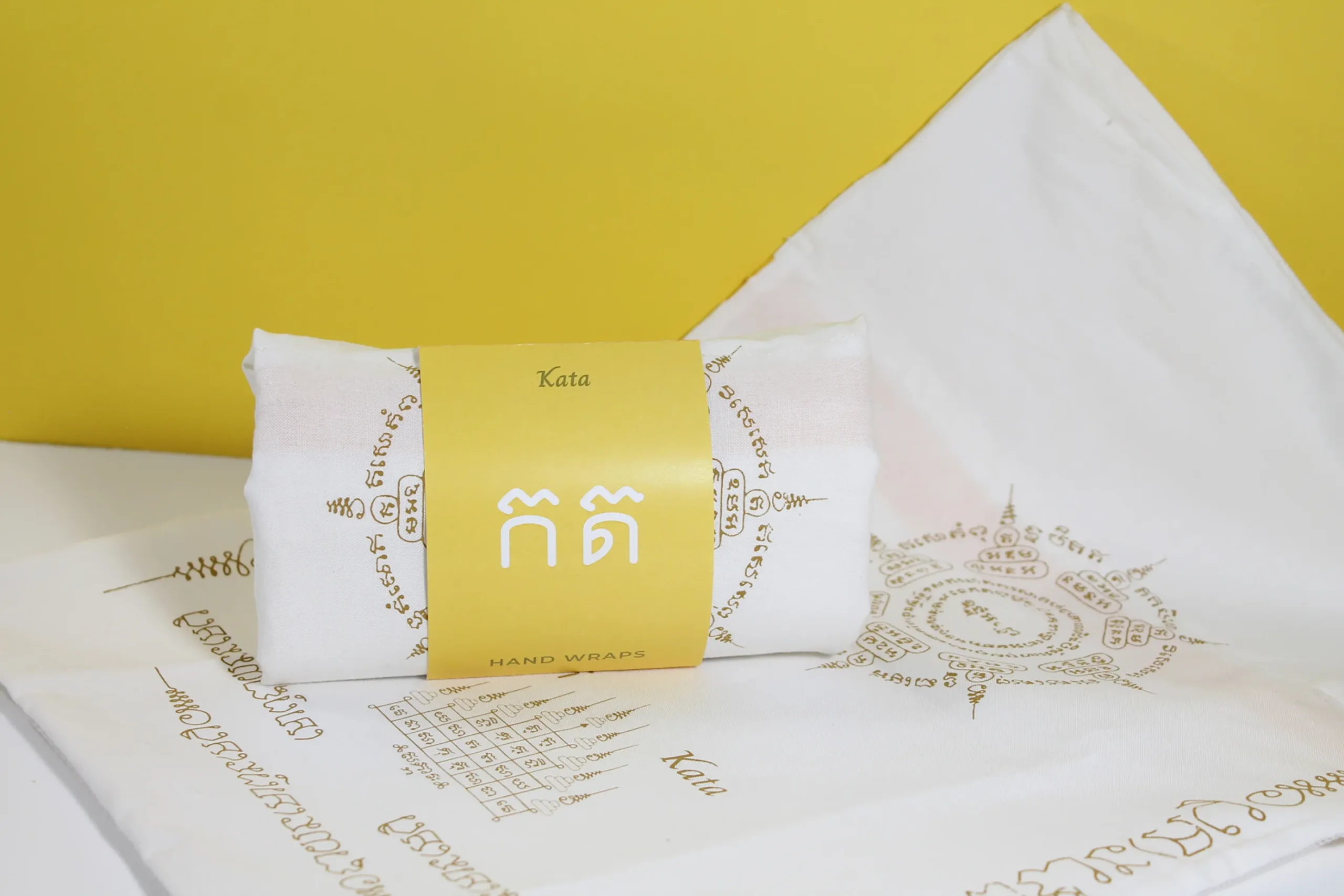
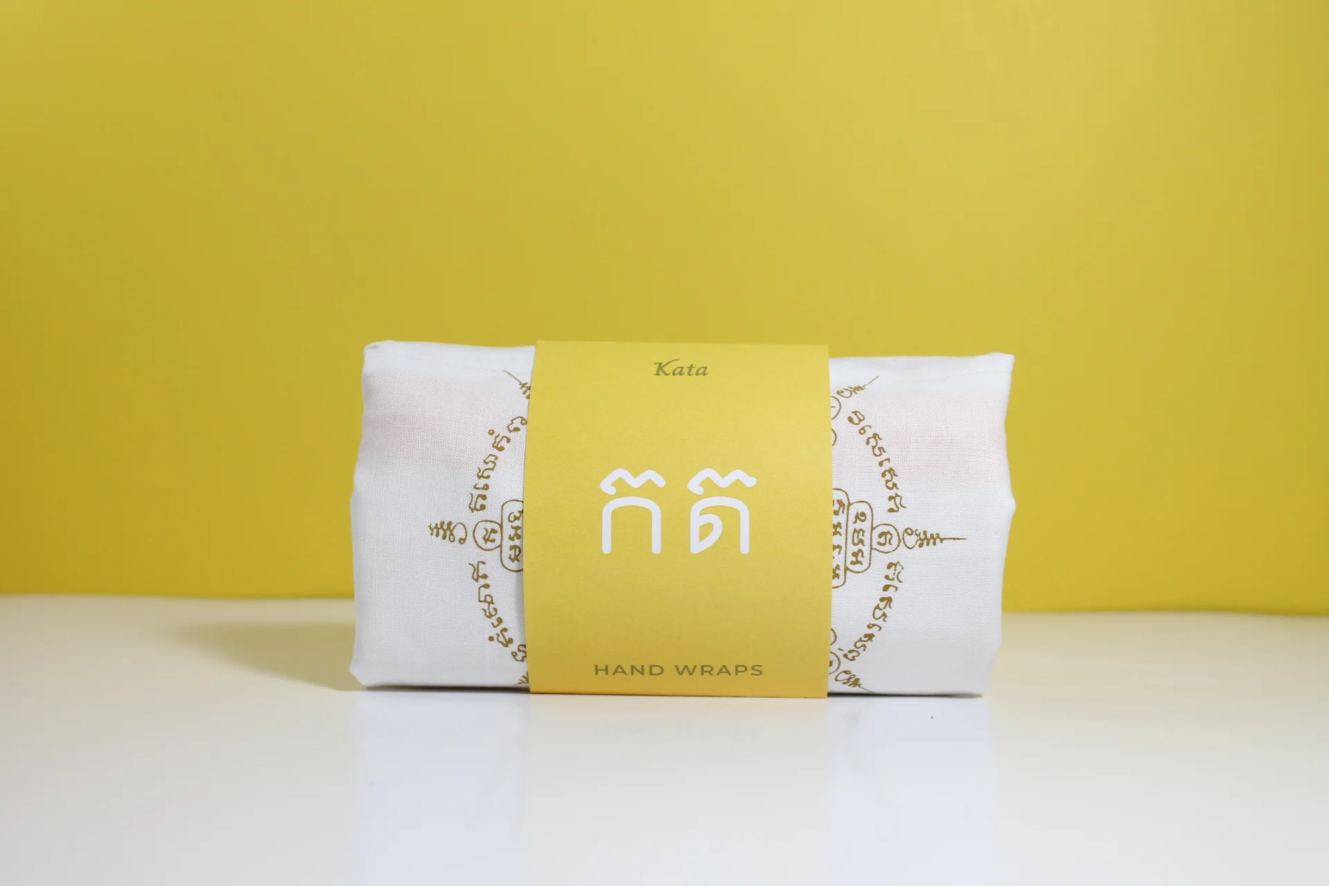
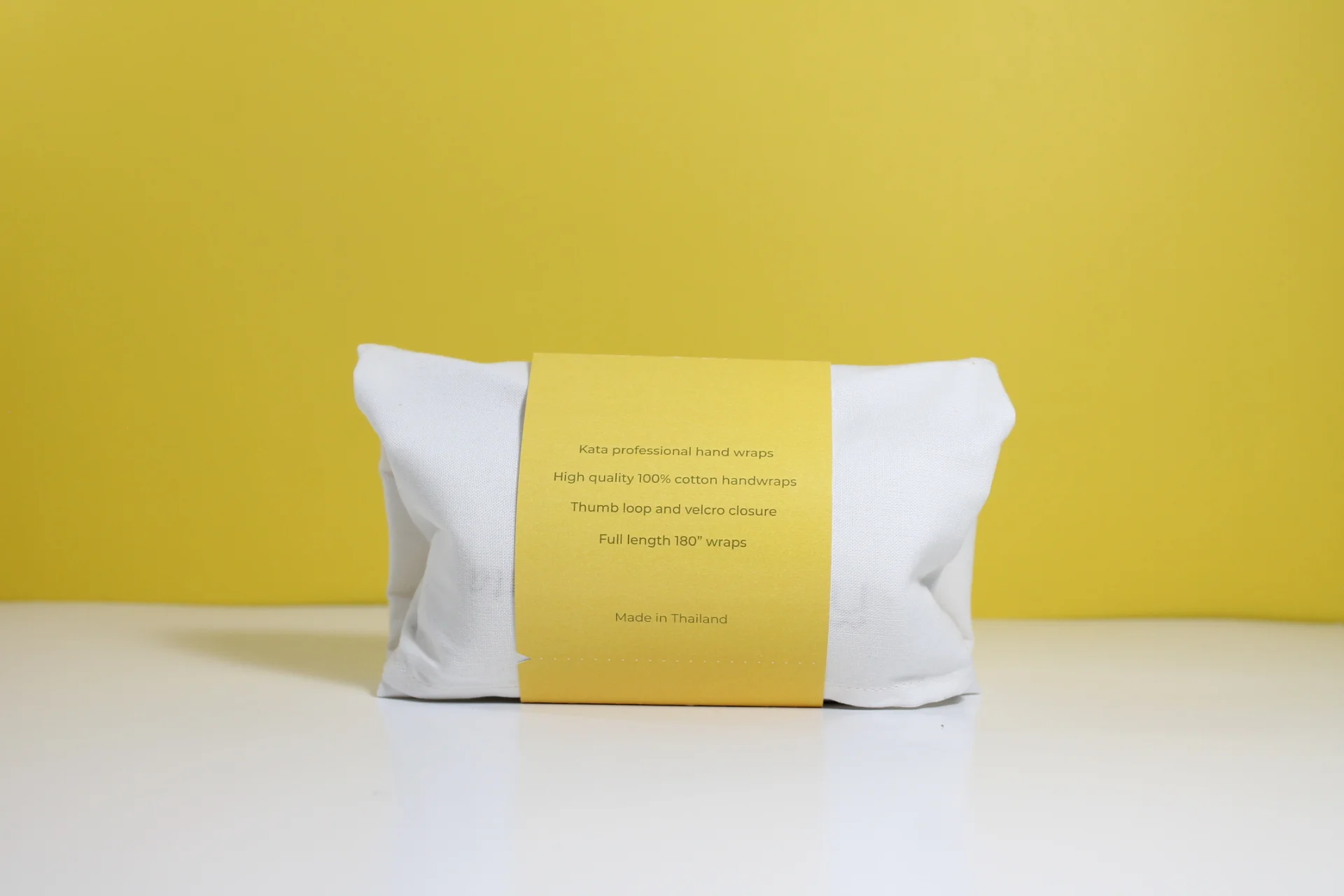
Package sleeve
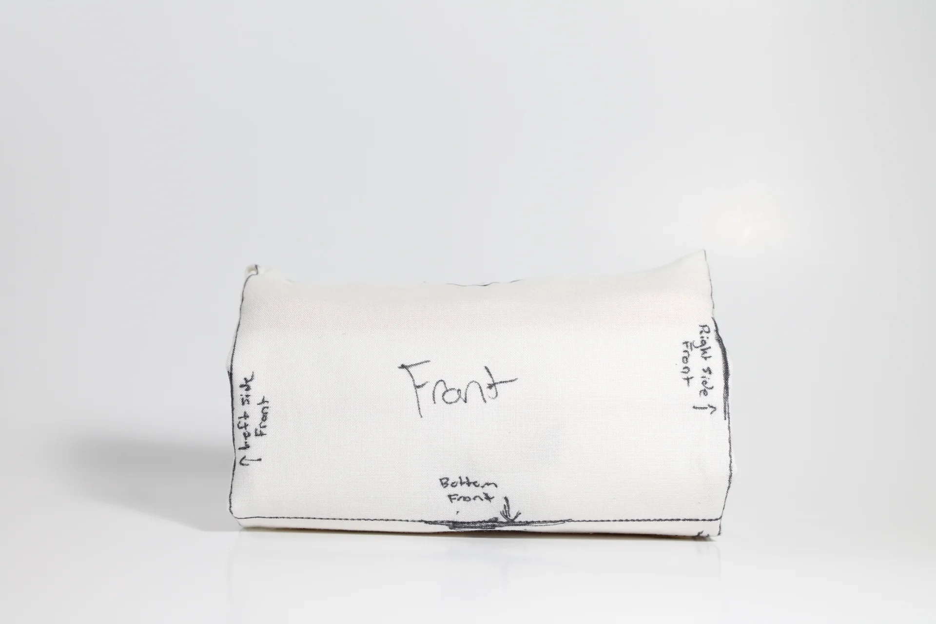
After creating the container with the laundry bag and establishing the intention to place the Sak Yant tattoos on the bag panels, There was no indication of what the package contained. To solve this problem, a sleeve was created to express the necessary information, indicating the brand and the contents within.
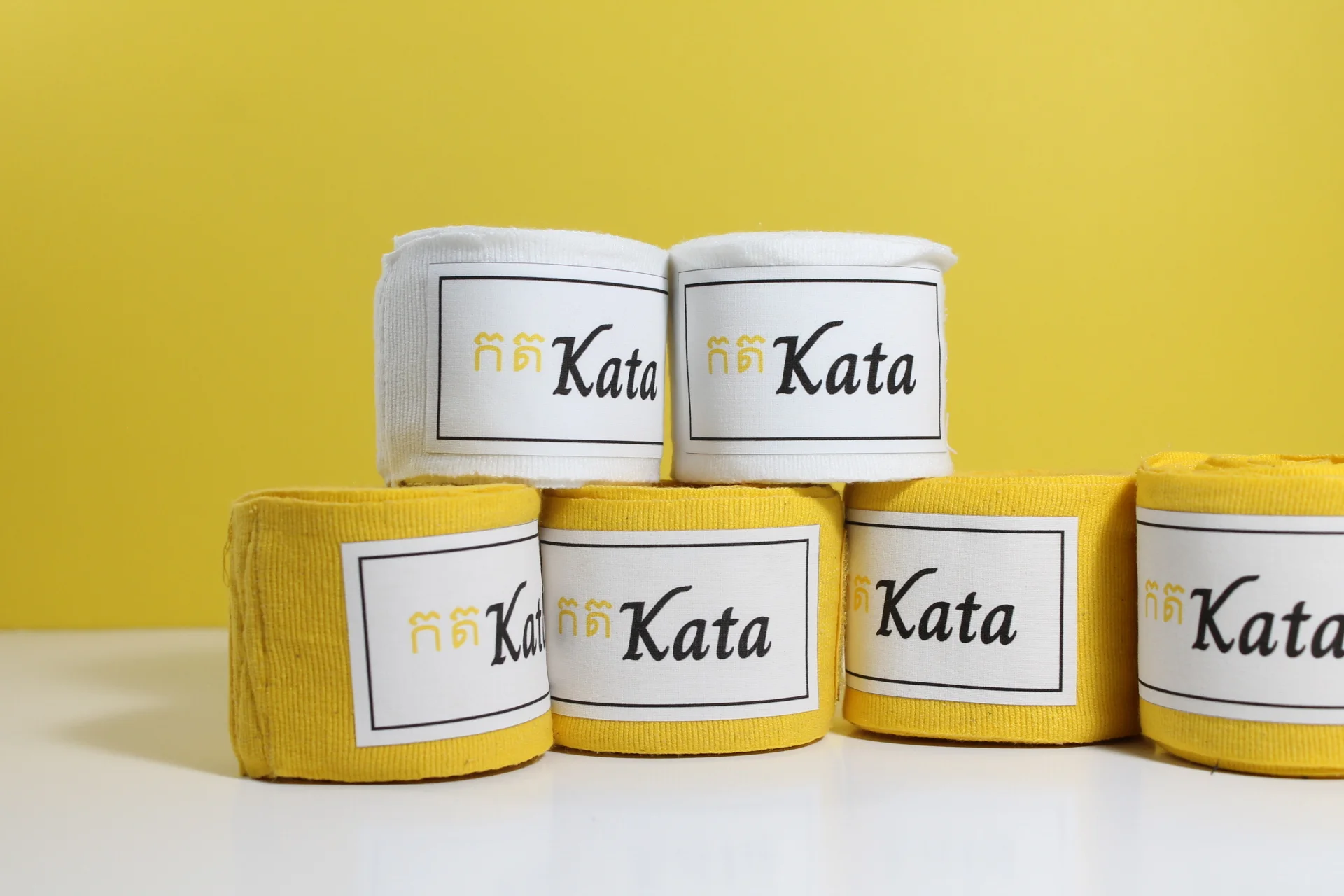
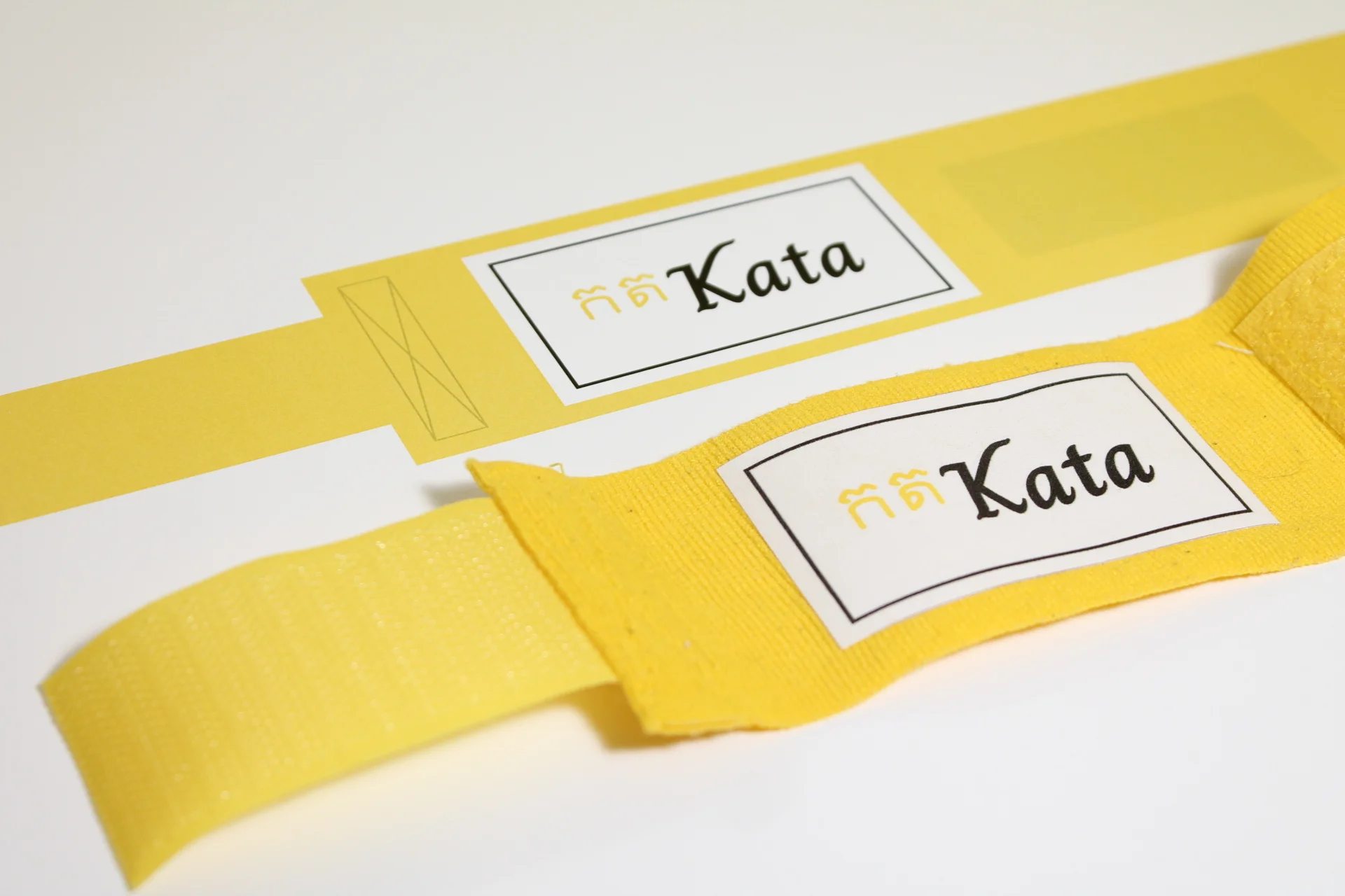
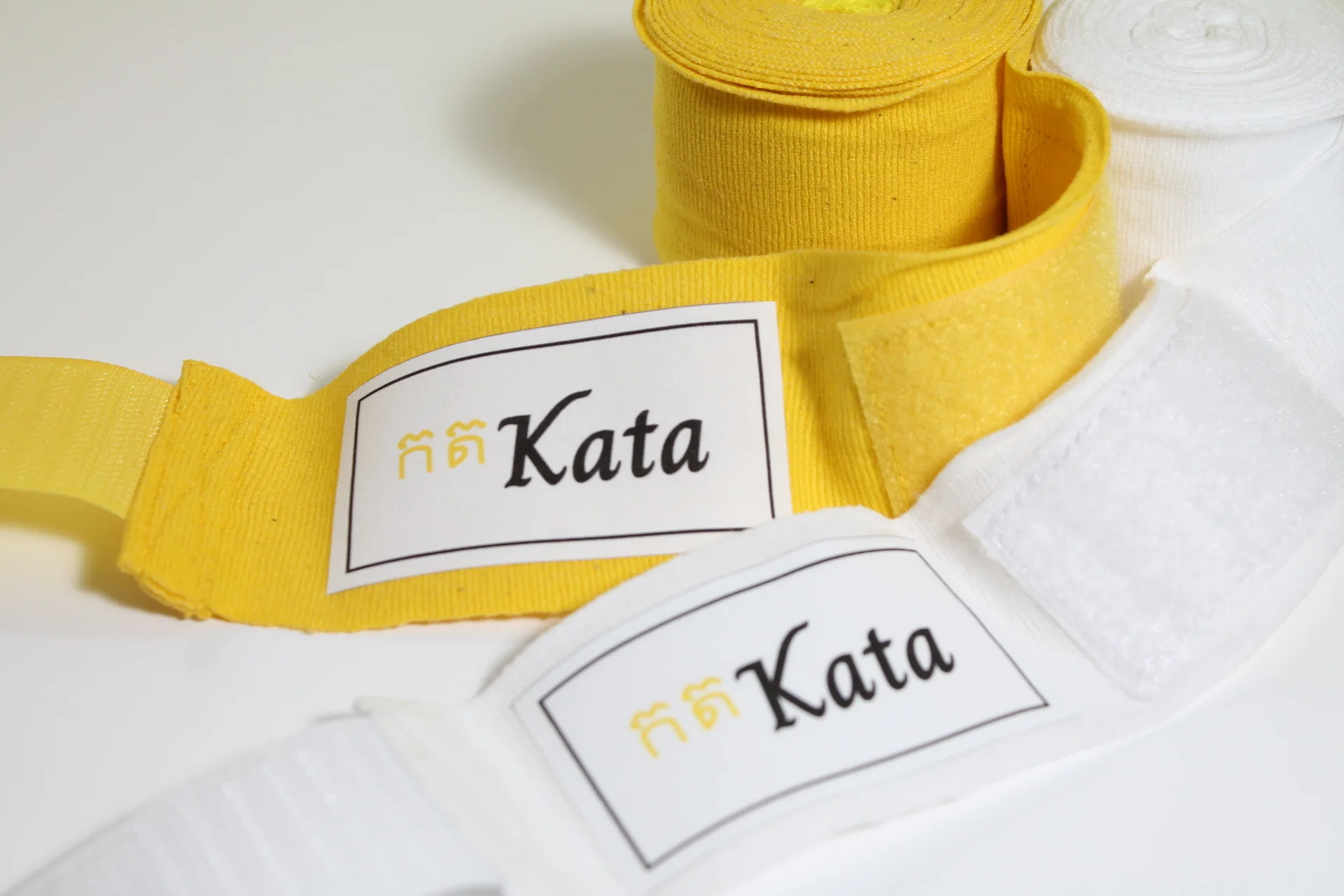
Hand wraps
For the hand wraps themselves, the intent was to keep the product very traditional, clean, and recognizable. The label is set with a bolder black border and white background to resemble the traditional layout. The simplicity of the hand wraps emphasizes the key brand elements.
Solution
The current packaging for hand wraps is wasteful and harmful to the environment. To combat this, Kata hand wraps use a folding technique, and a custom made laundry bag as the container. This gives the package a second life as users will use the laundry bag to wash their hand wraps instead of throwing them away. On the laundry bag are Sak Yant tattoos, meant to capture and introduce the users to the rich history of Thailand where the sport originated. This solution aims to reduce the waste associated with hand wraps and act as a gateway for users to explore more into the sport they love.