Readworthy
Readworthy combines text to speech with community and organization/planning tools to help promote user to engage with reading material that they would otherwise put off or forget about.
UI/UX Design
Project description
Text to speech has proven to be faster and more accessible to many users, but the apps are all self driven. Readworthy combines text to speech with community and organization/planning tools to help promote user to engage with reading material that they would otherwise put off or forget about.
This solution is unique because in the apps and text to speech software that I have explored and used: Natural Reader, Speechify, Kurzwell. There have been no community or organization/planning features. Aside from occasional notifications it is entirely up to the user to discover and engage with the reading material. Readworthy promotes and suggests manageable methods that meets the users needs so they can improve their reading habits.
Interview script for user research
Introduction
Hi, my name’s Colin. I’d like to start by thanking you for making the time to speak with me. I’m currently working on a solution that helps users improve their reading habits with the use of text to speech.
During this interview, I’ll ask you a few questions about your reading habits and use of text to speech software. Please be aware that there are no wrong answers as I’m interested in your own perspective on the subject. Your feedback will be very valuable to me and will be used to inform my design decisions.
With your permission, I’d like to record this call. The recording will only be used to help me in my research, and it won’t be shared with anyone
I’d like to keep this interview to 20 minutes and if you need a break or to stop at any time, please let me know.
Do you have any questions for me at this time?
1. Warm up
- Tell me about your reading habits (How often do you read?)
- What are your main methods of reading?
- What are some of the text to speech software you use on a regular basis?
- Why do you use text to speech?
2. In depth questions
- Can you tell me about how you use text to speech software?
- What environments do you find yourself using text to speech? Follow up: Why?
- Is there anything you are currently doing with text to speech softwares that makes it easier to read consistently? (Follow up: can you think of anything that could?)
- What is your primary pain point related to text to speech softwares you have used?
- During a typical day or week, when do you find yourself reading?
- Are there times that you find it the most difficult to read?
- How do you currently deal with a reading slump or what tricks do you use to get back into reading?
- When you save something to read, what are the obstacles you find that prevent you from going back to read it? Tell me about those.
For interviewees that have not used text to speech software
- How do you think you would use text to speech software?
Insights
Core needs
- Having all the documents and reading list all in one location ready to be read
- Daily/weekly schedule of what needs to be read each day and organized times to do it
- Share collaborative reading recommendations or files and notes with friends or classmates
- Use text to speech so they can multitask while reading
- Remove visual distractions on the page like ads and pop ups
- Help plan and organize times to read during the week and receive reminders to read at ideal times
- Get help finding easier fun things to help get back into reading
Pain points
- Always uses text to speech on a laptop because the software wasn’t available as a mobile app
- Lists of things to read are all in various locations notes, screenshots, lists so they get lost
- Have a hard time staying engaged with long reading
- Too tired to read after a long day of work
- Hard to find time during the day to sit and read
- Distracted by outside factors like notifications
- Difficult to read when there's a lot of people around (distrating)
- Adding to the ever growing list to read and not taking the time to plan out how to read them or just taking the couple minutes to read the article
User personas
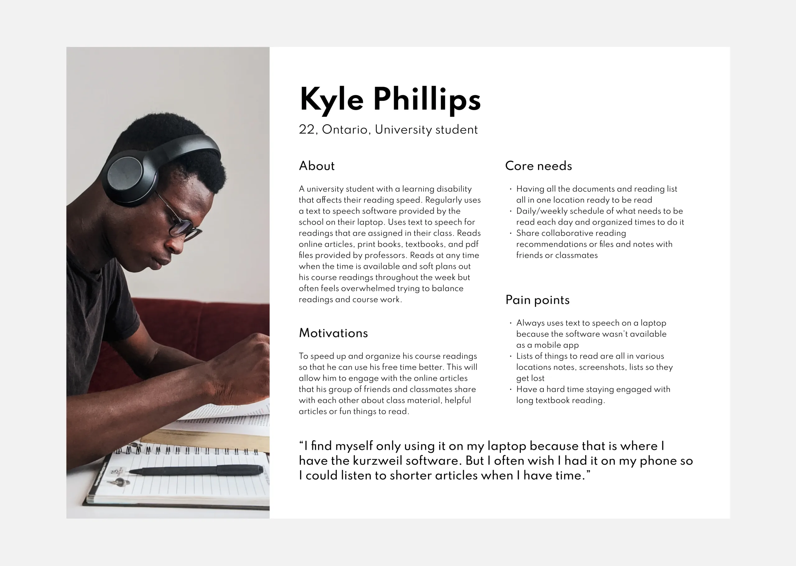
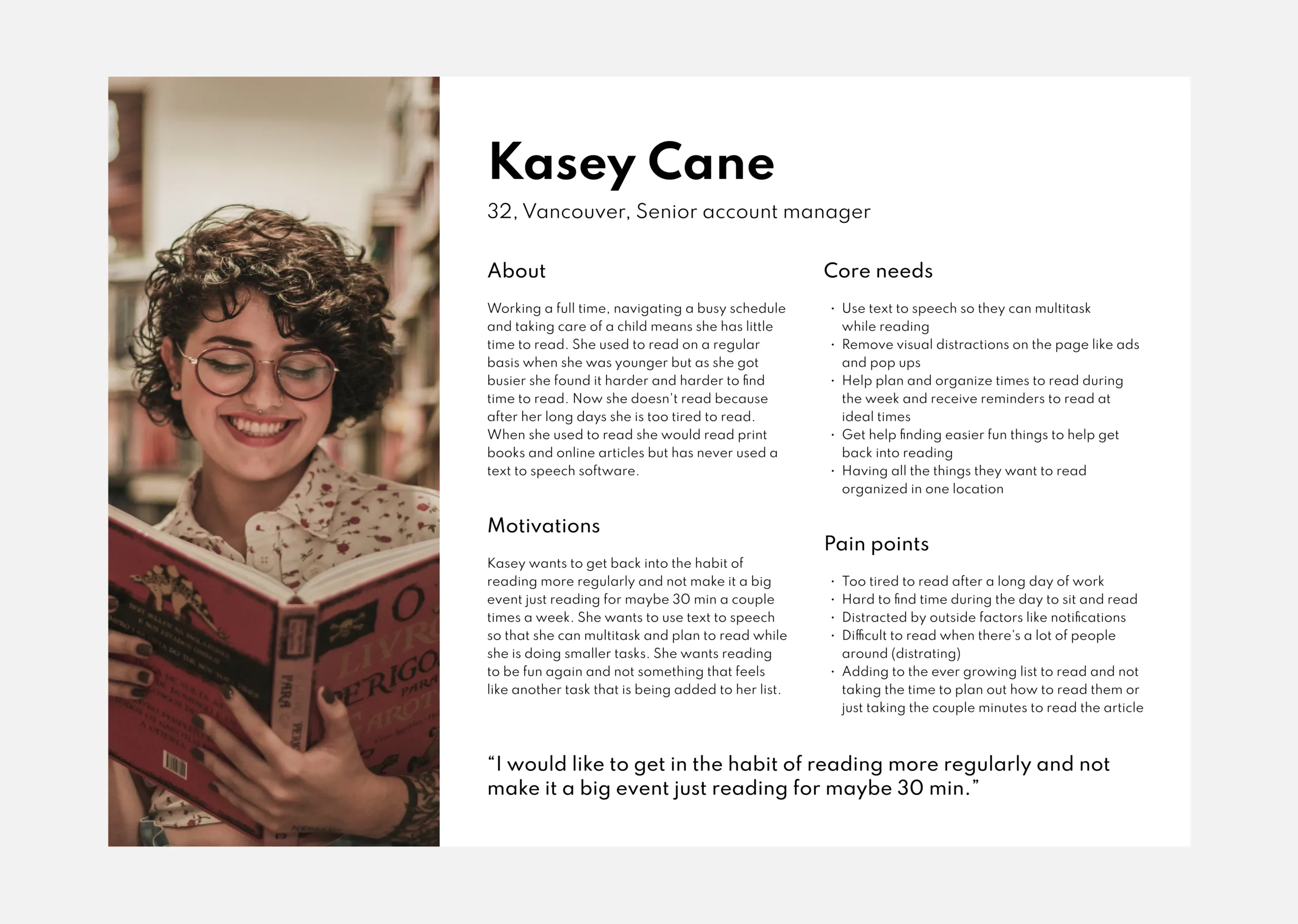
Based on the user interviews two personas were created to reflect the needs and wants of the user data that was collected. The two personas define unique users motivations, Core needs and pain points that were used to construct the two user flows for the project.
Information architecture V1
The information architecture began with organizing the users motivations, Core needs and pain points into the core experiences of the app. To help users effectively navigate the app the labels Reading list, Discover and Groups which also helped identify the core experiences of the app.
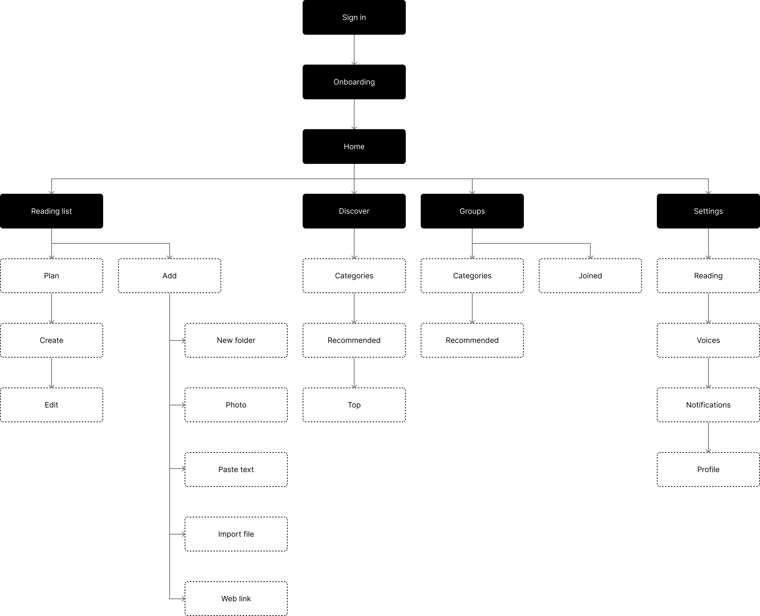
Information architecture V2
Changes were made to the information architecture based on discoveries made in iteration and feedback stages of the project. The theoretical vision of the core experiences were adapted and changed as I learned more about how users would practically use the app. The labels of the core experiences changed to reading list, reading plan, groups, discover and reading experience. These changes made navigation of the app easier for the user and met all the users motivations, Core needs and pain points defined in the two user personas.
User flows
For this project two user flows were created from the finds of the personas and information architecture. The first user flow reflects the motivations of Kyle Philips (Persona 1) and how they move through the content of the app. Likewise the second user flow reflects how Kasey Cane (Persona 2) will move through the content of the app. Many changes were made through the iterations of the user flows as seen in the information architecture and the below diagrams reflect the final user flows.
First time user adding readings to their reading list and plan

Experienced user adding a reading to their group and to their reading plan

Sketches
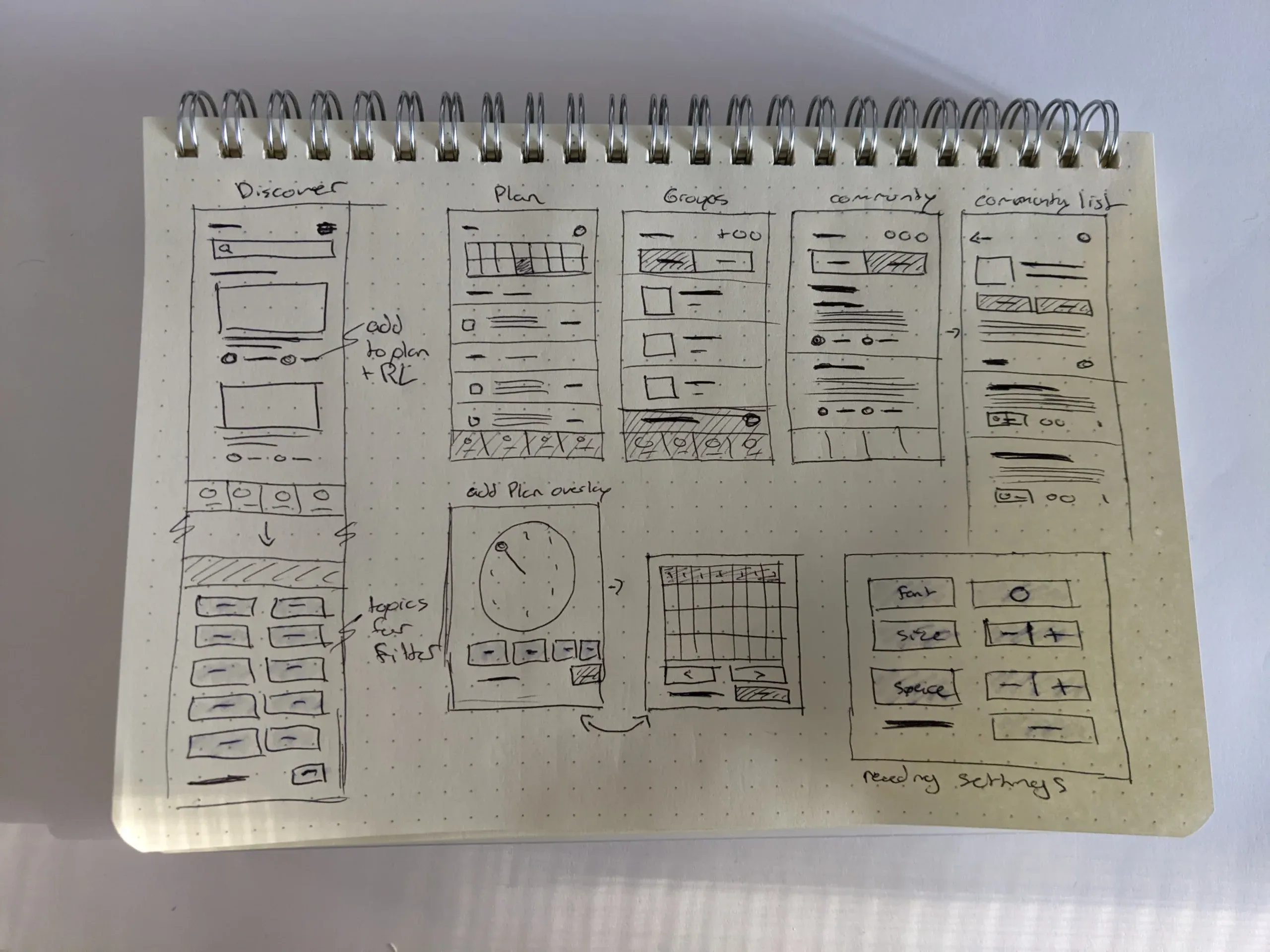
To begin visualizing the user flows I began with sketches of the wireframes. I found sketches challenging to iterate upon so a large amount of my low fidelity iterations were done in Figma where I found it much easier to experiment with layouts and ideas.
Wireframes
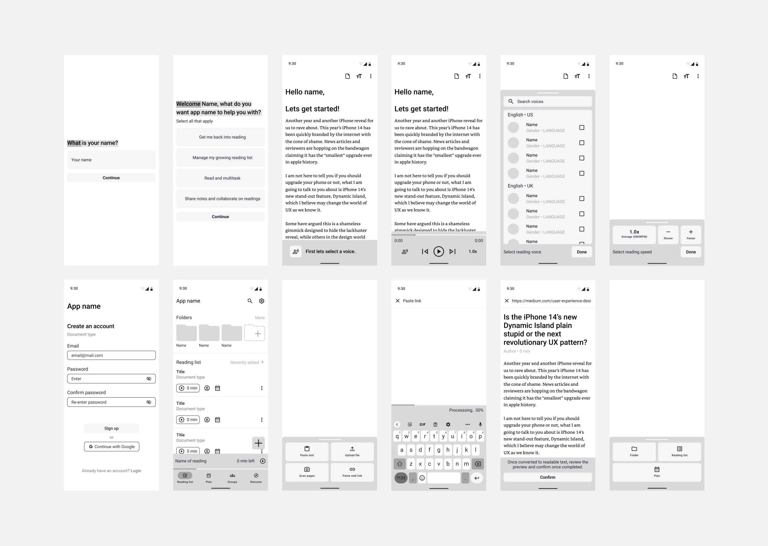
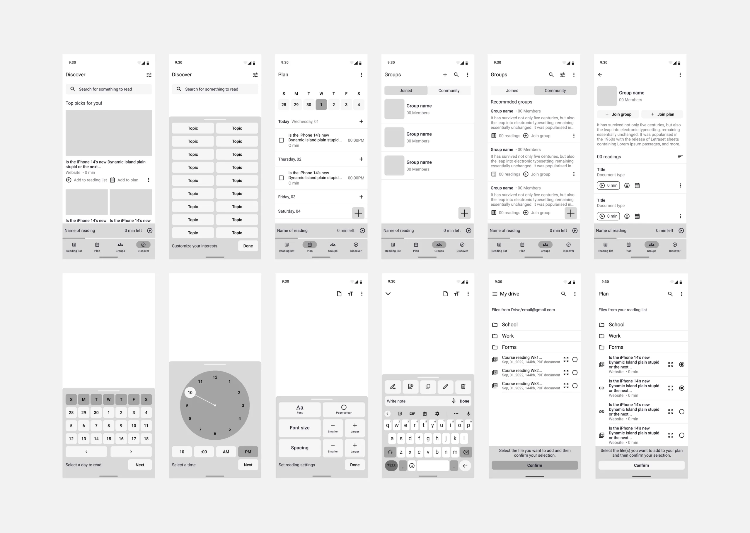
The low to mid fidelity wireframes were one of the most important stages of developing the structure and usability for the user. As a visual learner I was able to put myself in the mindset of the identified users and work throughout the user flows identifying pain points in my original site map and iterate until I came to an effective solution that met the needs of the users.
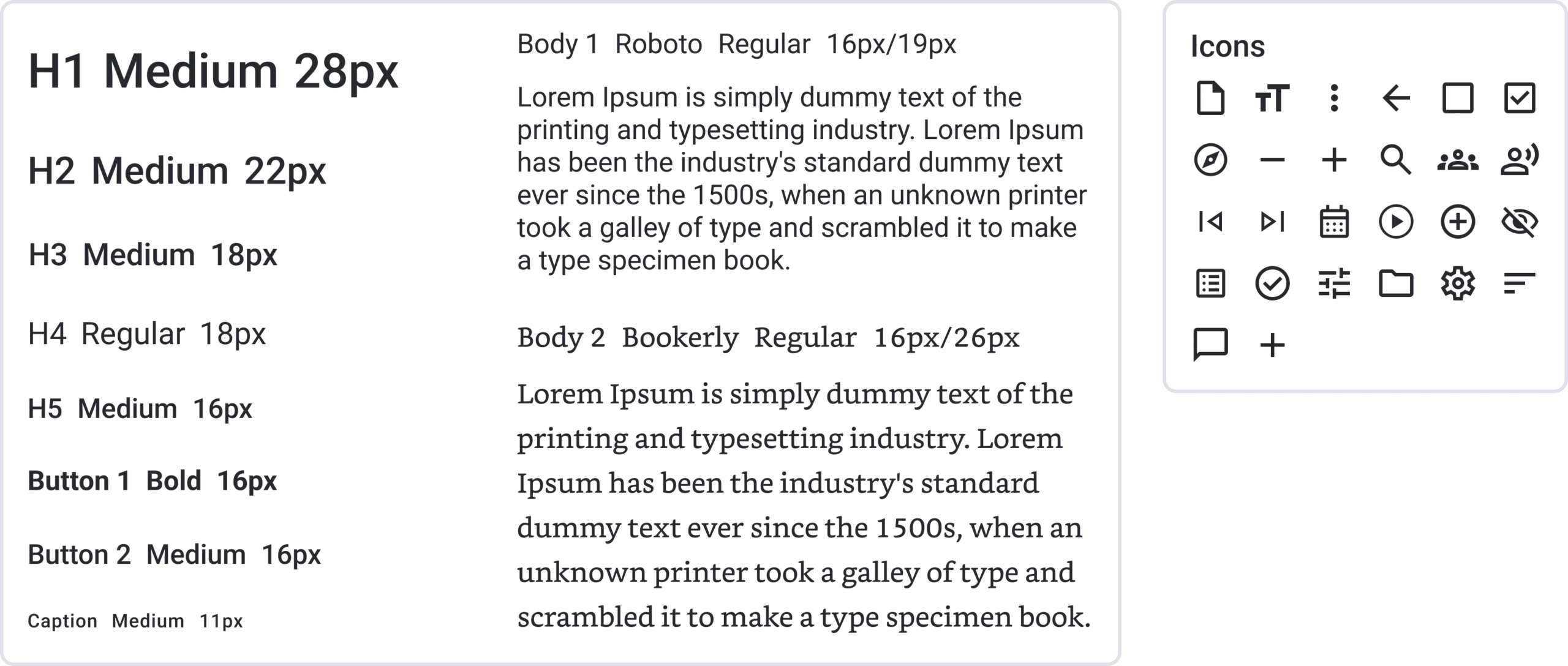
Style guide
High fidelity wireframes and prototyping
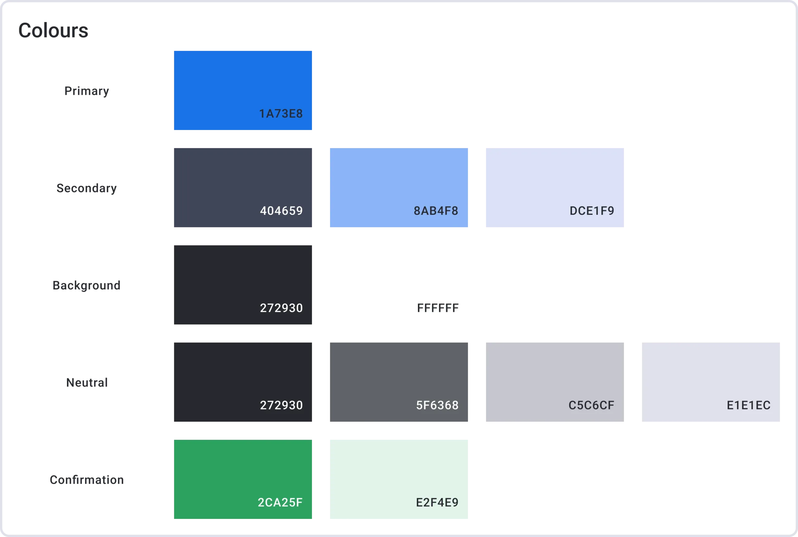
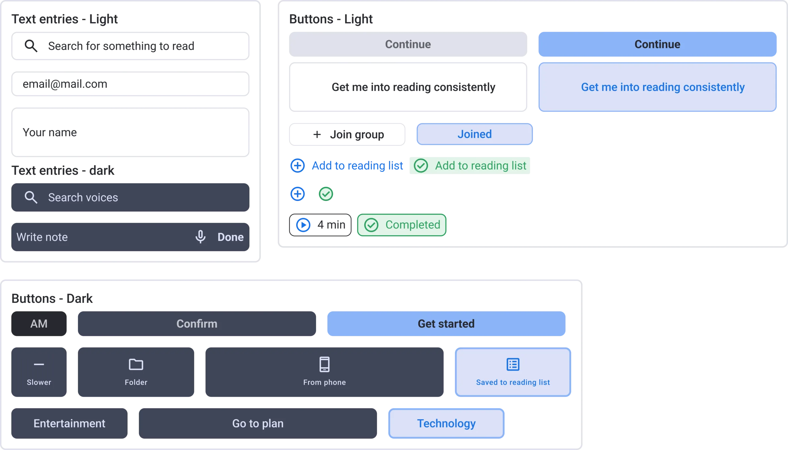
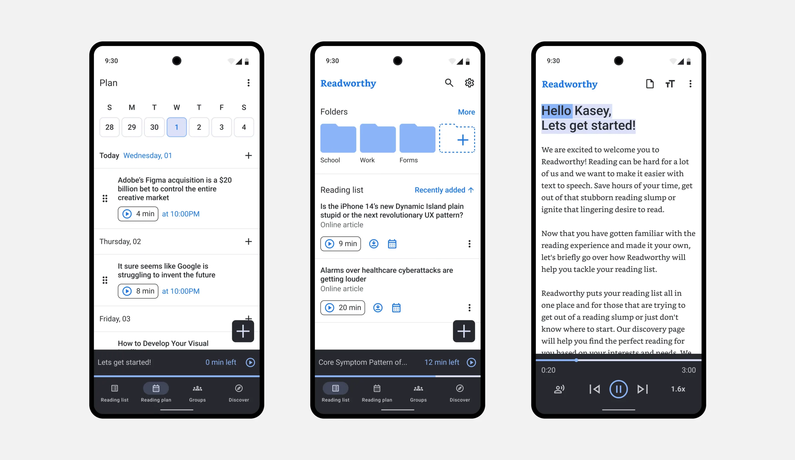
The detailed work that I put into the earlier stages of the project made the final stage of the project easier. Visually I wanted the experience to be familiar to users so the visual elements of the app follow the material design Google’s open-source design system.
Please feel free to explore the two complete interactive prototypes below yourself!
Learning outcomes
- Each stage of the process is important! Each stage influenced the previous or the next
- The value of good user research
- As a visual learner I found it hard to flesh out user flows without visual aids
- Having a general idea of experience and visual research, then working through my thoughts visually, helped me work through the stages of the experience
- Iterating, stepping away and challenging your thinking were valuable to constructing the experiences
- I think the area’s I need to improve the most on are the user interview, interview synthesis and conducting user testing
